Sip Sip Wok case study by Nora Pherome
brand
to
launch.

Hot wok. Cold beer. Lucky you.A wok and beer bar at Virgin Hotels Las Vegas. The agency made the identity. I carried it to packaging, print, ads and web. 😻
The identity was defined. I needed to make it work on everything from a takeout box to a hotel screen.
The agency set the foundation. I took it into the world.
The agency supplied the identity, brand guide and graphic assets. As INK Entertainment’s in-house designer, I developed the applications around them—from packaging and menus to hotel collateral, advertising and web. Each format needed its own decisions while still feeling like Sip Sip Wok. 🔥
The agency
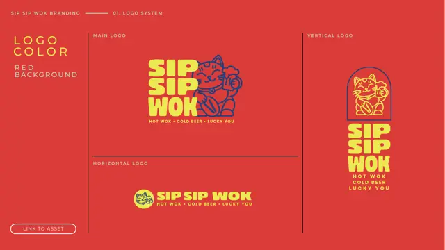
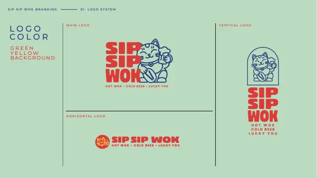
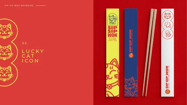
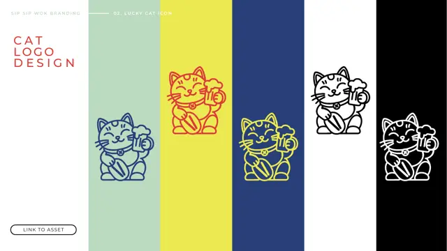
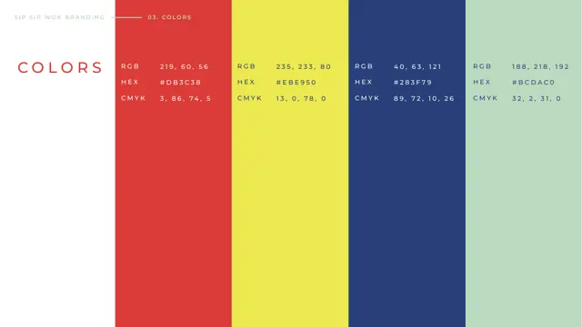
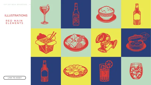
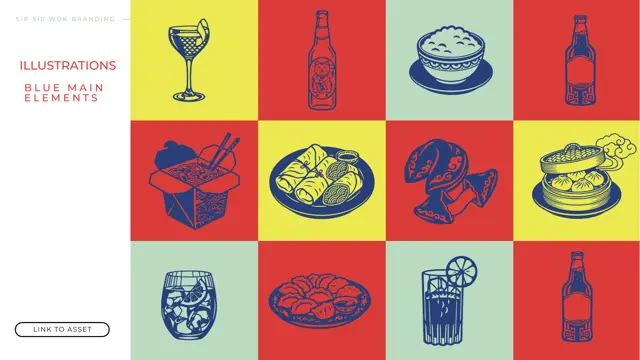
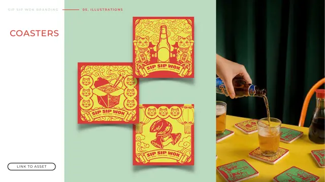
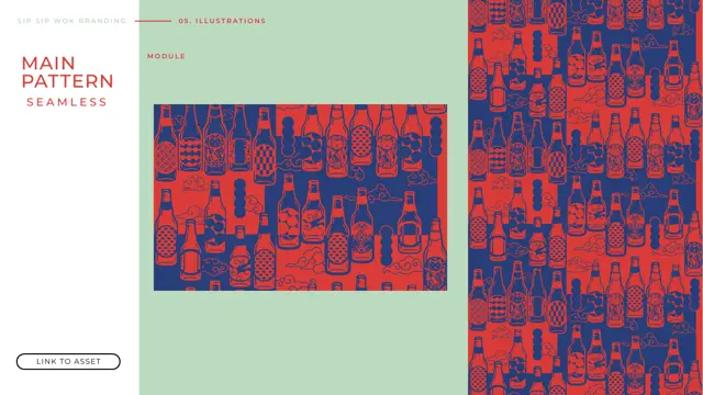
The identity, its core assets, and packaging feedback. 🧧
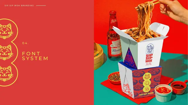
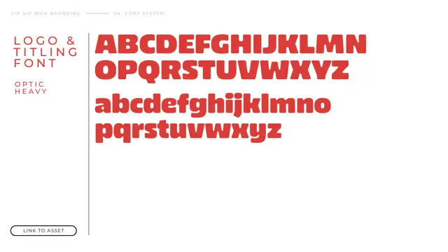
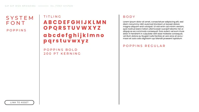
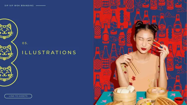
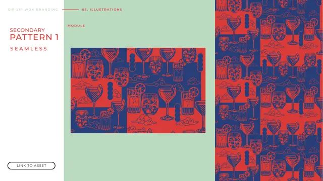
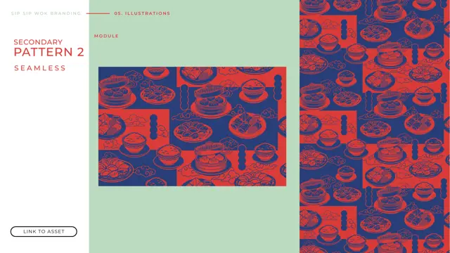
 1 / 23⤢ view full guide
Logo, colours, type and illustration. 🧧
The starting point for the rollout.
part
Me
Turning that foundation into the pieces guests see, hold and use. ✨
From first concepts to the final fold.
Packaging put the identity to its first practical test. I developed the initial layouts, then used the agency’s feedback to refine logo scale, colour and placement. Those decisions shaped the artwork across boxes, pails and liners. 🍜
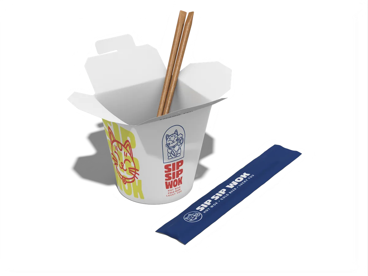 noodle box v1
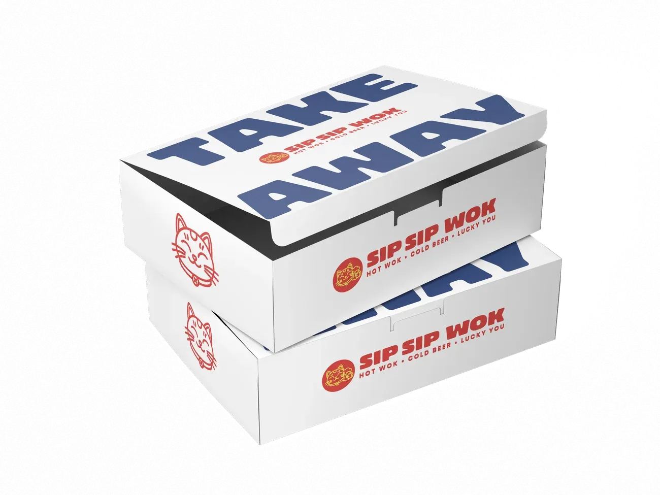 takeaway v1
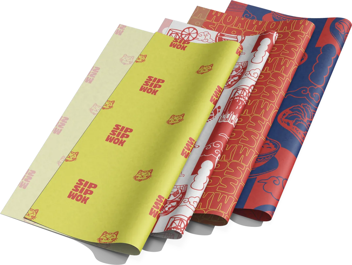 liners v1
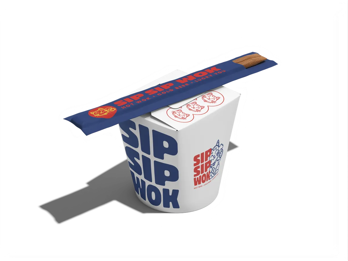 wordmark box v1
Agency notes
packaging review- Logo: too big and centered. Use white space, put content top and bottom, and play with proportion.
- Logo placement: primary logo on the main face of the takeaway box, secondary logos on the sides.
- Colour: red or yellow on white leads. Navy is only an accent.
- Two colours, not three. Change the pairing for variations.
- Colour blocking + pattern: always give one side a different colour or the pattern.
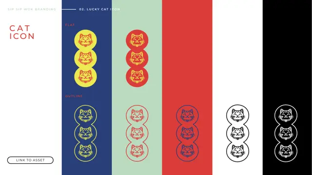
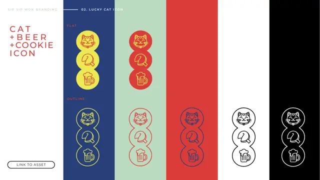
- Lucky: use the three-cat layout, not the head alone (it links to the signage), and keep the original pose.
- Mood: felt fast food. Push street food, Asian inspired, simulate linoprint.
- Icons + framing: less generic, draw from Asian design.
- Sticker effect: drop it. It pulls away from colour blocking and linoprint.
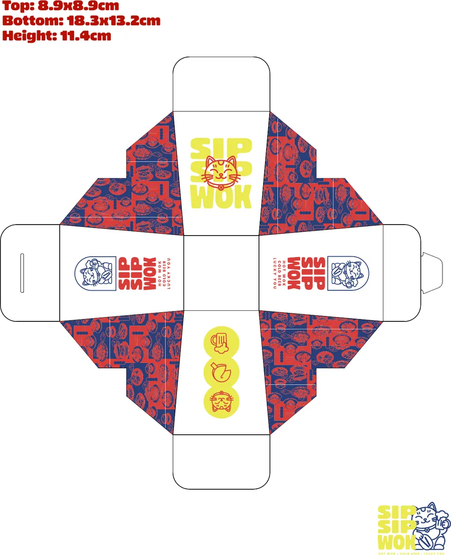
Dielines + pattern application
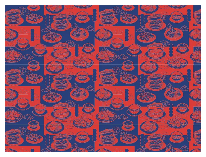
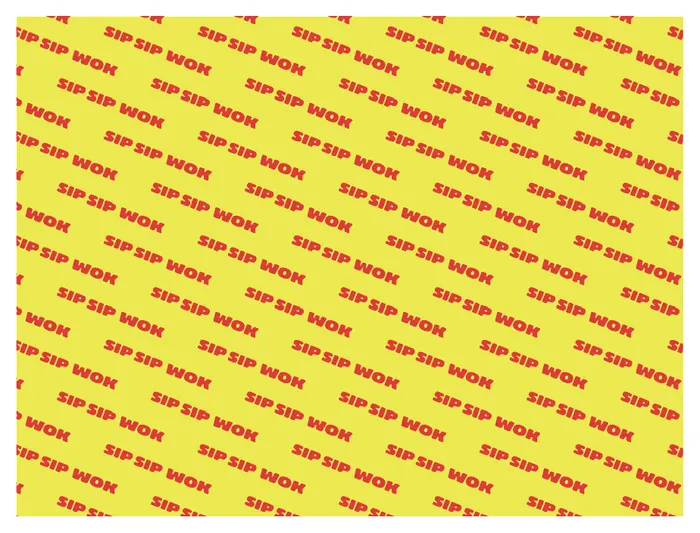
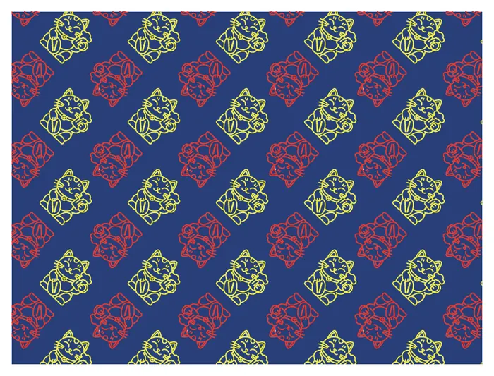
I adapted the brand’s illustrations and patterns across the 8×6×3 in container, 16 oz pail and two liner sizes, working out how the artwork sits across each surface. 🥢
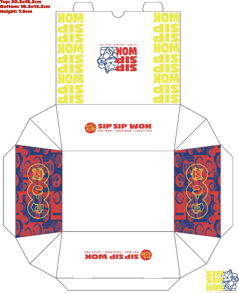
Meet the guest before the first bite.
small pieces, big personality ✨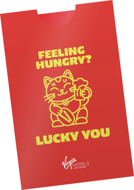
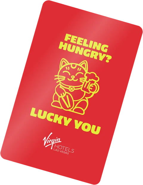
an appetite ✨
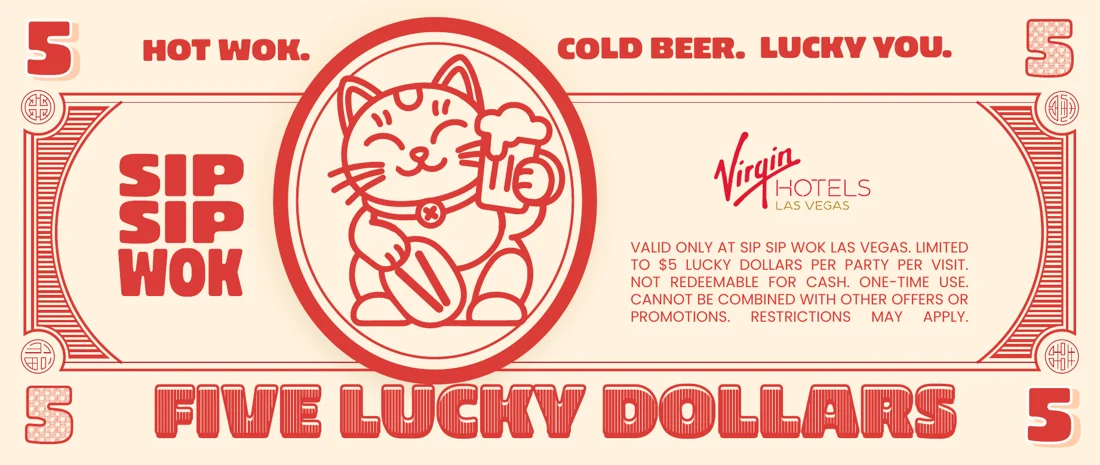
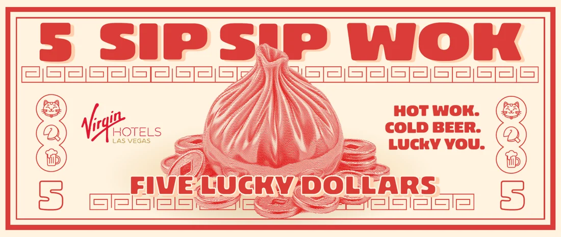
currency 🍜
Bring the same appetite to the screen.
same flavour, new format 😻I designed the coming-soon page and full website in Claude Design, carrying the brand’s colour, type and illustrations into a digital experience. With photography not yet available for the web designs, I created AI food imagery to give the pages their appetite. 😻
Food takes the lead. A dumpling breaks through the oversized wordmark, giving the opening screen a clear focal point. 🥢
Familiar faces. Lucky and the three-cat mark carry the identity from packaging into the digital experience. 🐱
Made for the late crowd. The ‘Till 2AM’ badge brings late-night dining into the message for hotel guests and the Vegas crowd. 🍺
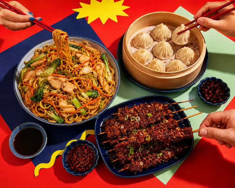
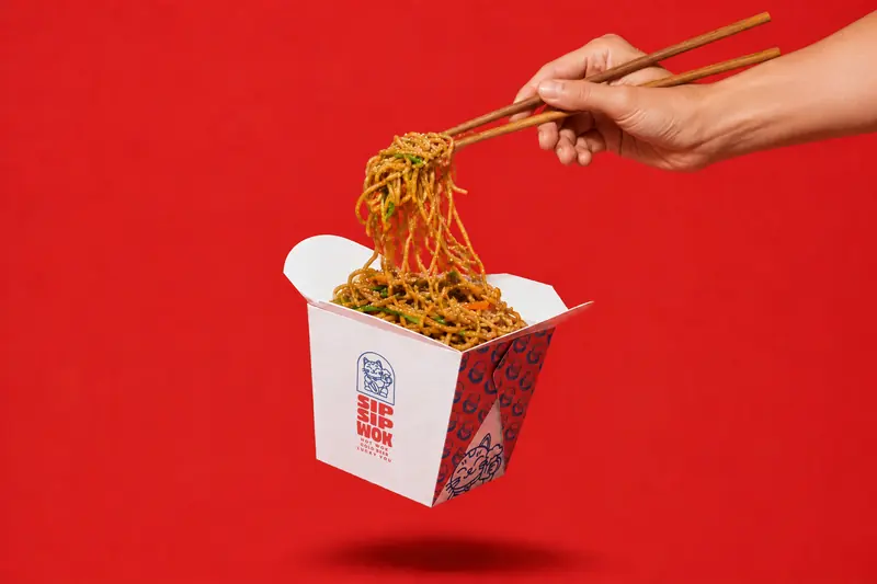 noodle pull 🍜
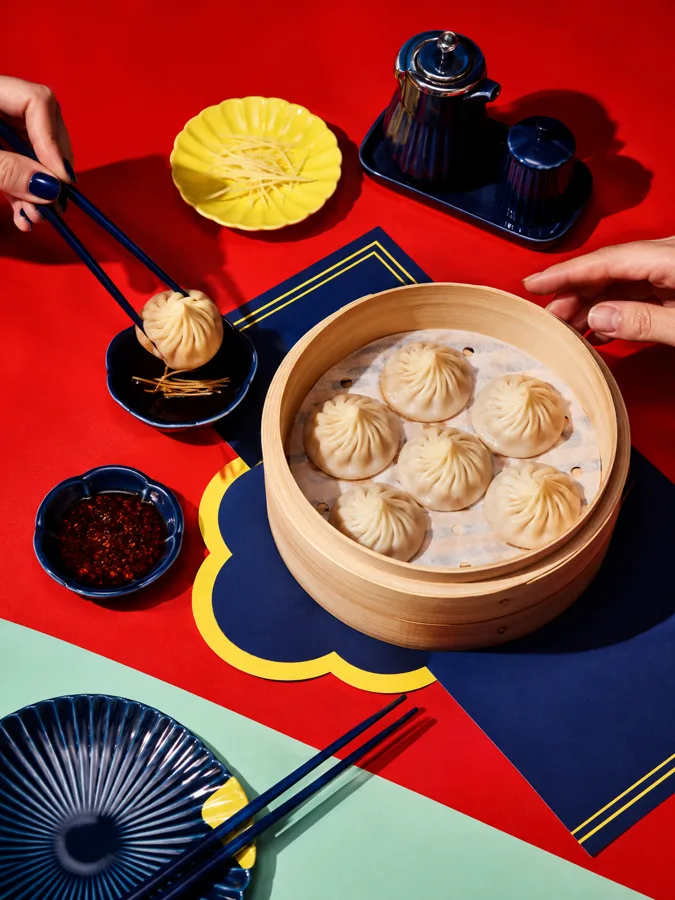 soup dumplings 🥢
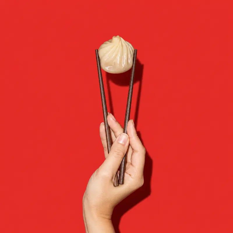
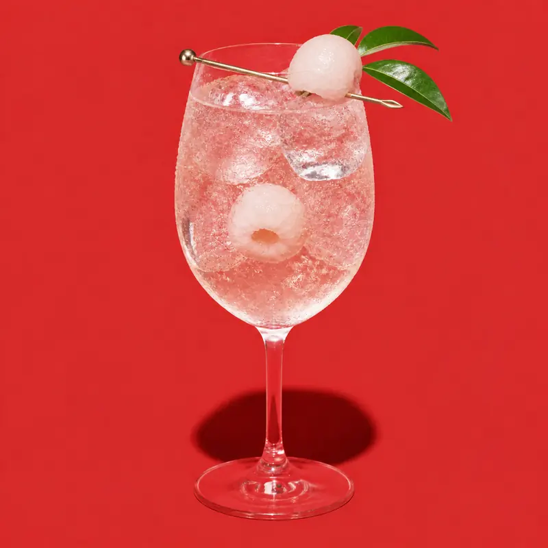
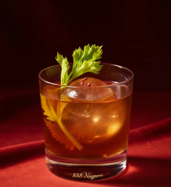 888 Negroni
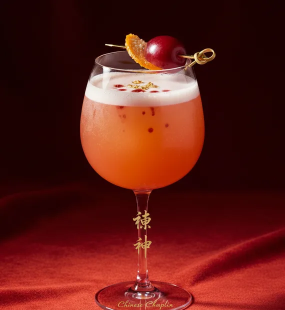 Chinese Chaplin
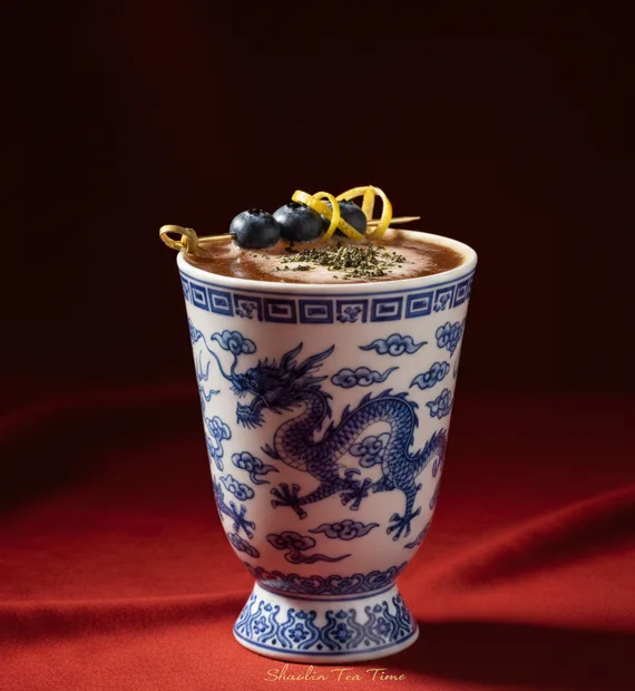 Shaolin Tea Time
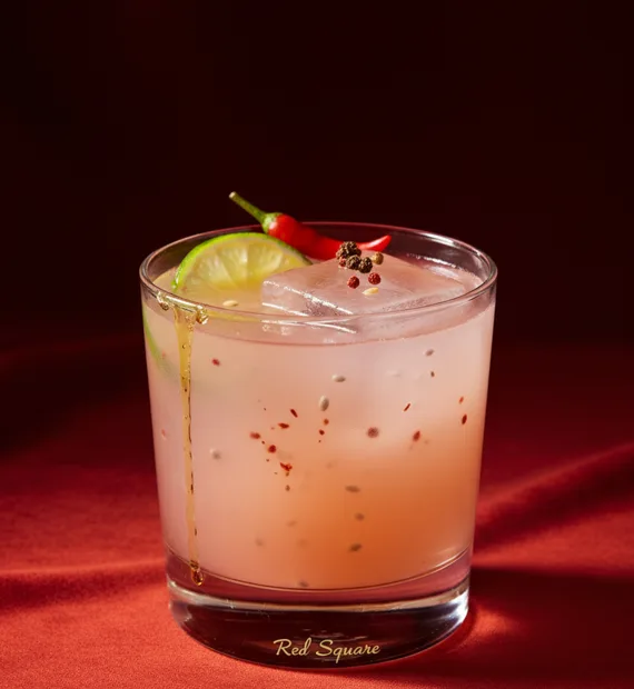 Red Square
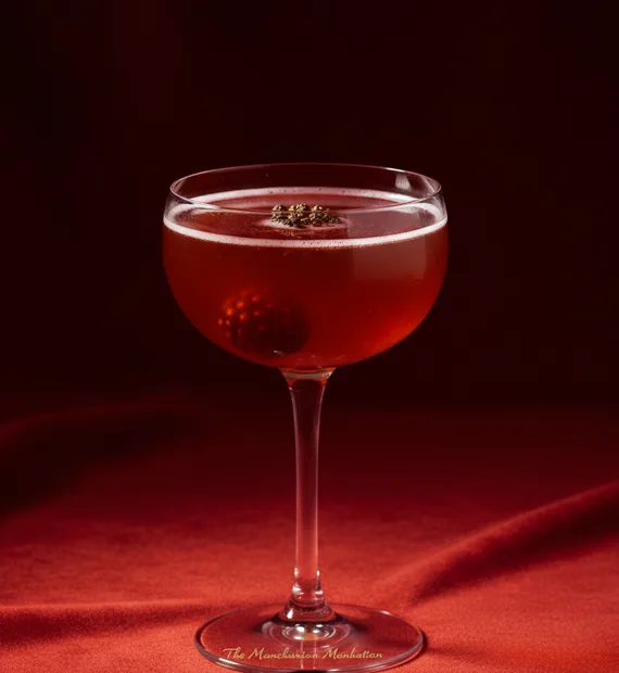 Manchurian Manhattan
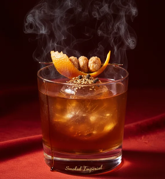 Smoked Imperial
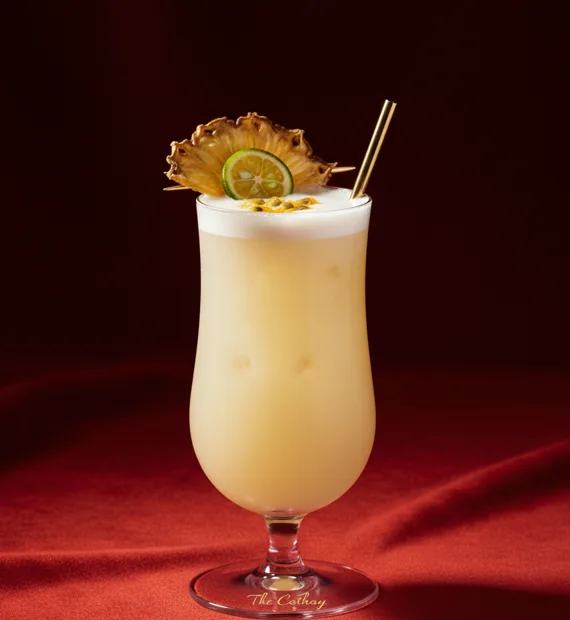 The Cathay
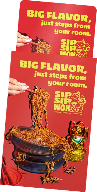
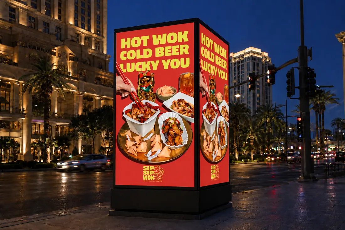
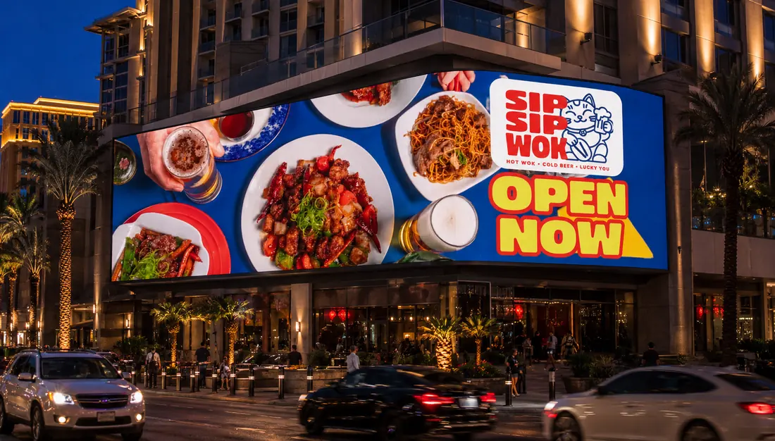
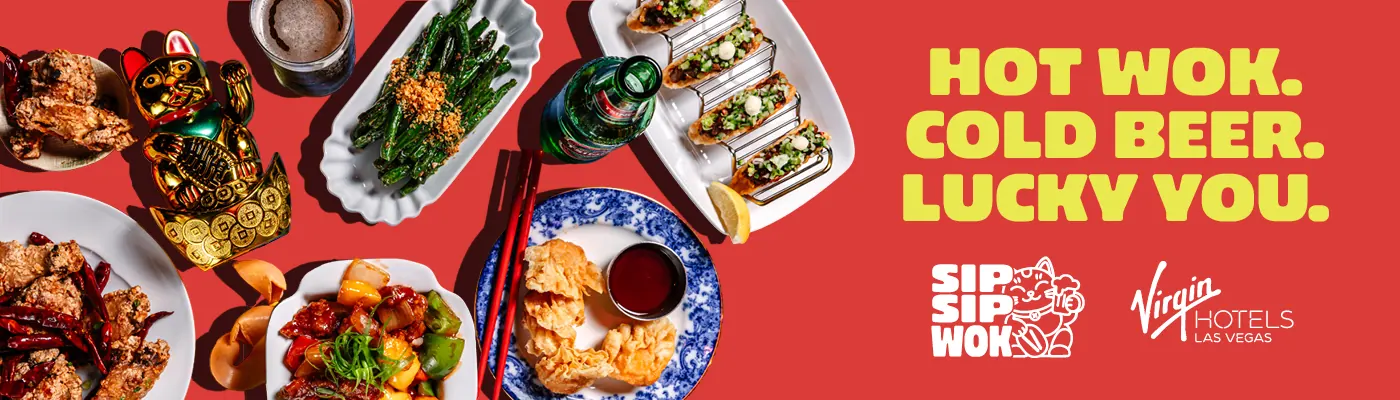
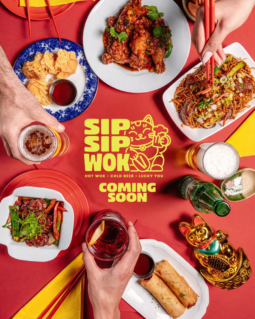
One campaign. Different compositions.
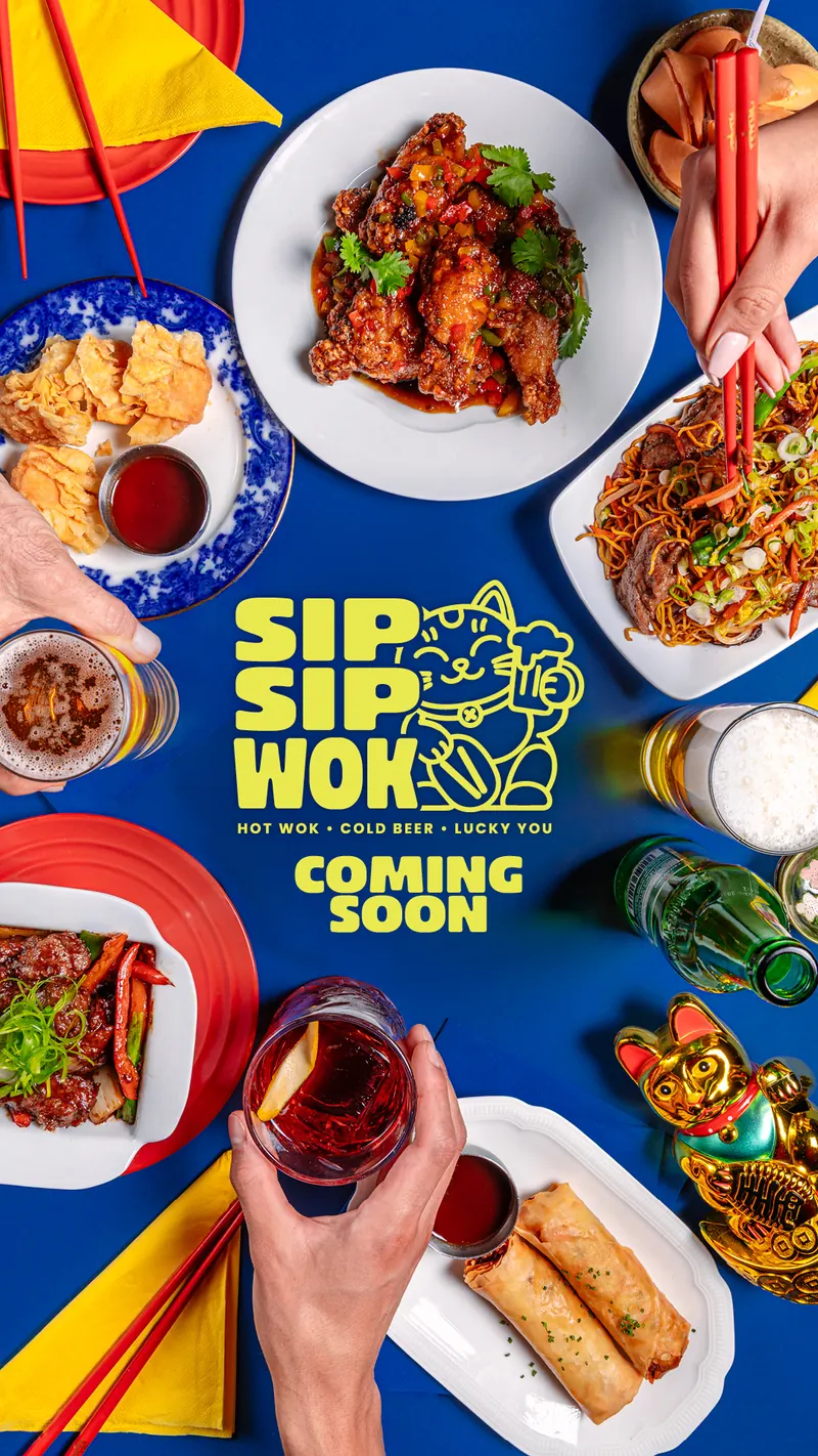
it's Vegas, go big 🔥I adapted the campaign across outdoor screens, hotel placements and social formats, recomposing the food, headline and logo for each size. I also created AI mockups to show the designs in context. ✨
 the chef, signing off 🔥
Thanks for taking a look.
I hope you enjoyed a little taste of Sip Sip Wok. 🥢