
Meláni · Modern Greek
Dinner, drinks and dessert menus for a modern Greek restaurant at Yonge & Eglinton. An editorial layout, a palette pulled from painted vases, and an octopus on every cover.
Meláni took over the old Byblos Uptown space and opened as a modern Greek room built around shared plates, grilled seafood and a long wine list. The team wanted the room to feel like the Aegean.
My job was the menus. Close to 50 dishes, a cocktail list and five pages of wine had to fit on paper that still feels calm, more like a page from a travel magazine than a price list. Guests share plates here, so the menu needed to be easy to read across a table, in low light, by a group.
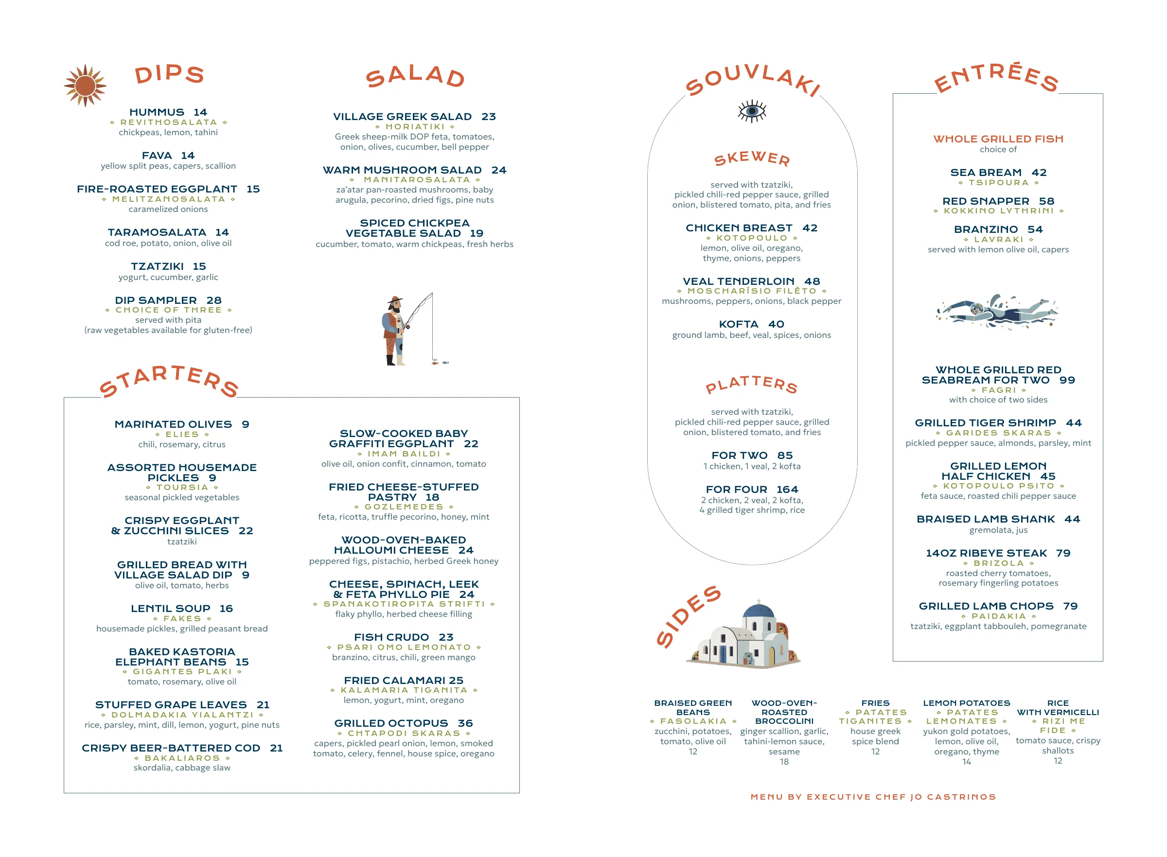
The dinner menu is one sheet with two panels. The left panel is meze for the table: dips, salads, starters. The right panel is the main event: souvlaki, entrées, sides. You read it in the same order the food arrives.
Instead of one long list, every section is its own shape.
Every section title sits on an arc. It borrows the shoulder of a Greek vase and the whitewashed arches of the islands, and it gives the eye a clear place to land.
English name and price, then the Greek name in olive caps between diamonds, then ingredients in a light weight. The price sits right after the name with no dot leaders, so the food reads first.
Starters is the biggest section with 18 dishes. A thin frame and two columns keep it together so it never spills into Dips and Salad above it.
A sun, a fisherman, an evil eye, a swimmer and a chapel fill the gaps between sections. They give the page air and turn it into a small story about the coast.
Souvlaki is the only section with its own sub-menu (skewers, then platters). So it gets a different shape, an arch like a Santorini doorway, to show it works differently.
Entrées stand on the right edge, the last stop for the eye. Whole grilled fish leads, because the kitchen is built around the grill.
Five sides run in one row along the bottom. Small, even columns that are easy to add to any main without hunting.
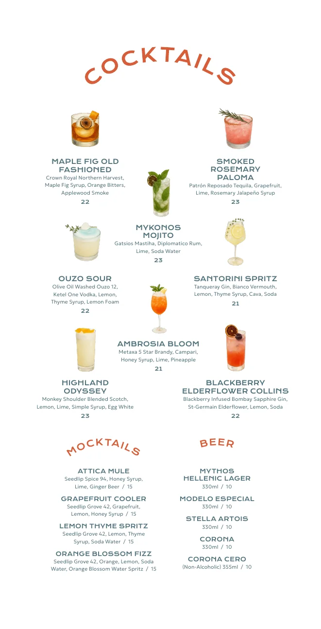
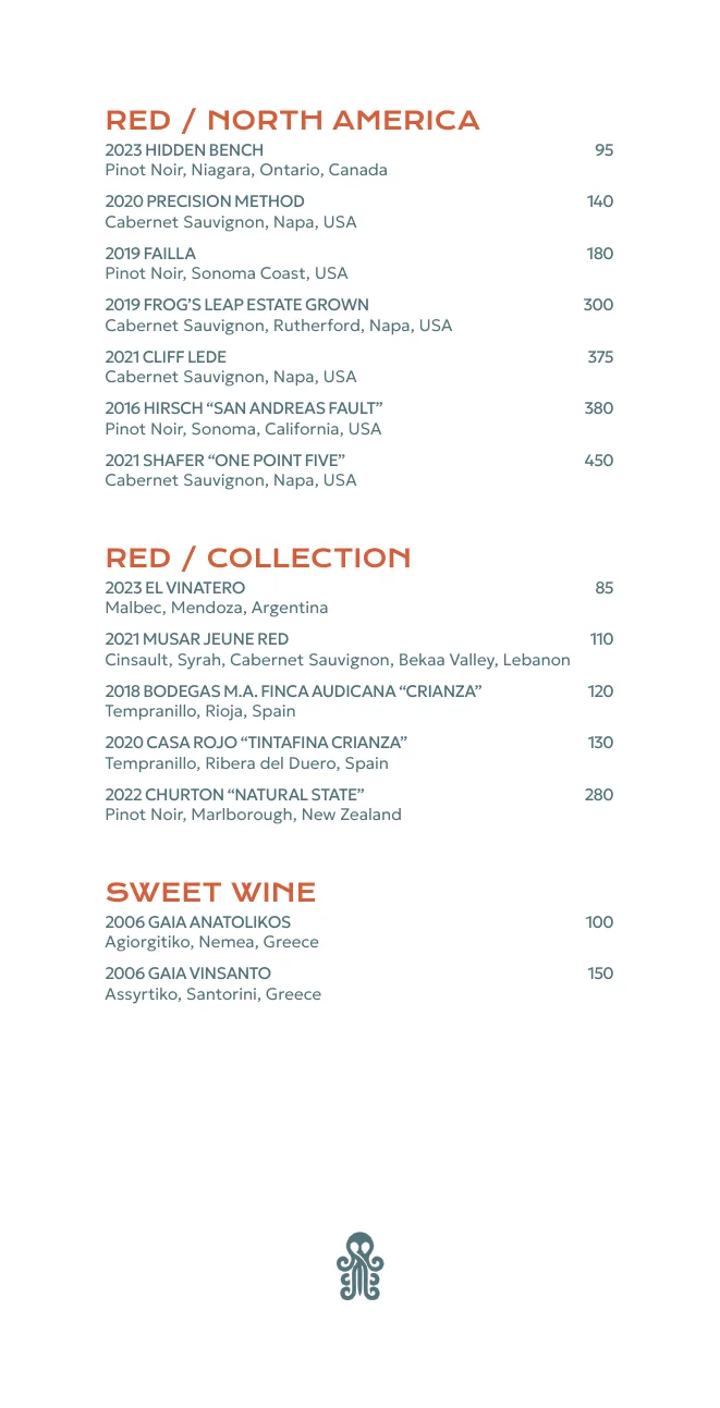
The drinks book changes rules on purpose. Cocktails are a gallery: each drink is a photo with its name, set in a zigzag so the page feels like a bar shelf.
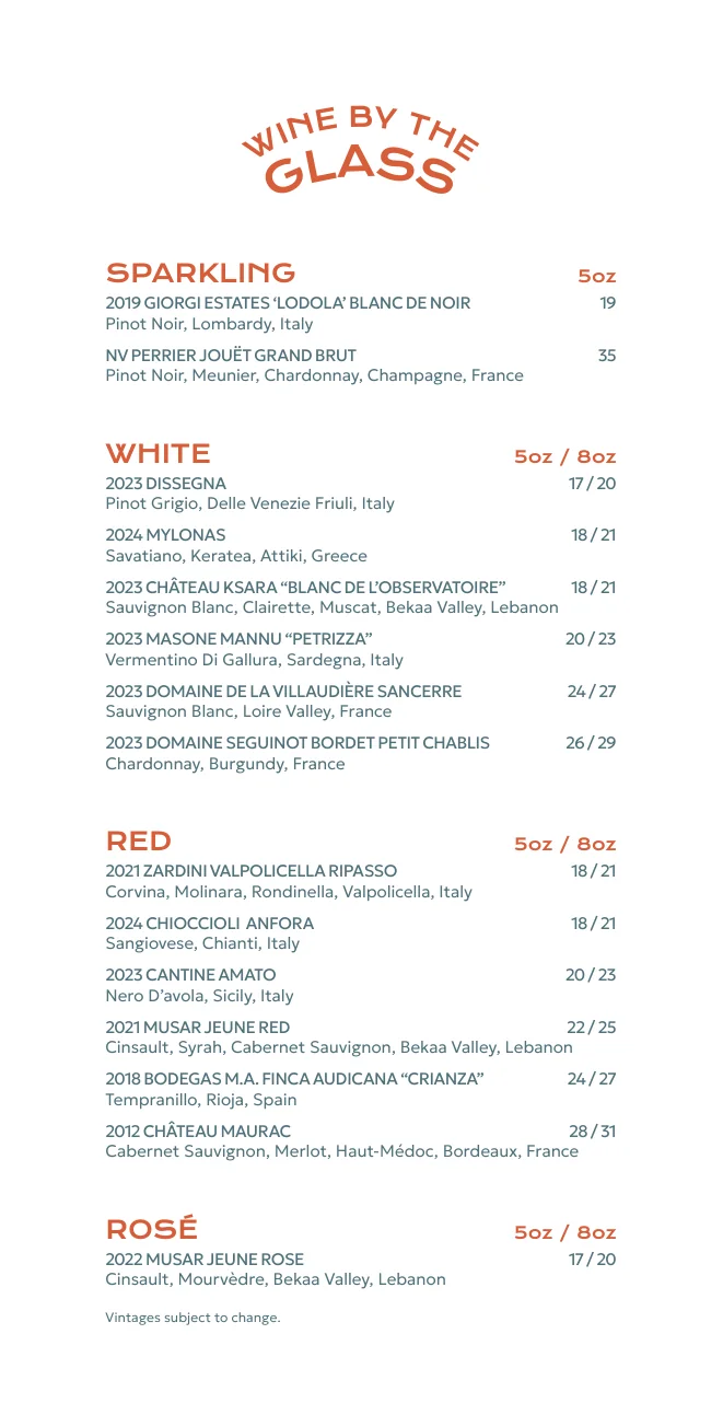
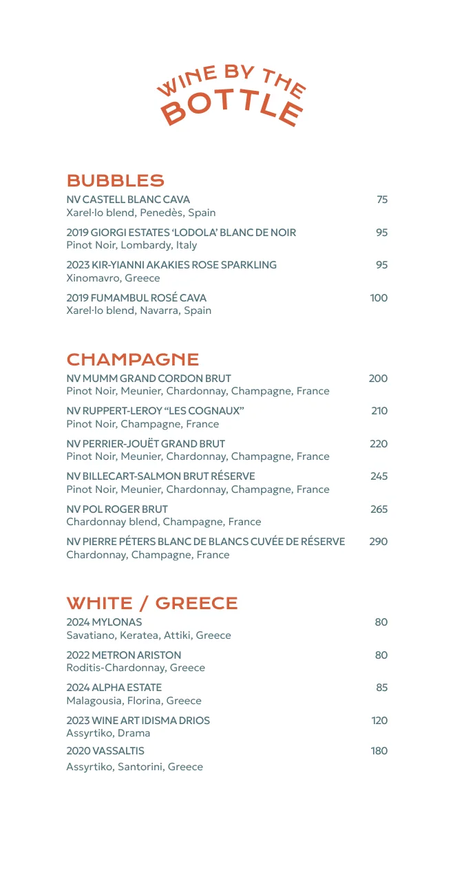
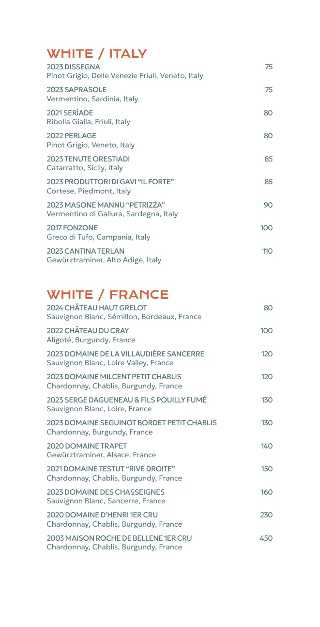
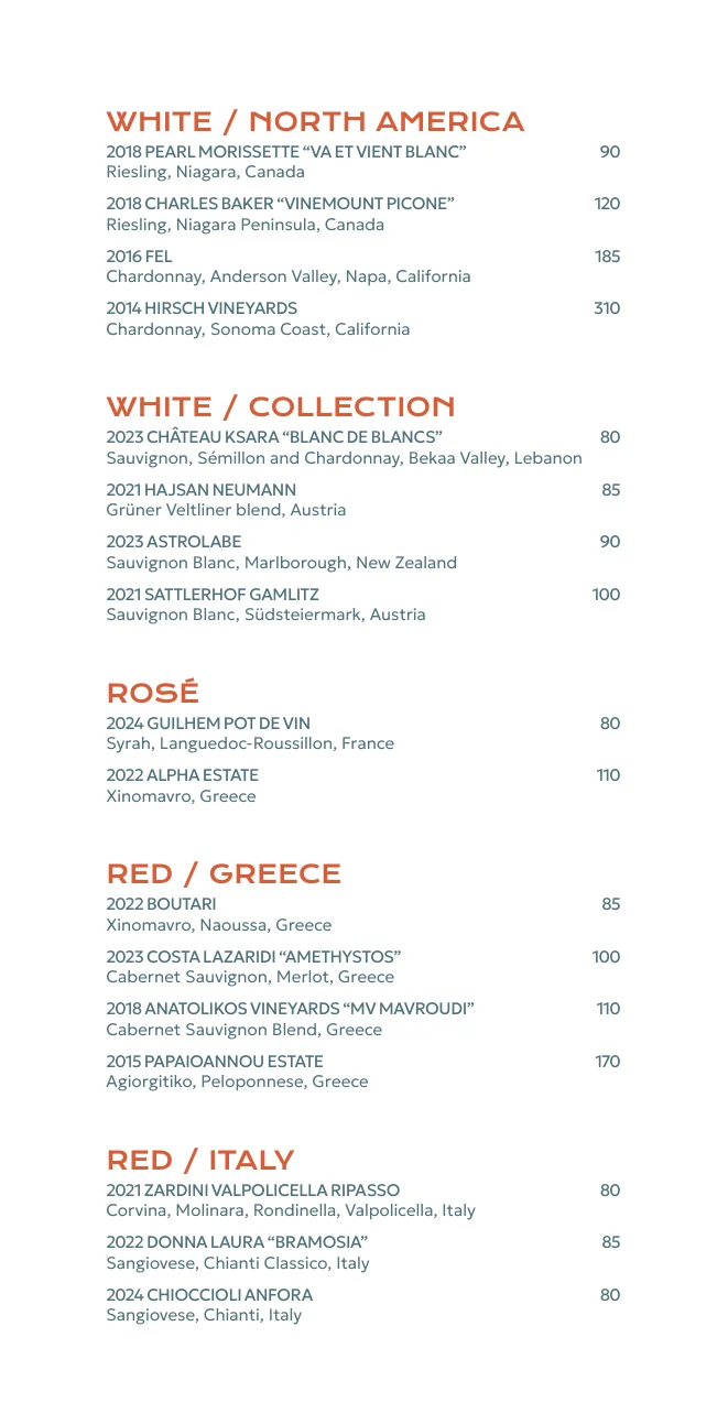
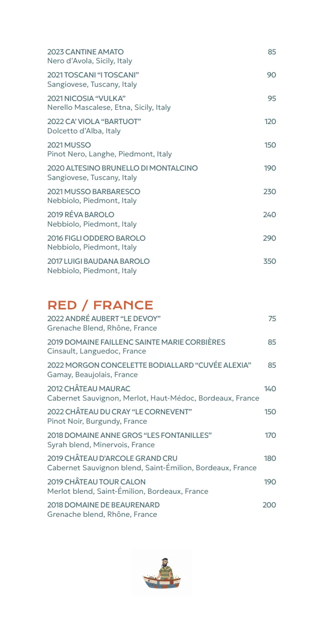
Wine is a ledger. Names sit left-aligned, the grape and region go underneath, and the price is flush right. People choose wine by region and price, so those pages need to scan in straight lines.
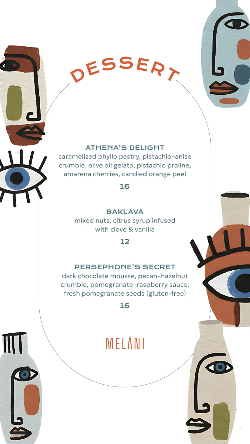
At 4.5 × 8 inches, the dessert card is a single arch with three desserts inside. The vase faces peek in from the edges and get cropped by the trim, like they are leaning in to look. The back is solid Bella Blu with the octopus mark.

Two typefaces do all the work. One is wide and solid for names. One is thin and quiet for ingredients. Colour adds a third voice for the Greek.
Wide, flat and geometric, close to the letters carved into old Greek stone. It holds up in small caps on a dim table, so dish names stay readable from across a shared plate.
Light and open. Ingredients read softly under the bold names, and long sections like Starters never look heavy.
Olive colour, extra letter spacing, set between diamonds. It teaches guests the real name of the dish without fighting the English.
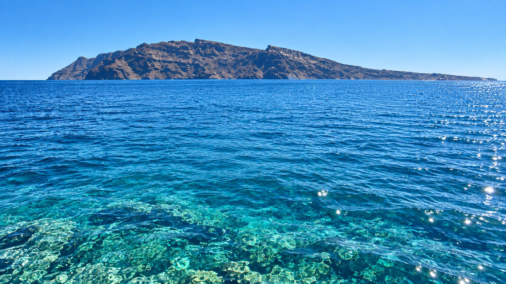
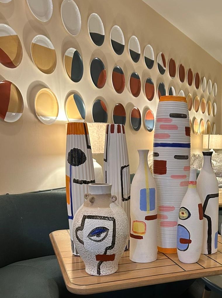
I picked the palette from what was already in the dining room: the painted vases, the teal banquettes and the terracotta plates on the wall. The menu should look like it was made in the same place.
PANTONE 1595 U · #D67045
Clay pots and the rust paint on the vases. Section titles and the wordmark.
#55757D
Deep Aegean water and the teal banquettes. Dish names, frames, the dessert back.
PANTONE 7746 U · #9B9E5E
Olive groves and olive oil. Used only for the Greek dish names.
PANTONE 5523 U · #BBD4D7
Shallow water on a Cretan beach. Lives inside the illustrations.
#F7F9E1
Sun on lime-washed walls. The paper tone behind covers and art.
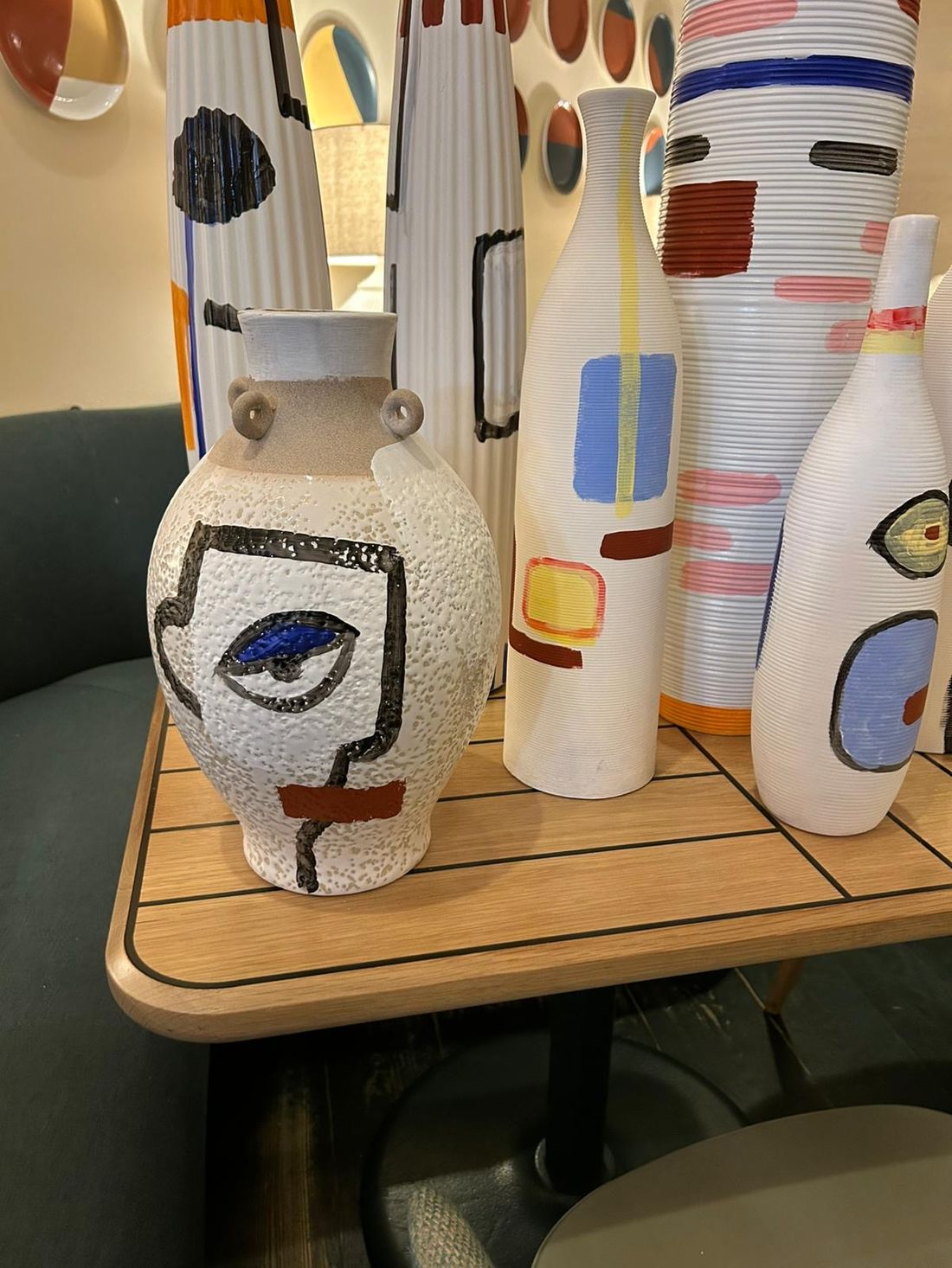
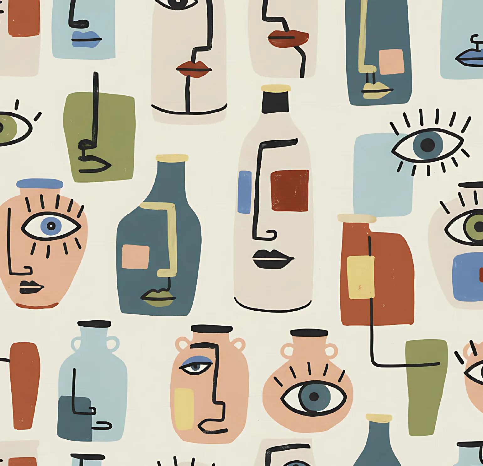
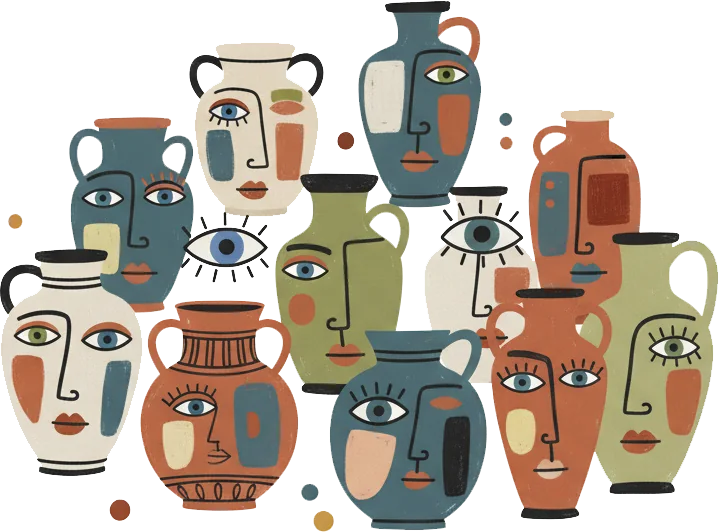
The restaurant commissioned a painter to make vases for the dining room. Tall ribbed bottles and round jars, each one with a face drawn in a single black line, blocks of blue, rust and yellow, and an eye.
I wanted the menus to belong to that room, so I created a set of illustrations based on the vase paintings. Guests see the real vases on the shelf and the same faces on the dessert card in their hand.
My illustrations
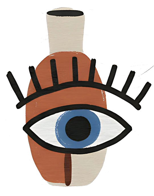
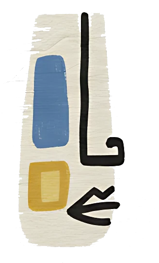
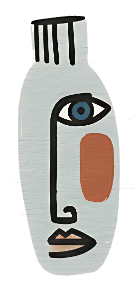
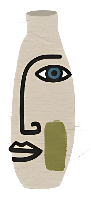
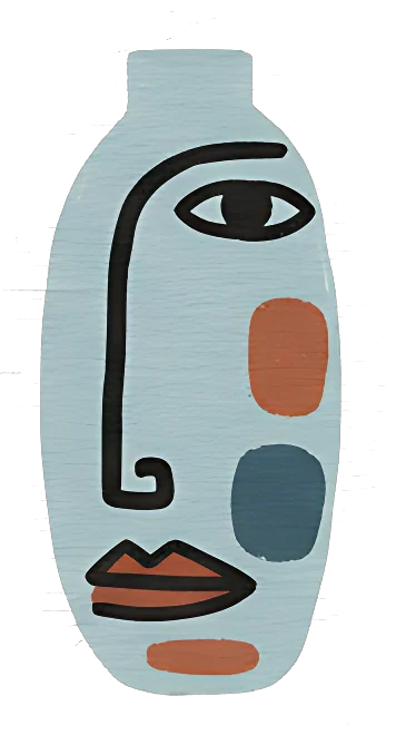
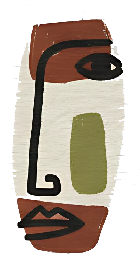
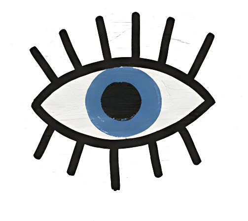
Each face is drawn with a single continuous black line, the way the painter drew on the vases.
Colour sits in soft rectangles that do not follow the line, straight from the brand palette.
The evil eye, a Greek charm against bad luck, shows up on vases, in the pattern and as a spot drawing on the dinner menu.
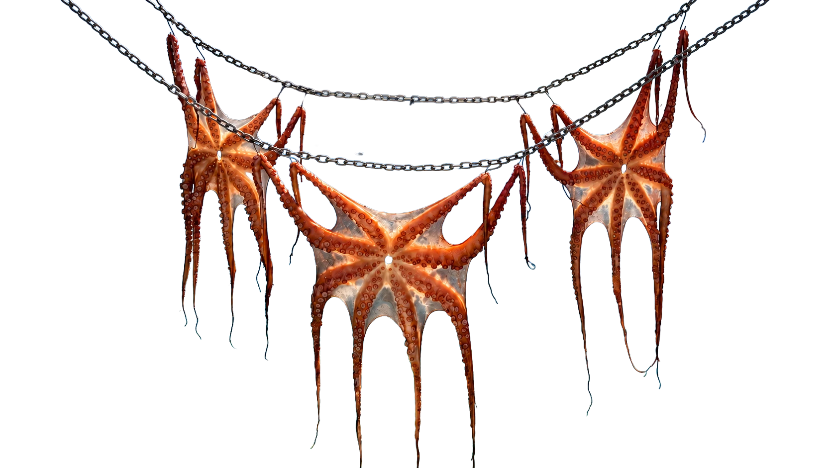
Octopus is everywhere in Greece. It swims across Minoan jars from Crete made 3,500 years ago, and it hangs on a line to dry outside island tavernas.
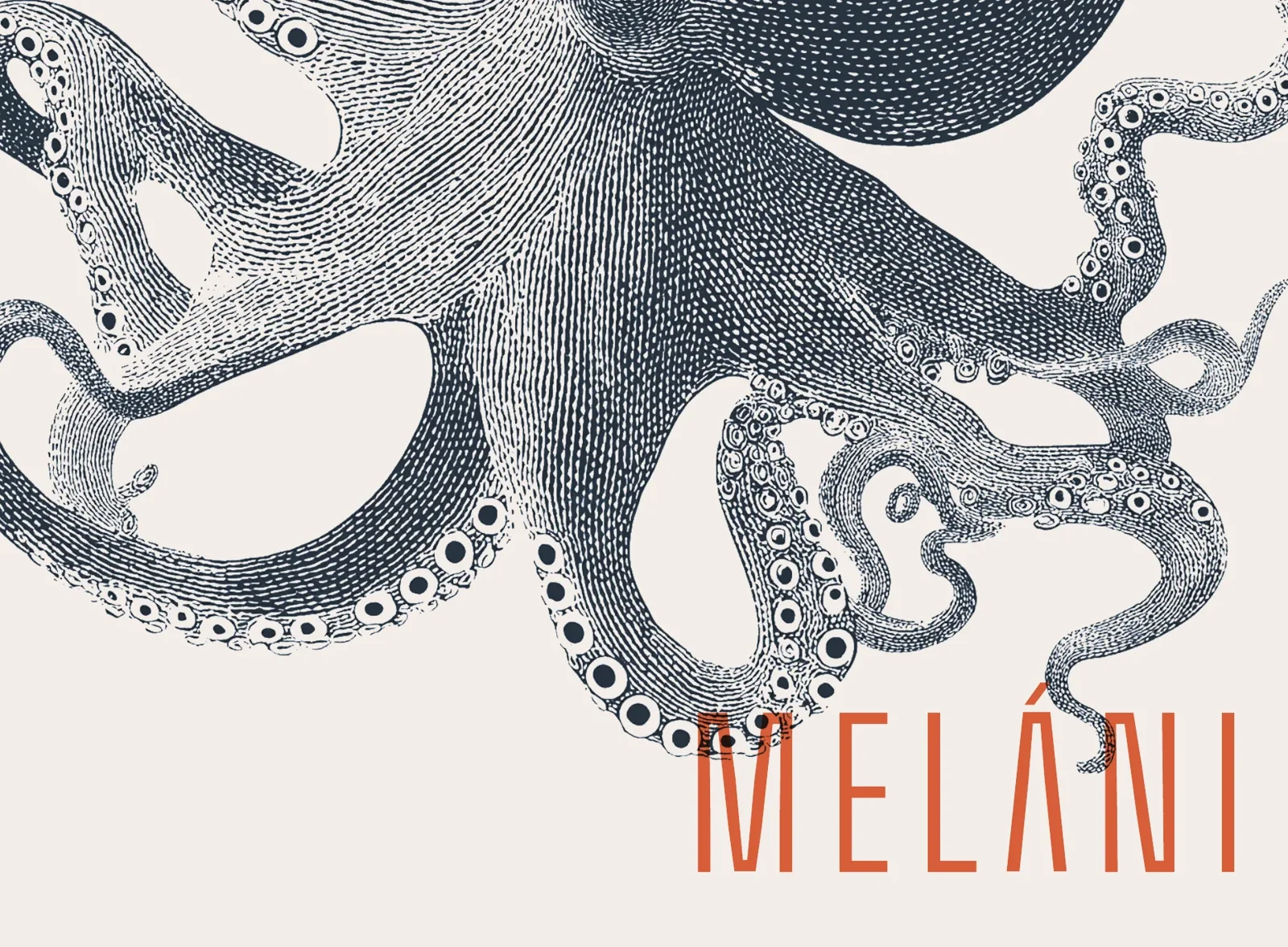
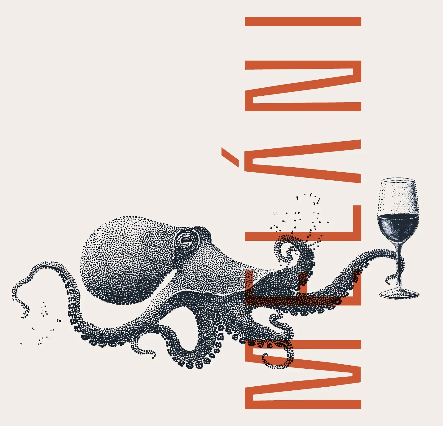
It is also on Meláni's menu. So the octopus became the hero of the covers: a Greek symbol that is also a real plate guests can order.
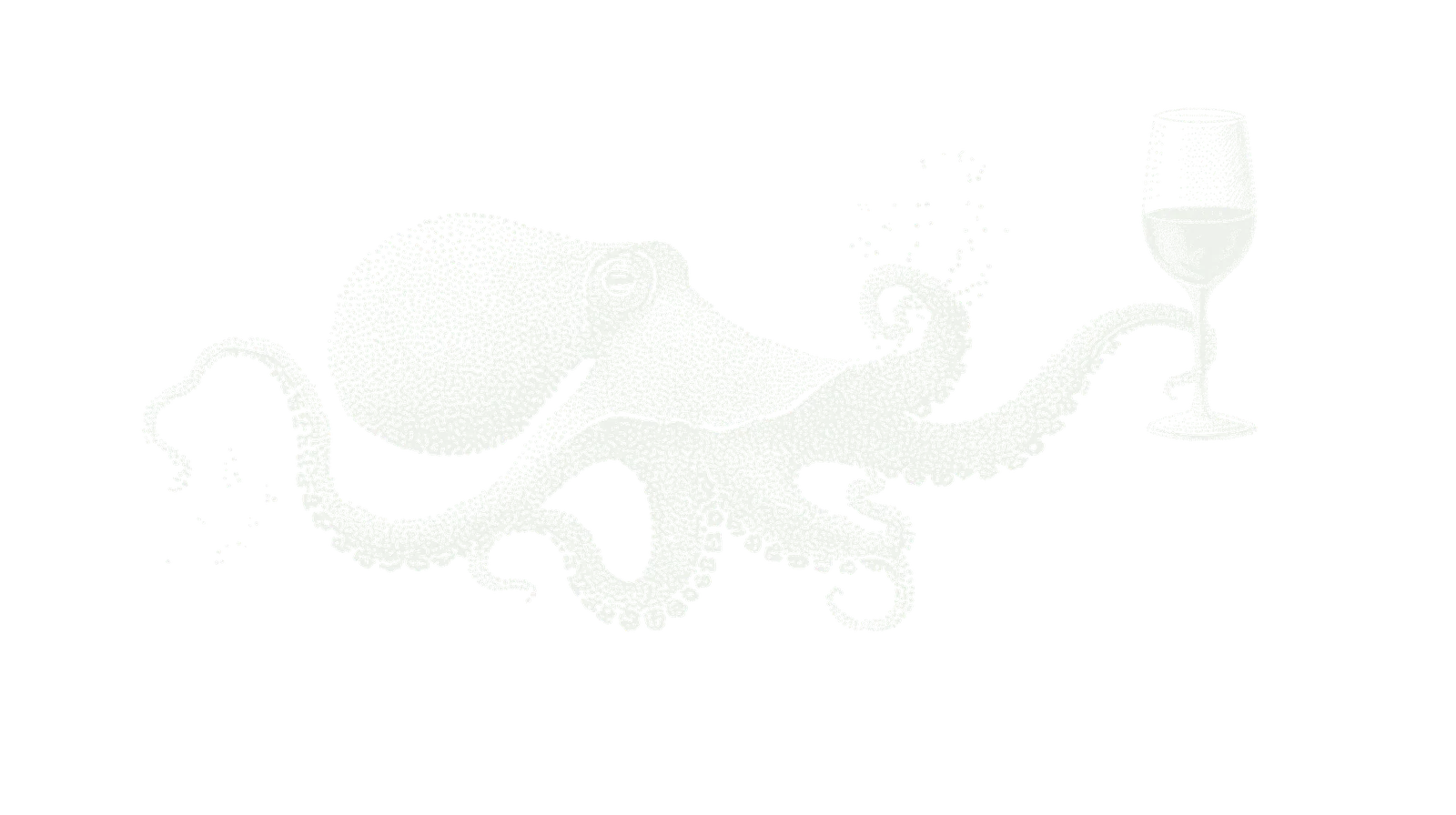
Both covers are single sheets folded into a book, and I drew the art across the whole sheet, not just the front. The octopus wraps around the spine, so the back cover is part of the story too.
The cover is one printed sheet folded in half, and the art is planned across the fold. The octopus's body sits right on the spine, so it reaches over both the front and the back. On the front, one tentacle comes down to touch the wordmark.
Open it and the Cretan beach is mirrored exactly at the fold. The menu sheet slips inside, and its centred, balanced layout picks up that same symmetry.
The octopus lives on the back cover, then reaches around the spine to hold a glass of red on the front, right next to the tall wordmark. Pick up the menu and you hold the whole animal in your hand.
Inside, the vase pattern runs across both panels without a break, so the open cover reads as one wall of painted vases around the drinks list.