 Case study · Web design · 2025 / 2026
The restaurant became the brand guide One landscape. Two moods.
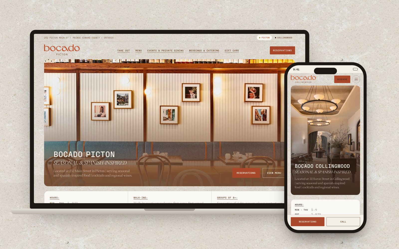
Two websites for Bocado, a seasonal and Spanish-inspired restaurant with one room in Picton and one in Collingwood, Ontario.
One brand, a second room
Bocado has two restaurants, one in Picton and one in Collingwood. Both needed to live on one website and still feel like the same place.
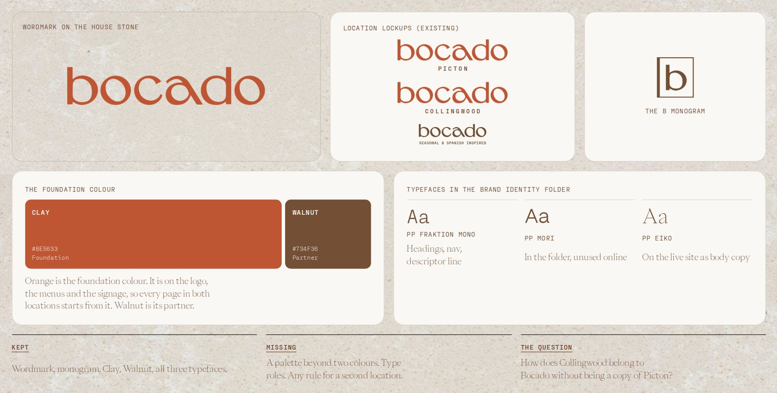
The brand had a wordmark, a monogram, an orange, a brown and three typefaces in a folder. There was no brand guide and no rule for how a second location should look.
How does Collingwood belong to Bocado without being a copy of Picton?
The rooms wrote the palette
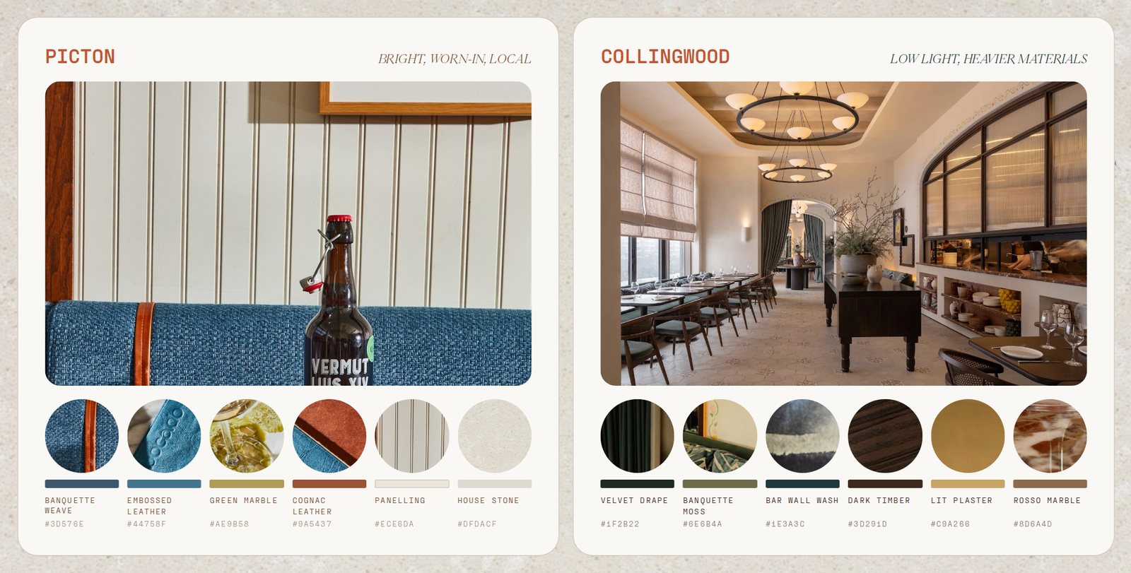
With no guide, I used the restaurants themselves. Picton is bright and worn-in: blue banquettes, cognac leather, marble and white panelling. Collingwood has lower light and heavier materials: velvet drapes, dark timber, lit plaster and rosso marble.
Every colour beyond the original orange and brown is sampled from those two rooms.
Orange is the foundation
Shared
Picton
Collingwood
Headlines, buttons and links are clay in both locations. Clay Ink #A8472A takes over for buttons and small text so it passes contrast.
Walnut in Picton and timber in Collingwood hold the text, the photo gradients and the footer.
Blue, teal and green come from the rooms, so they show up as a dot, a rule or a detail in a photo. Never a background.
Two typefaces, two voices
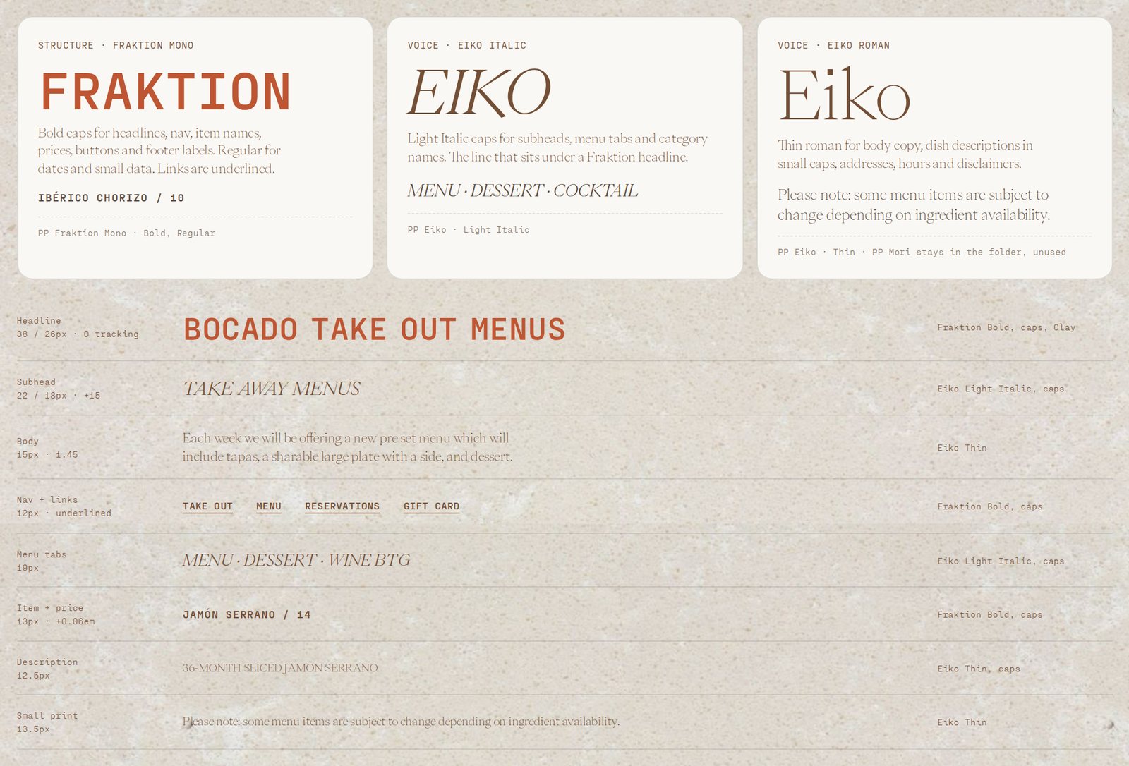
Both faces were already in the brand folder. PP Fraktion Mono Bold caps is the structure: headlines, nav, item names and prices. PP Eiko is the voice: Light Italic caps for subheads, Thin for body copy and dish descriptions. They alternate line by line, the way a printed menu does.
Two rooms, one question
On the live site, the entry page is stone, a logo and floating food, and the two location links are easy to miss. In the refinement, Bocado sits at the top and the two rooms sit side by side under it. Each card is one big tap, and on a phone they stack.
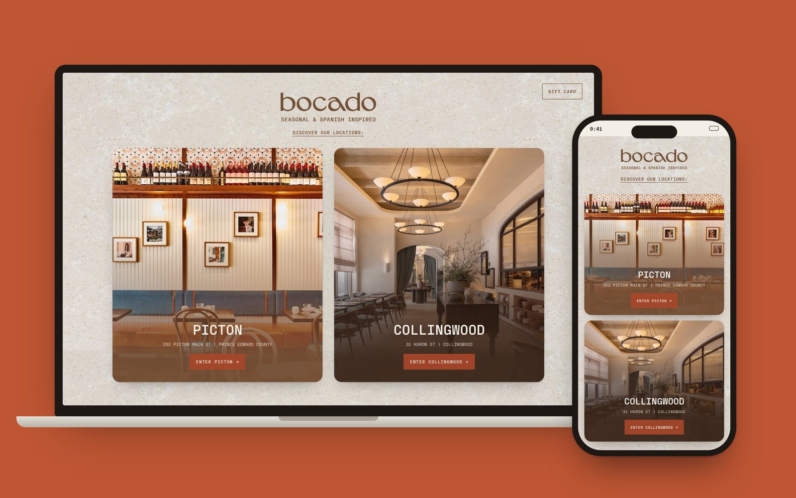
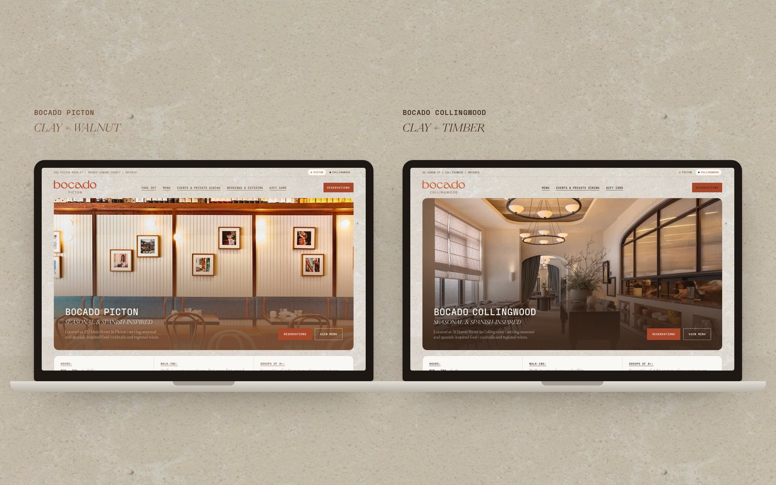
Bocado Picton
The home page leads with what a guest needs to decide: the hours, the food and how to book. Walk-ins and the rule for groups of eight or more sit right under the hero, not only in the footer.
The menu reads like the paper one. Item and price share one Fraktion line, with the description in Eiko Thin caps under it. Menu, dessert, cocktails and both wine lists are tabs on one page.
Take Out and off-site Weddings & Catering only exist in Picton, so they are built as modules the Collingwood site can leave out.
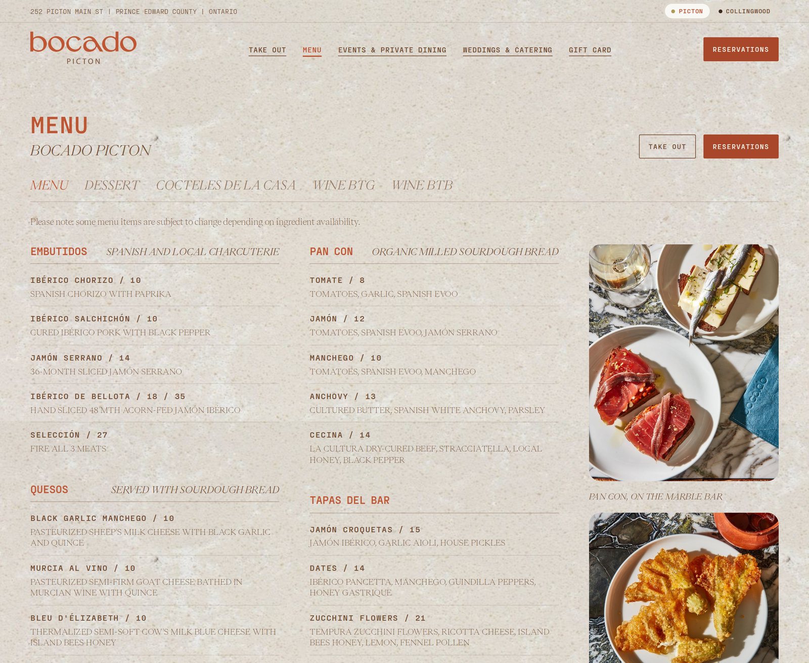
Bocado Collingwood
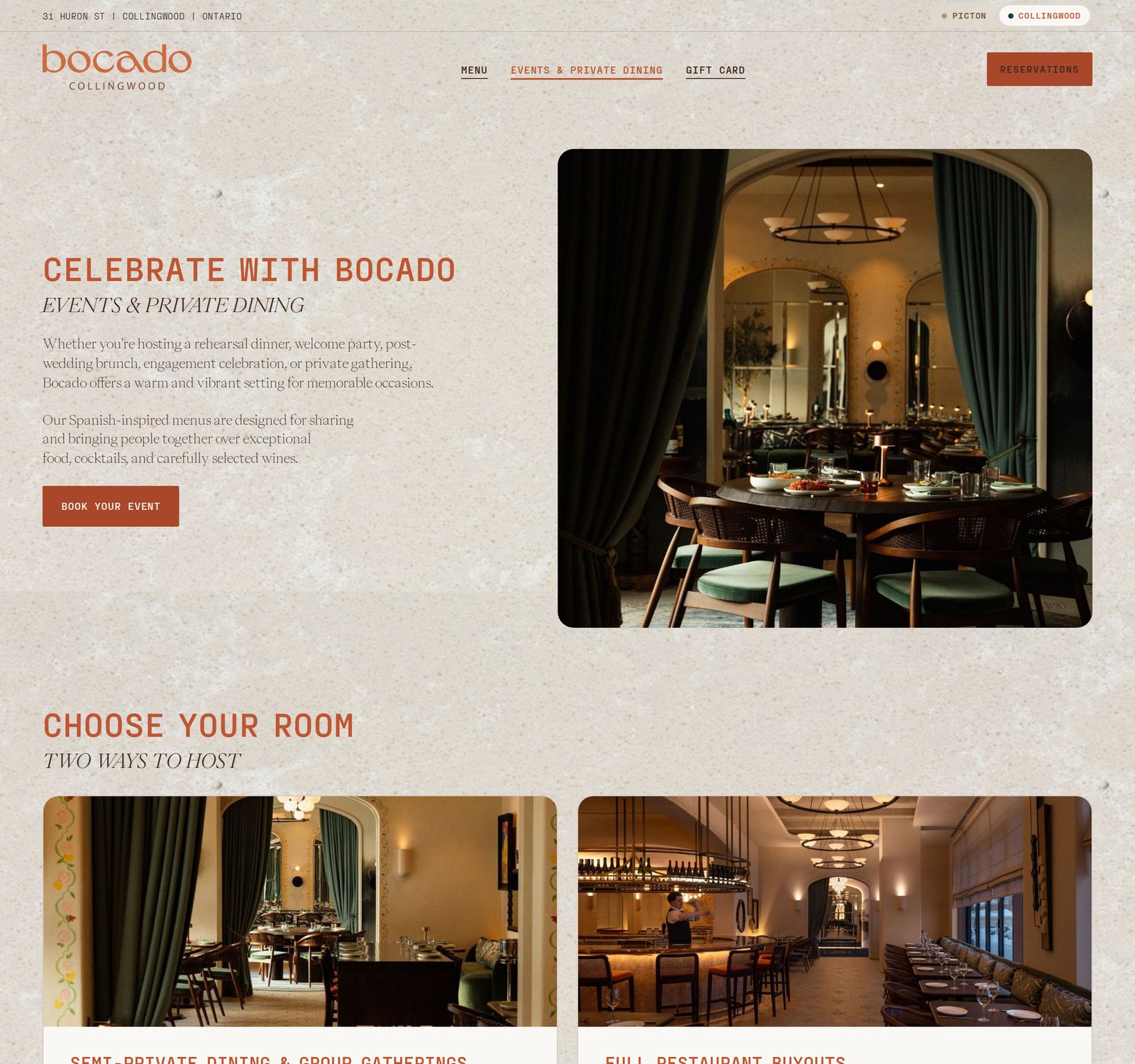
Collingwood uses the same header, hero, info strip, menu cards and footer as Picton. Only the photos and a few tokens change: timber takes over the footer and the photo gradients, and teal replaces olive as the small accent.
The events page puts the private dining room first. Semi-private dining and full buyouts sit side by side with the live "ideal for" and "perfect for" lists, and a short enquiry form ends the page.
Built for the phone
On mobile, Reservations and Call stay fixed at the bottom of every page. The menu folds into categories, so the full menu is one short scroll and nothing needs pinching.
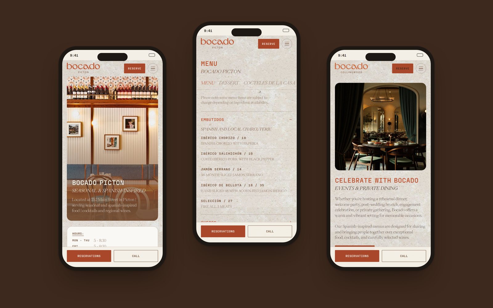
Two sites, one kit
Fraktion Bold caps headlines in clay, Eiko italic subheads, Eiko Thin body, clay buttons, the stone ground, 18px corners, and the nav, info strip, menu cards and footer layouts.
Photography, the hero gradient and footer colour (walnut and clay in Picton, timber in Collingwood), the accent dot and the lockup name.
Take Out and Weddings & Catering. Collingwood leaves those modules out, so its home page is shorter.
Who did what
Wordmark, monogram, location lockups, clay and walnut, PP Eiko, PP Fraktion Mono, PP Mori, the house stone texture, restaurant photography and all site copy.
Both websites from scratch: art direction, UX/UI, the extended colour idea, image selection, layouts, responsive design and developer handoff. Built by a web developer.
Exact colour values and hierarchy, type roles, component states, the new entry page, the info strip, menu accordions, event option cards, the enquiry form concept and the sticky mobile booking bar.