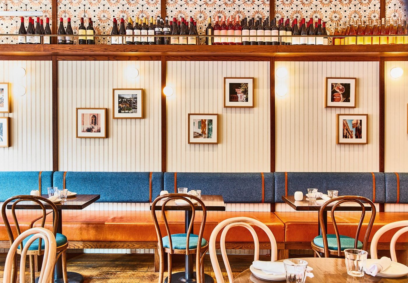
 Prince Edward County
Daylight
Picton
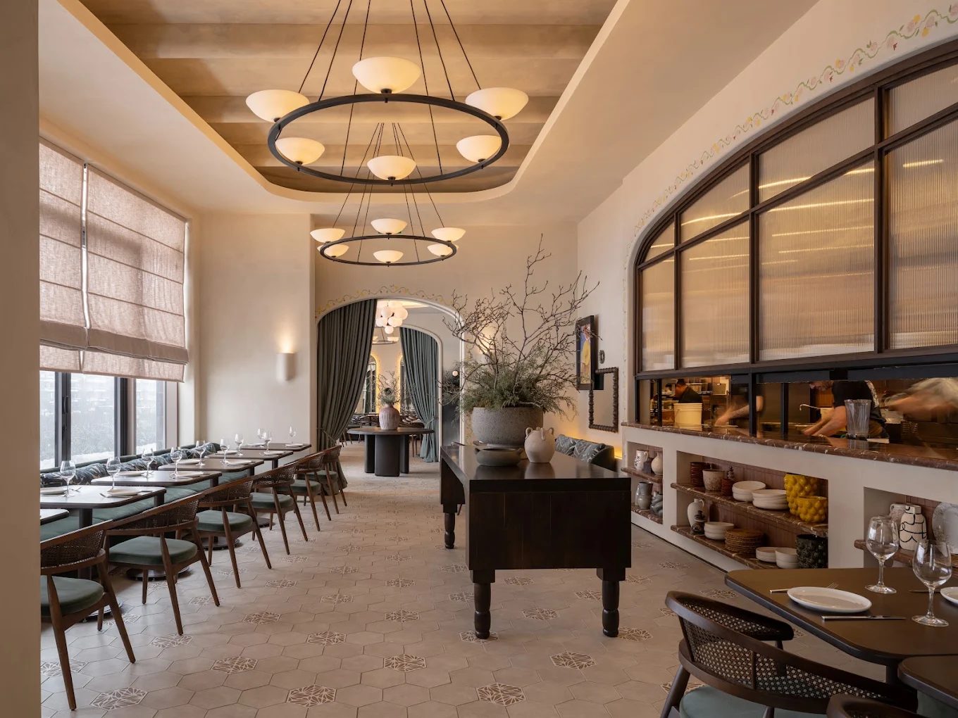 Southern Georgian Bay
Dusk
Collingwood
 Seasonal & Spanish-inspired dining in Ontario
 Digital brand system · Sept 2026
Bocado had a wordmark, two typefaces, an orange and a brown.
No guideline. So I read the rooms.
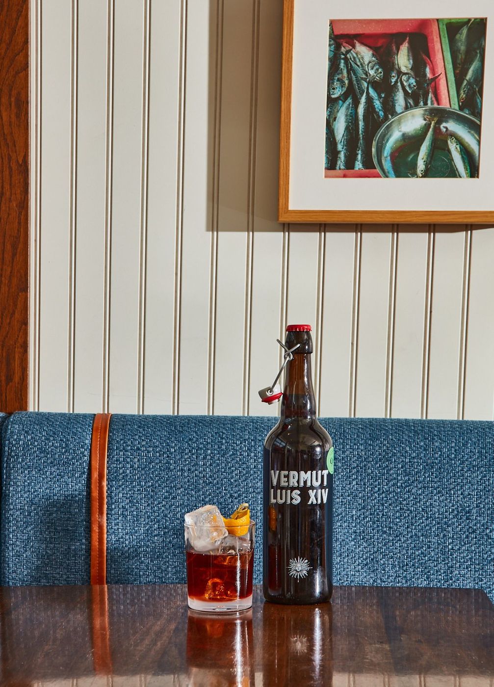
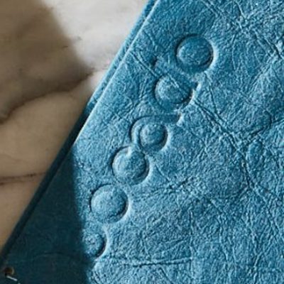
Every colour beyond the heritage pair is sampled from the two dining rooms: the banquettes, the marble, the leather, the velvet. This board is that system, tightened for the portfolio.
No brand book came with the job. These are the pieces already in use on menus, signage and the old site. The system keeps all of them.
PictonCollingwood
 The b monogram
Orange is the foundation colour. It is on the logo, the menus and the signage, so every page in both locations starts from it. Walnut is its partner.
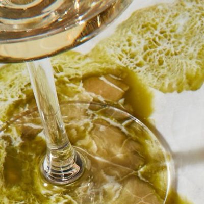
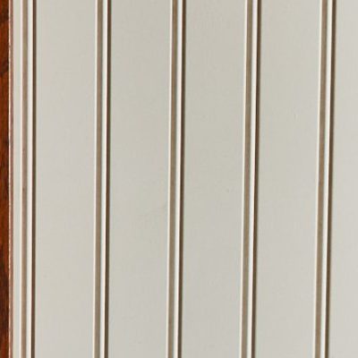
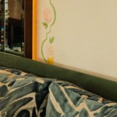
Blue, teal and green kept showing up in both interiors, so they joined the identity as accents that connect the site to the room. Orange stays the lead in both locations. Each swatch below is sampled from the restaurant photography.








The core never changes between locations. Each location adds its own room colours and decides how much of the page they cover. Widths show roughly how much of a screen each colour occupies.
Clay #BE5633 is the brand colour in both places, on the same ivory ground. For small text and buttons it deepens to Clay Ink #A8472A, so it passes contrast.
Collingwood is richer, but it sits on the same ivory as Picton and the orange is still the loudest thing on the page. Black and gold would make it any steakhouse. Walnut and clay keep it Bocado.
Blue, teal and green come from the rooms, so they stay, but only in small moments: a tag, a dot, a detail in a photo. They never fill a background or a button.
The difference between locations comes from light, photography, texture and pace. Logo, grid, type, buttons, menus and booking stay identical.
Local · Seasonal · Natural · Ontario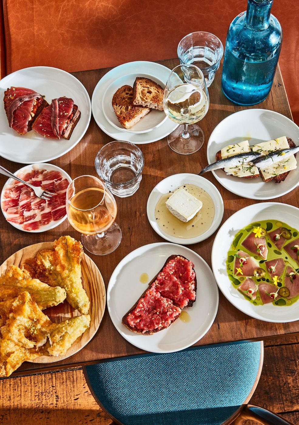
A really good restaurant that belongs exactly where it is.
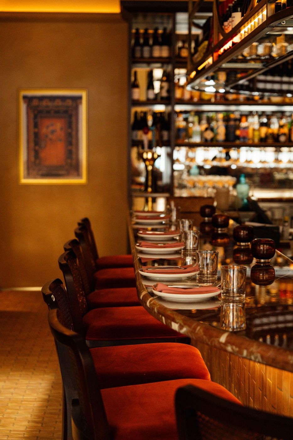
Sunset turning into night. You slowly melt into the room.
This follows the type system I used on the live Bocado pages. Fraktion is the structure: everything you click, scan or order. Eiko is the voice: the sentences, the descriptions and the italic subheads. They alternate line by line, which gives the pages their menu-card rhythm.
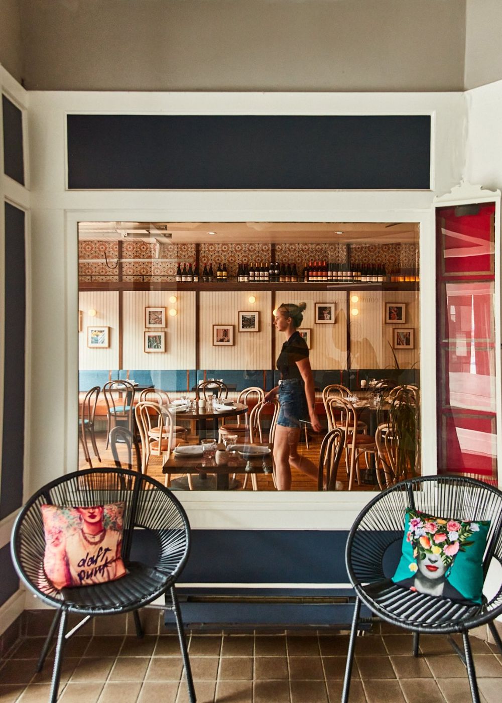
Both shoots already existed. My job was choosing and sequencing them so each site holds one light. Picton frames go to Picton, dusk frames go to Collingwood, and they never cross.
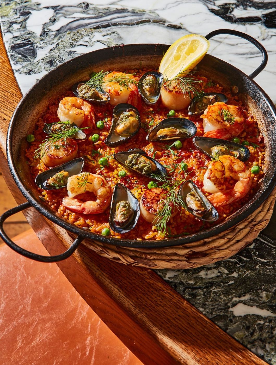
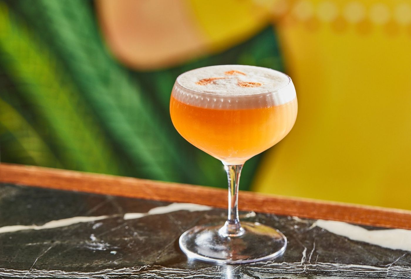
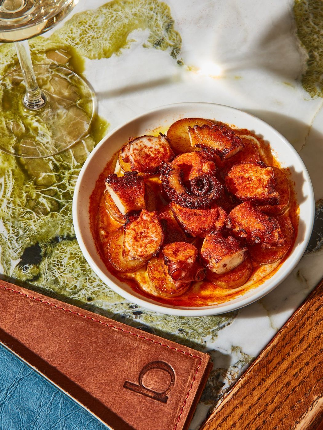
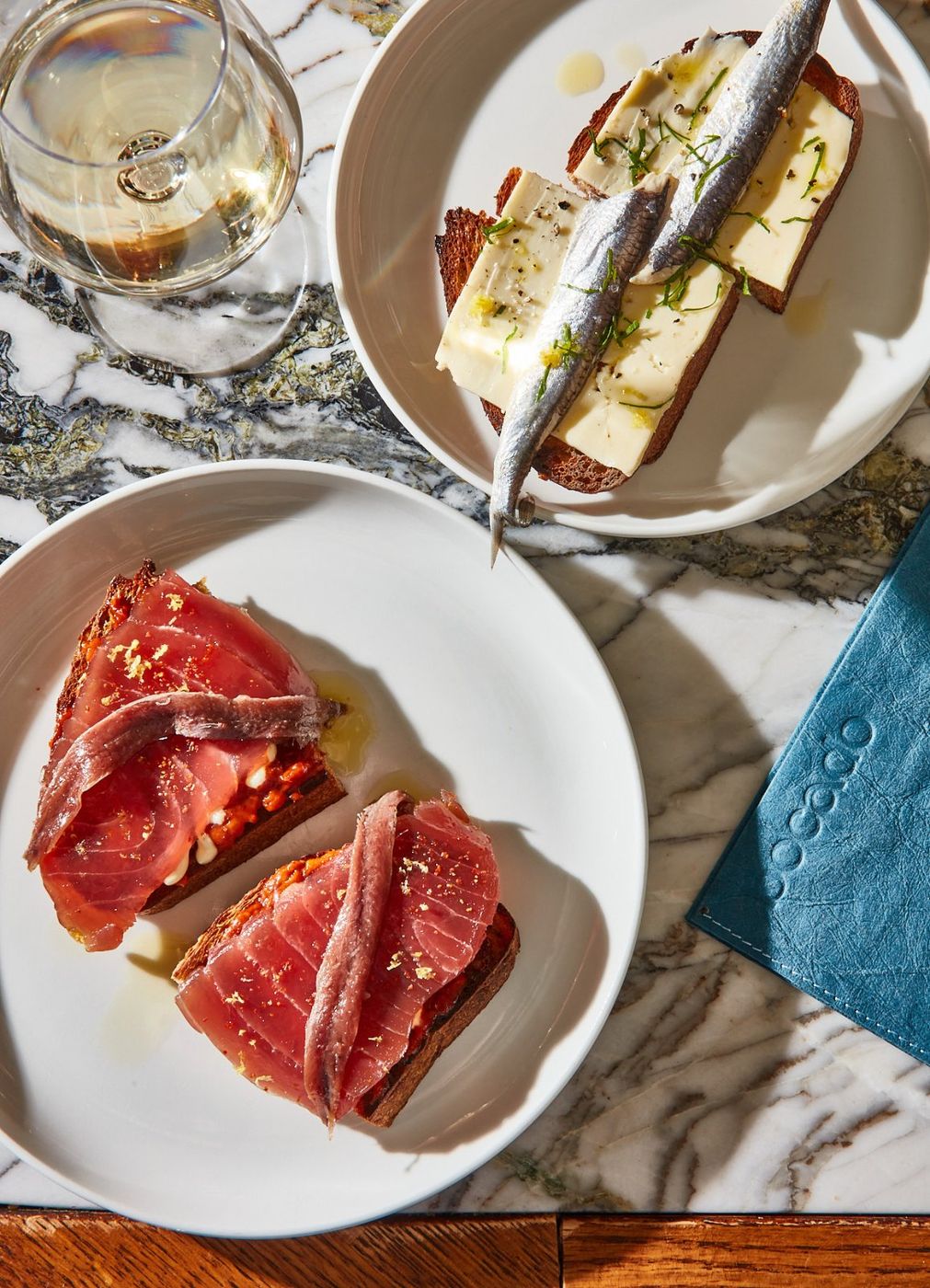
Overhead or 45°. The table is the subject.
Direct sun, hard shadows kept, not softened.
Abundant. Plates run off the edge, hands welcome.
True whites, blue and olive surfaces show through.
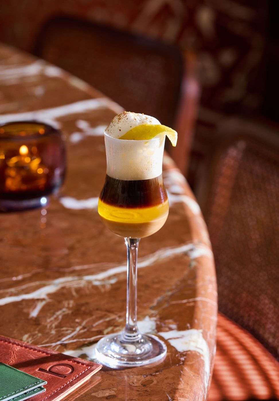
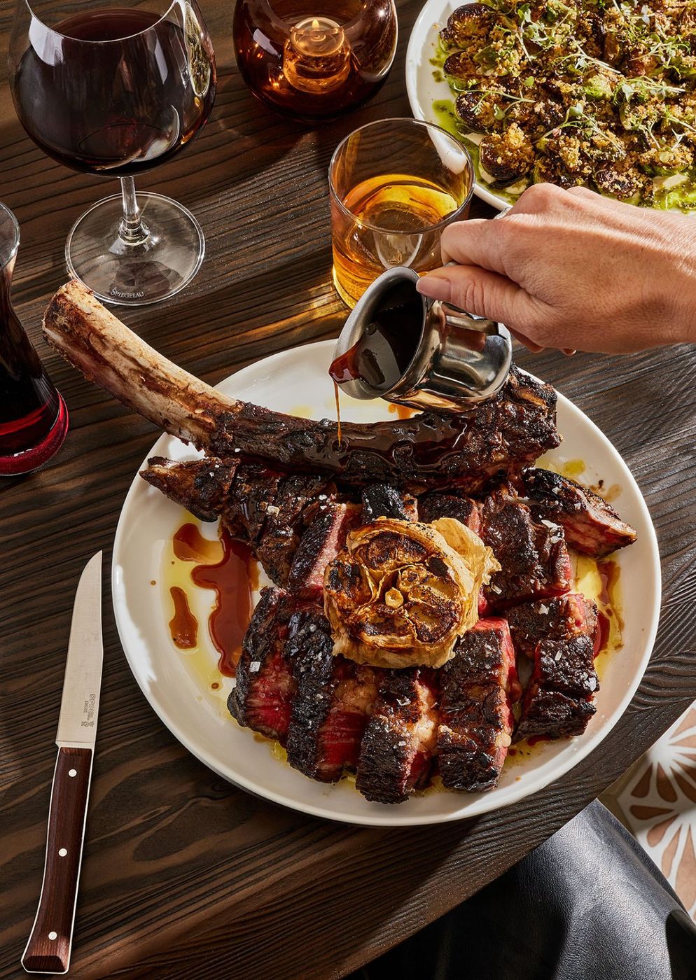
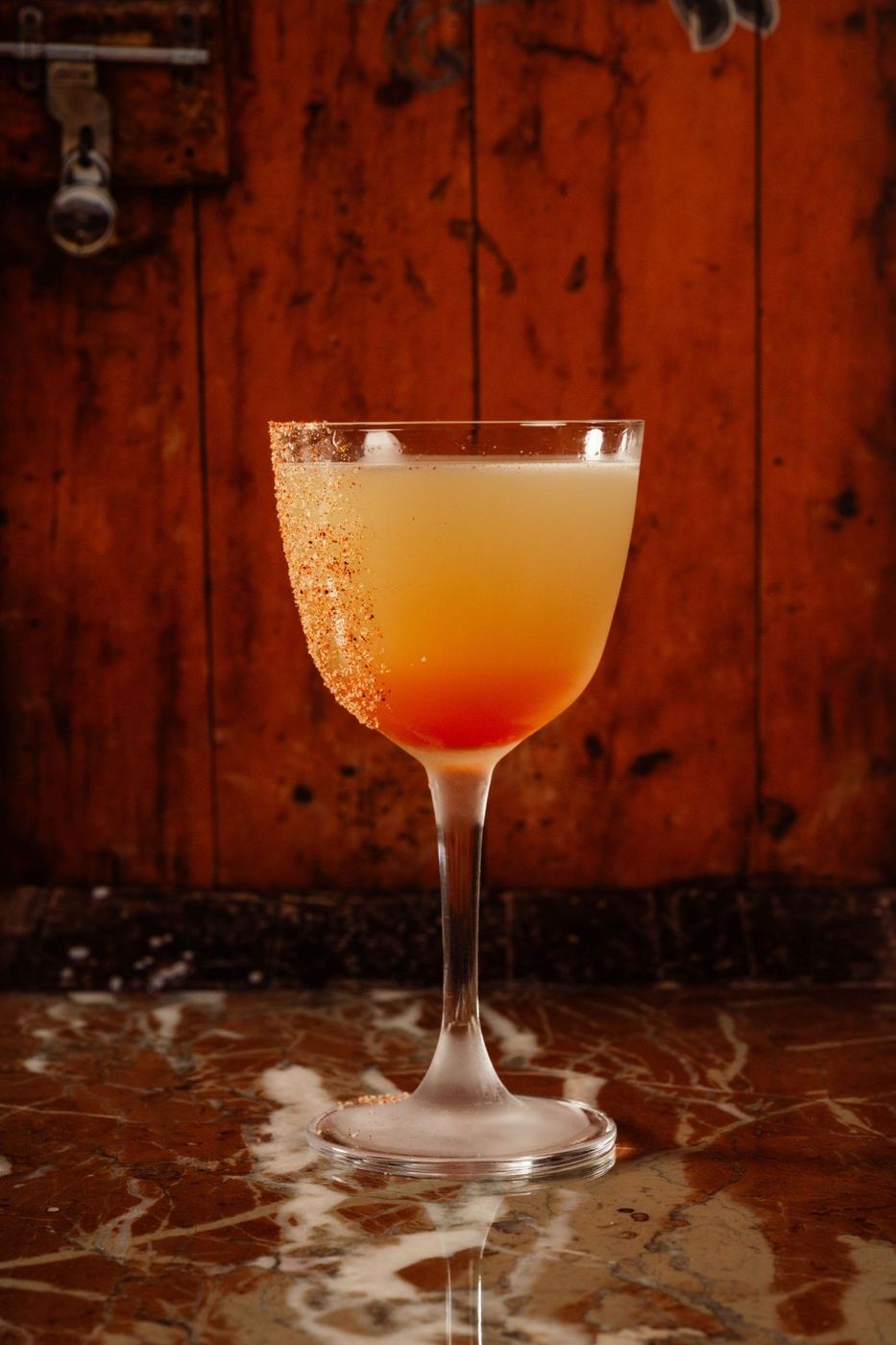
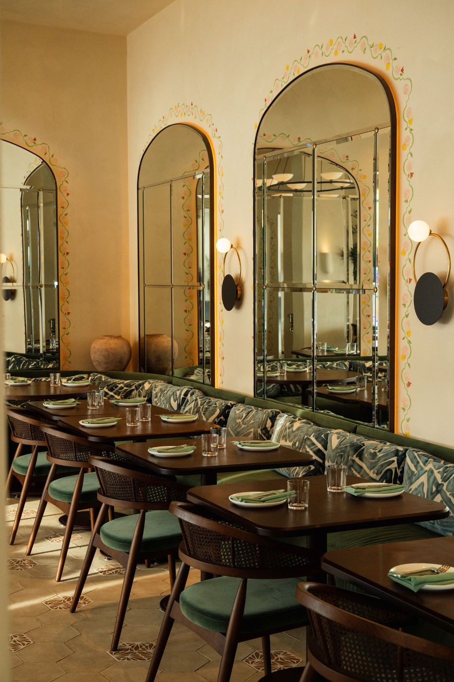
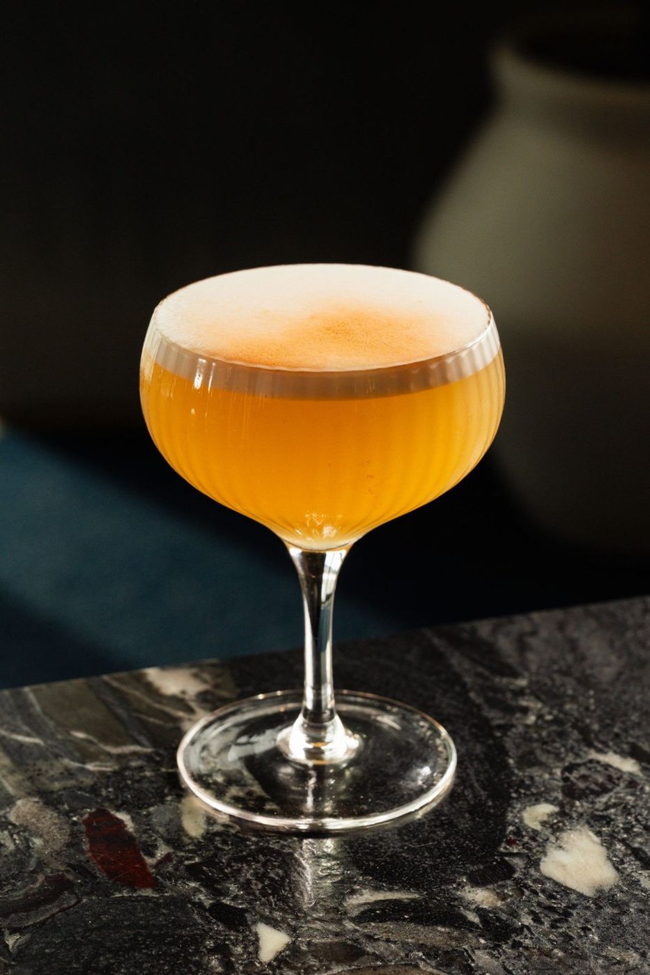
Eye level. Doorways, arches, depth.
Warm point sources, let the edges fall to black.
One subject, more air around it.
Amber highlights, timber shadows, a hint of green.
Every piece below is the same component with a different token set. A developer builds it once. Hover the buttons to see states.

The two sites are one build. Picton has services Collingwood doesn't, so those modules turn on for Picton only instead of leaving empty pages in Collingwood.
| Module | Picton | Collingwood | Booking tool (from live site) |
|---|---|---|---|
| Menu + wine list | HTML menu, wine list PDF | ||
| Reservations | OpenTable widget | ||
| Events & private dining | Tripleseat inquiry, events package PDF | ||
| Take out | Tock ordering, Picton only | ||
| Weddings & catering | Off-site catering across the County | ||
| Gift cards | SilverPay, separate store per location | ||
| Location switch | Keeps you on the same page type when you switch |
A first pass at the bocadorestaurant.ca entry. The current page is stone, logo and floating food with the location links easy to miss. Here the two locations are the page, and the light tells you which is which before you read a word.
Prince Edward County
Daylight
Southern Georgian Bay
DuskSeasonal & Spanish-inspired dining in Ontario