
01The challenge
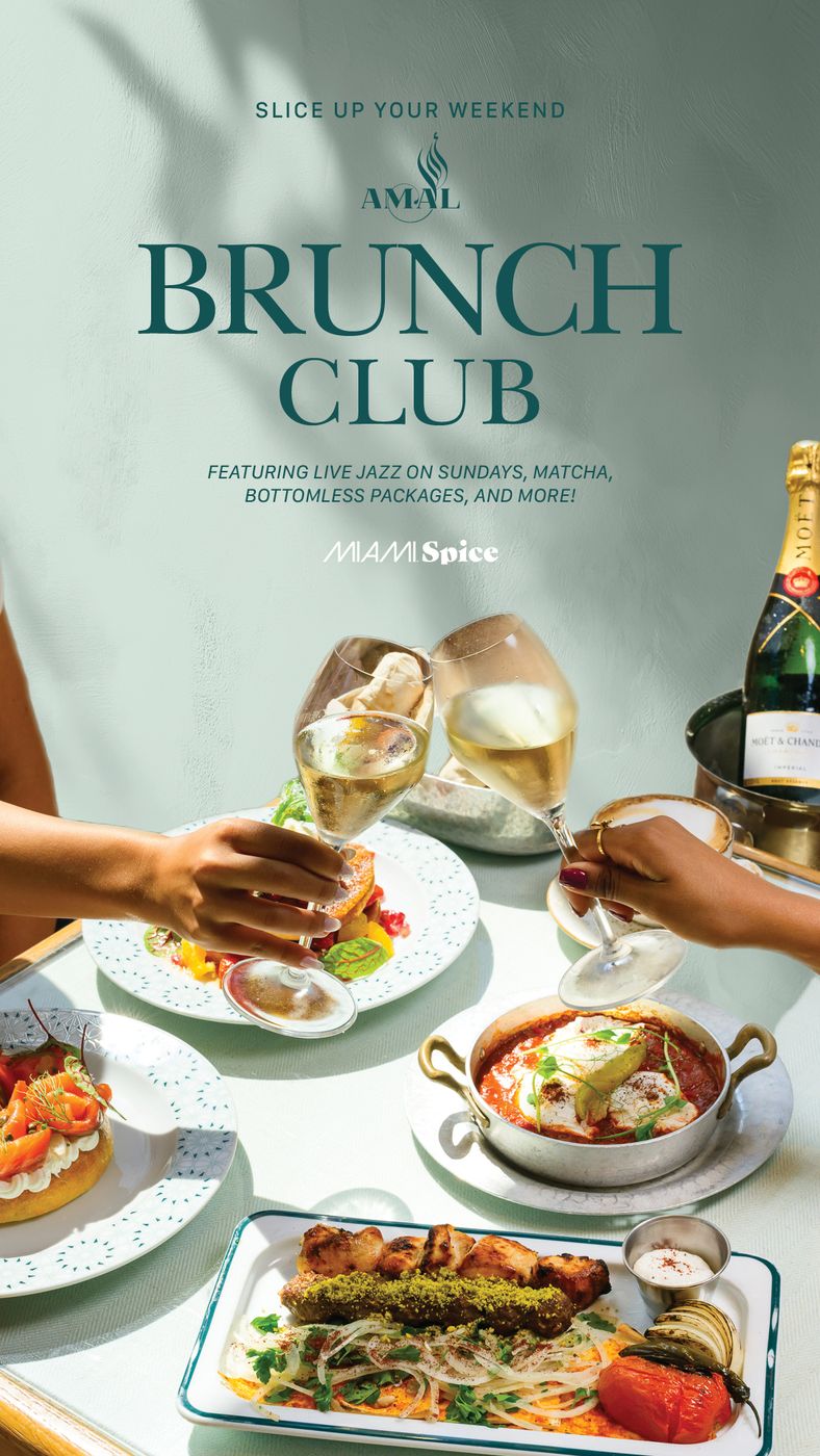
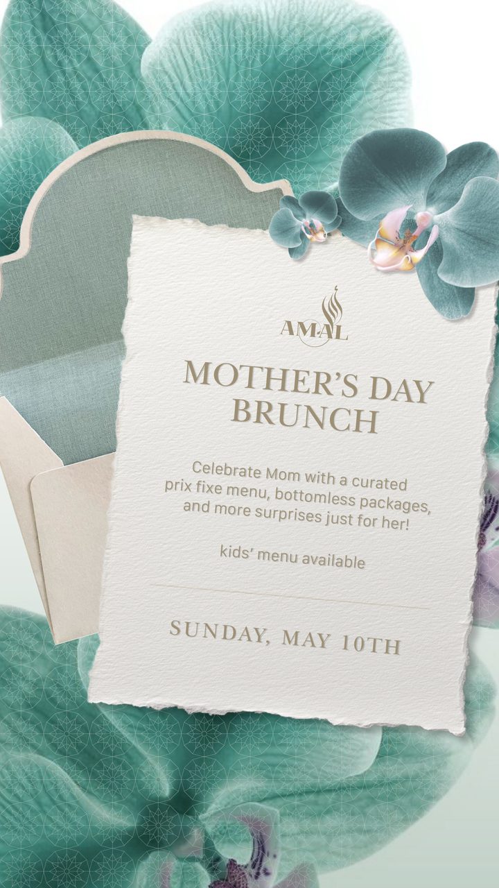
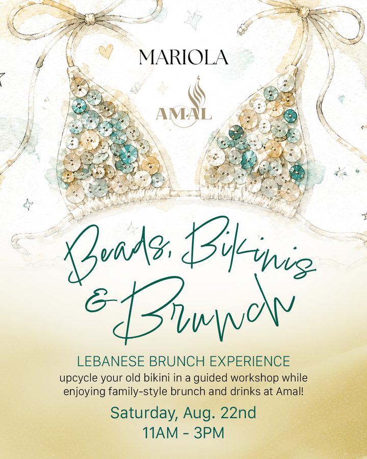
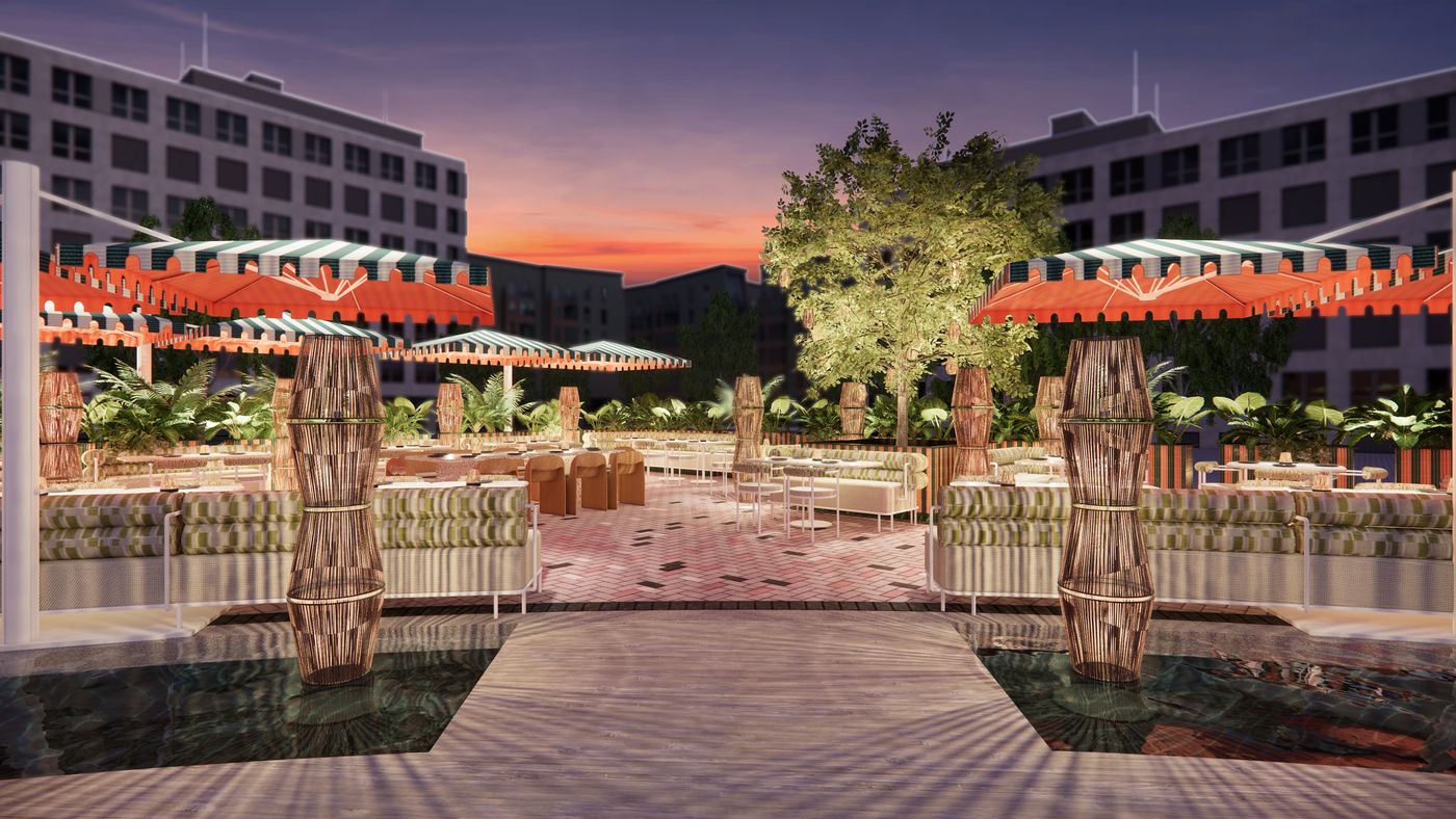
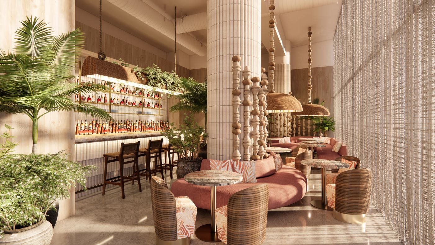
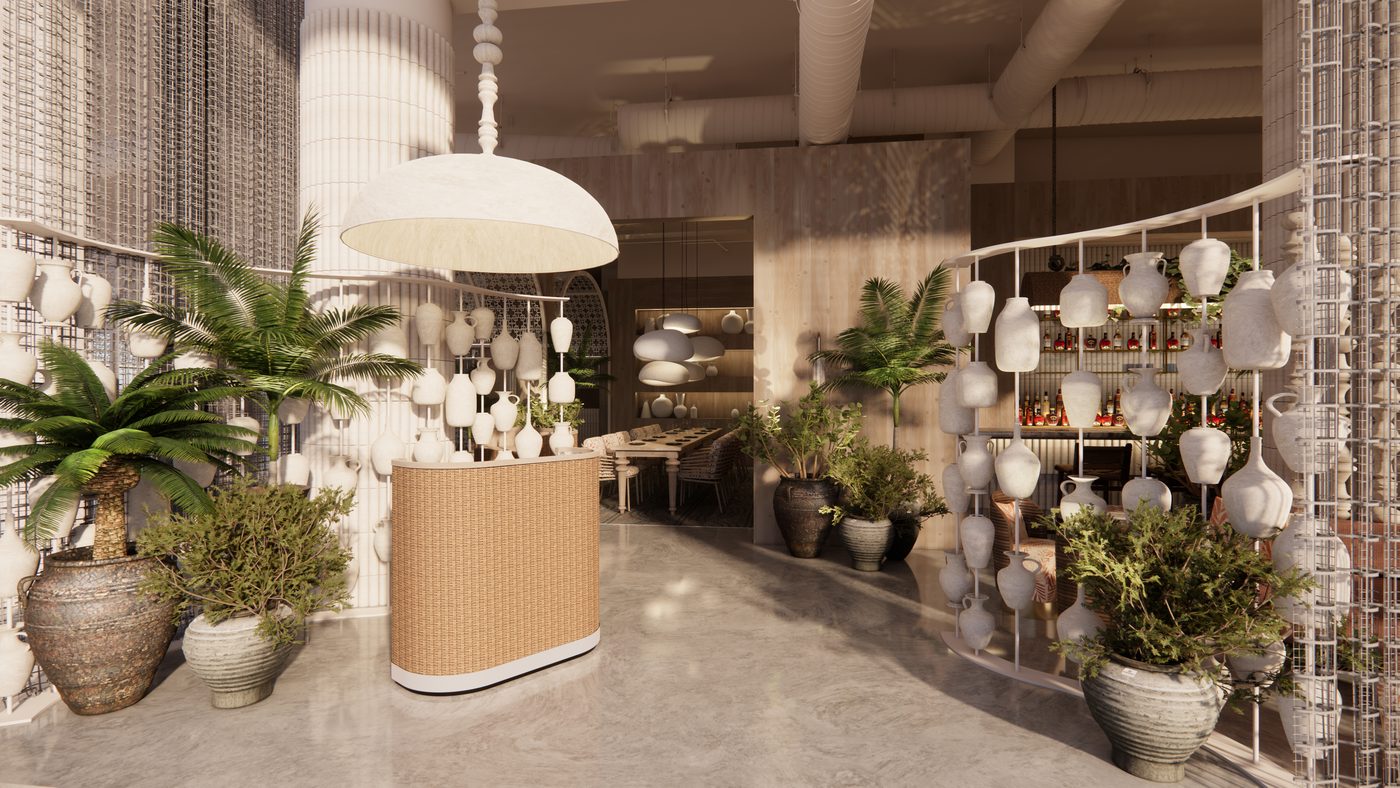
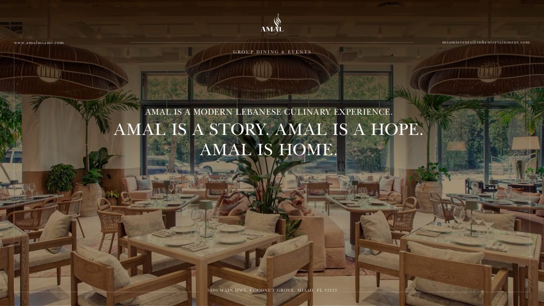
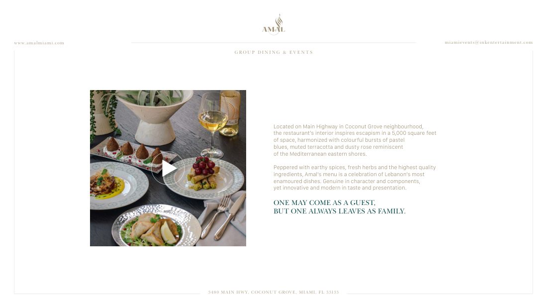
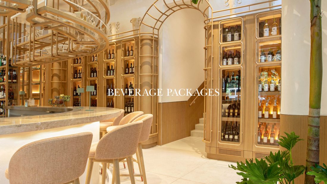
Amal already had a beautiful identity. But a restaurant talks to guests every week, with new menus, holidays and events across more than one city. With only the guidelines, everything started to look the same.
02The idea
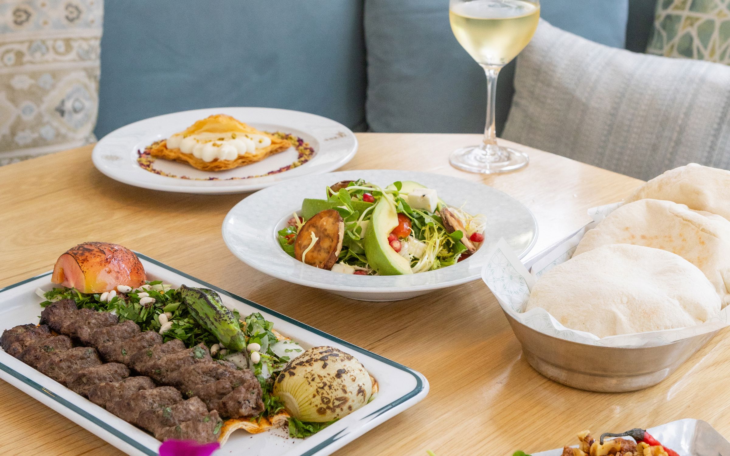
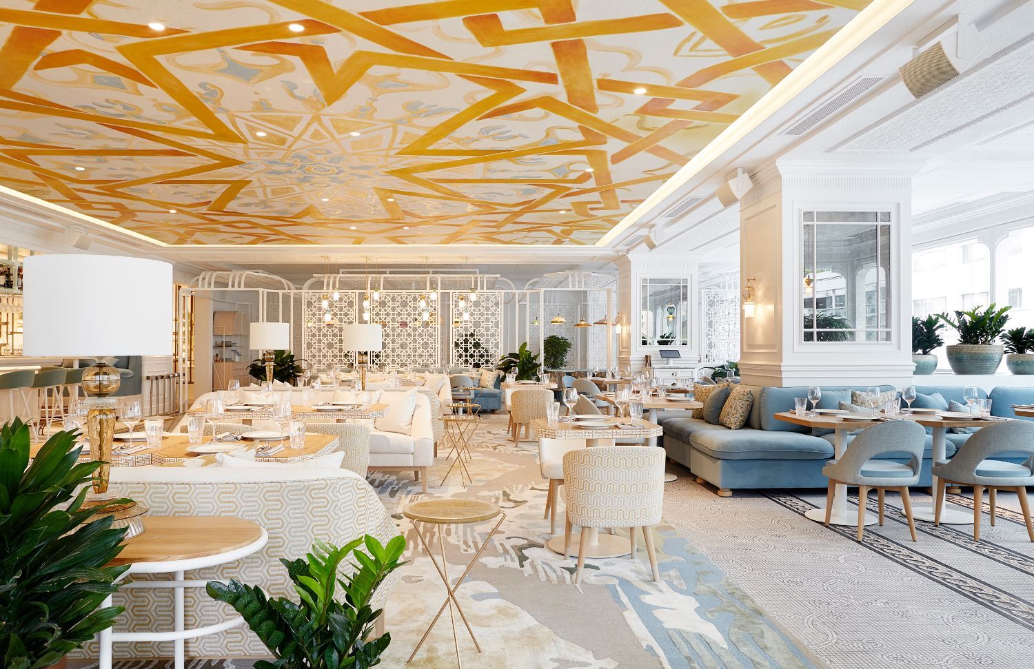
Keep the core brand as it is, and add new layers that feel like sitting in the dining room: warm, generous and a little poetic.
03The work
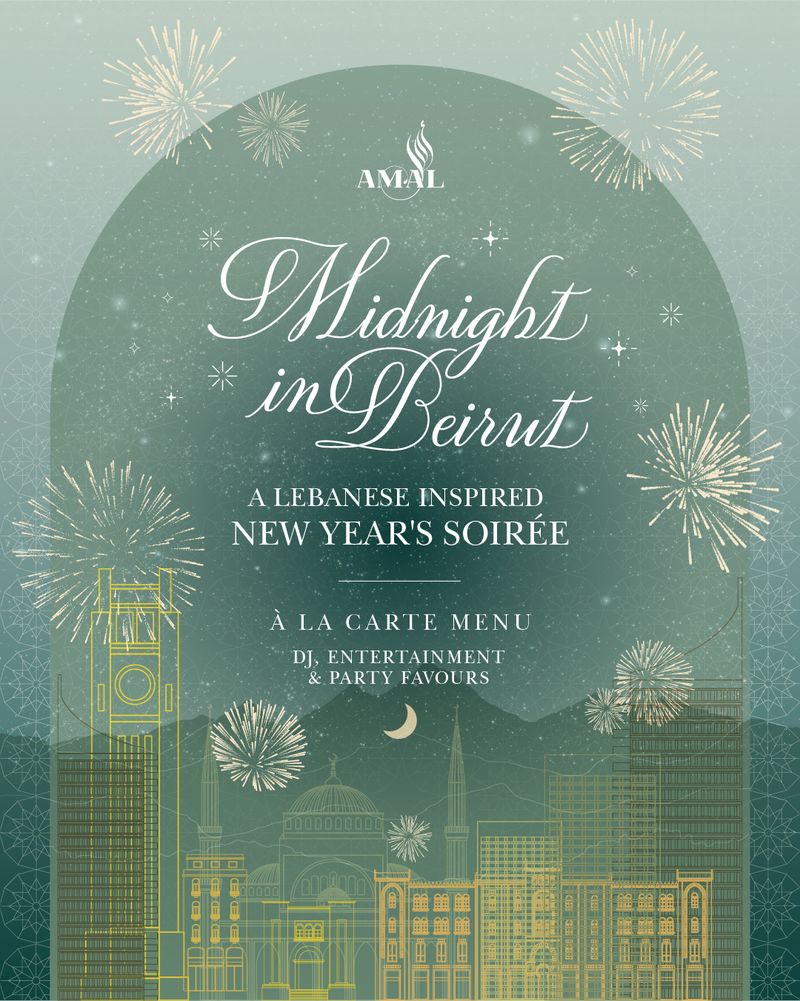
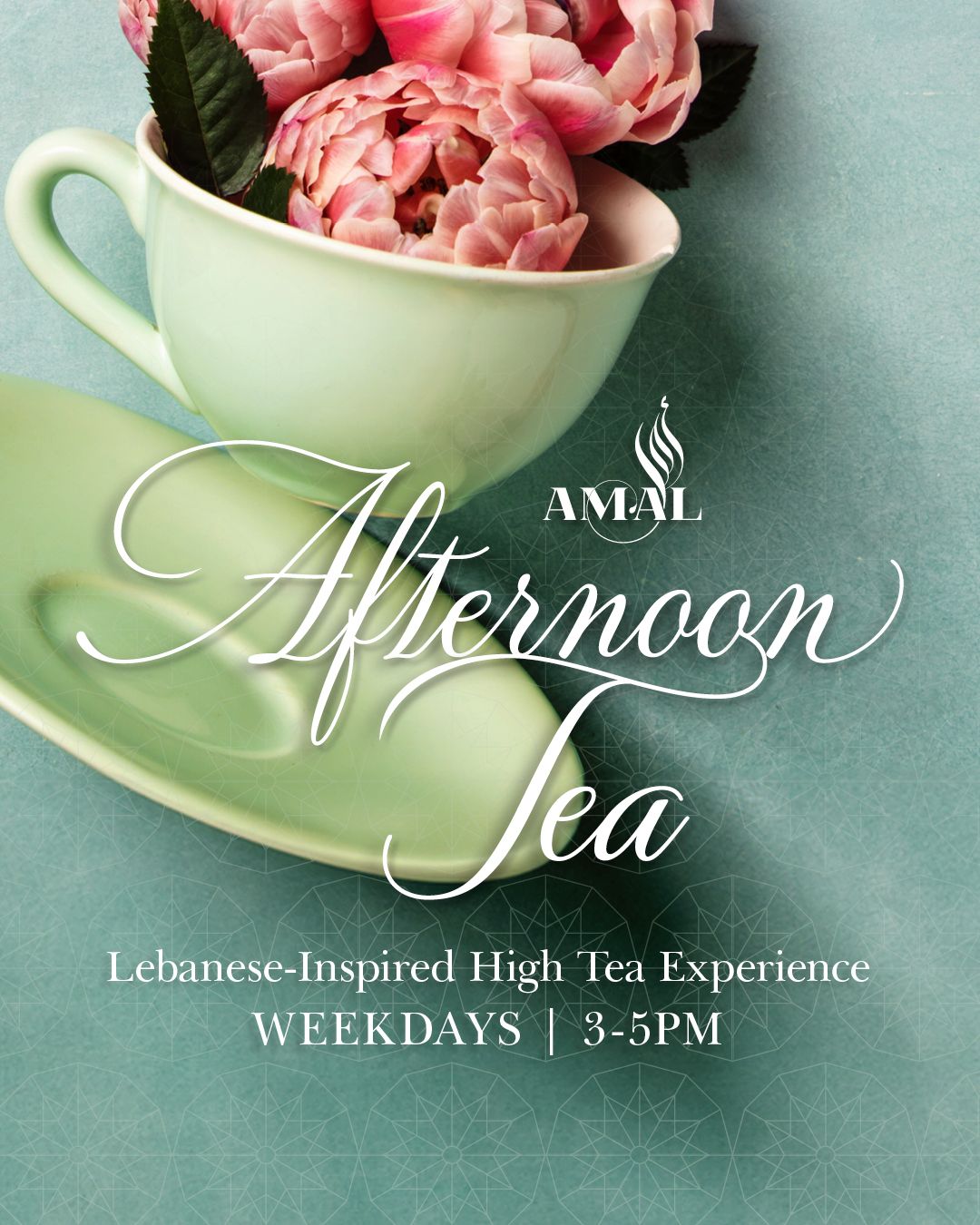
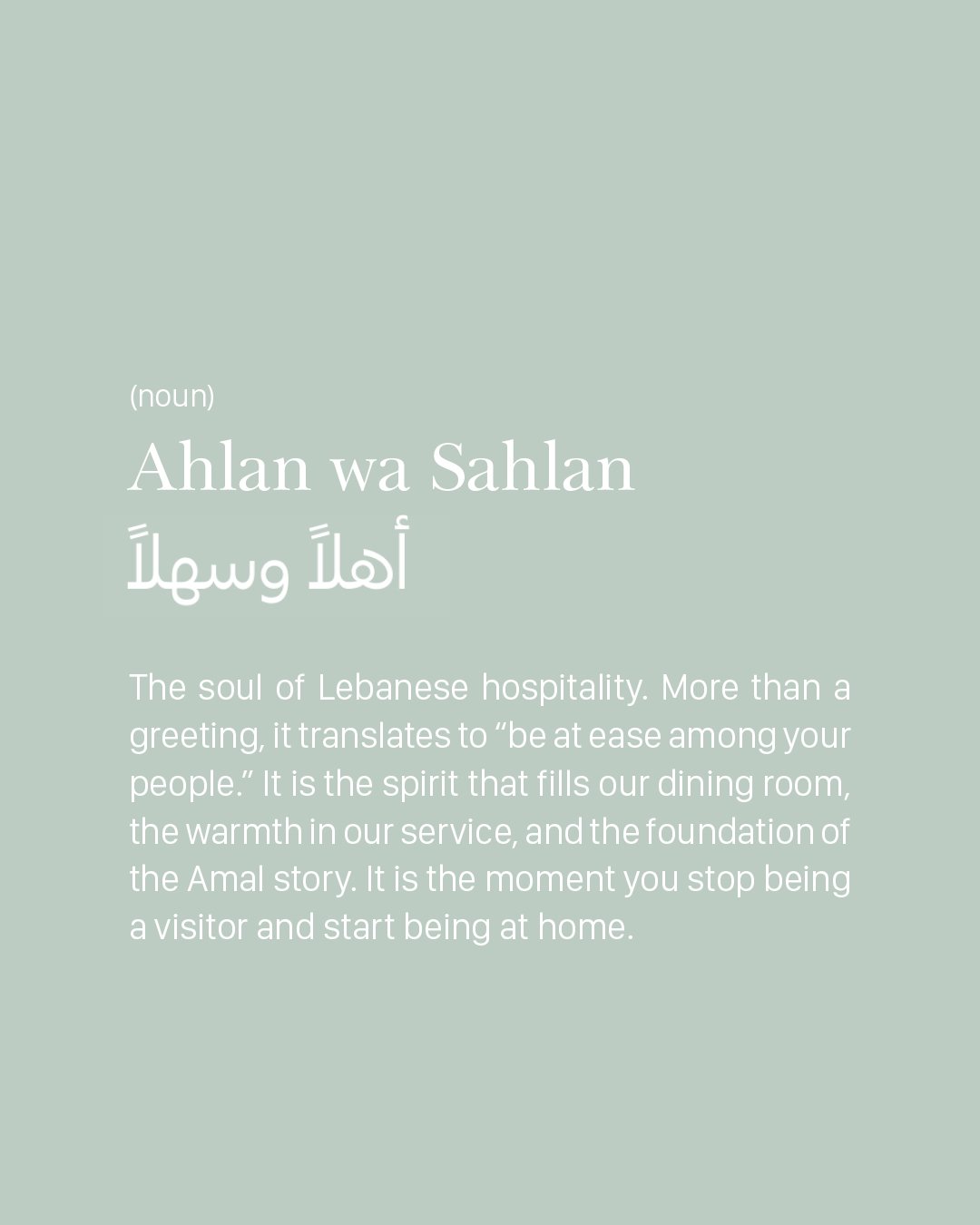
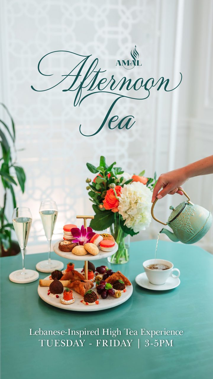
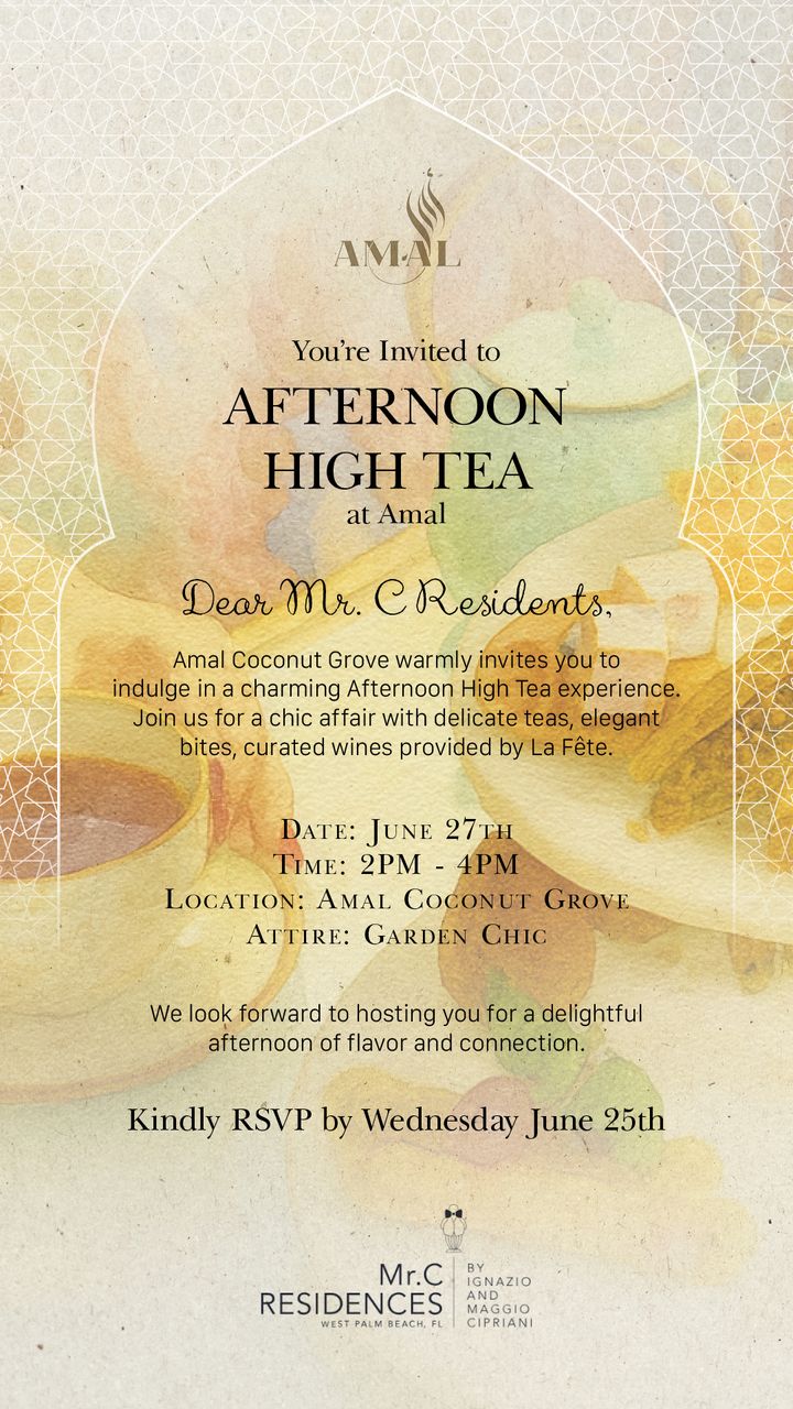
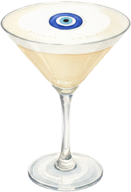
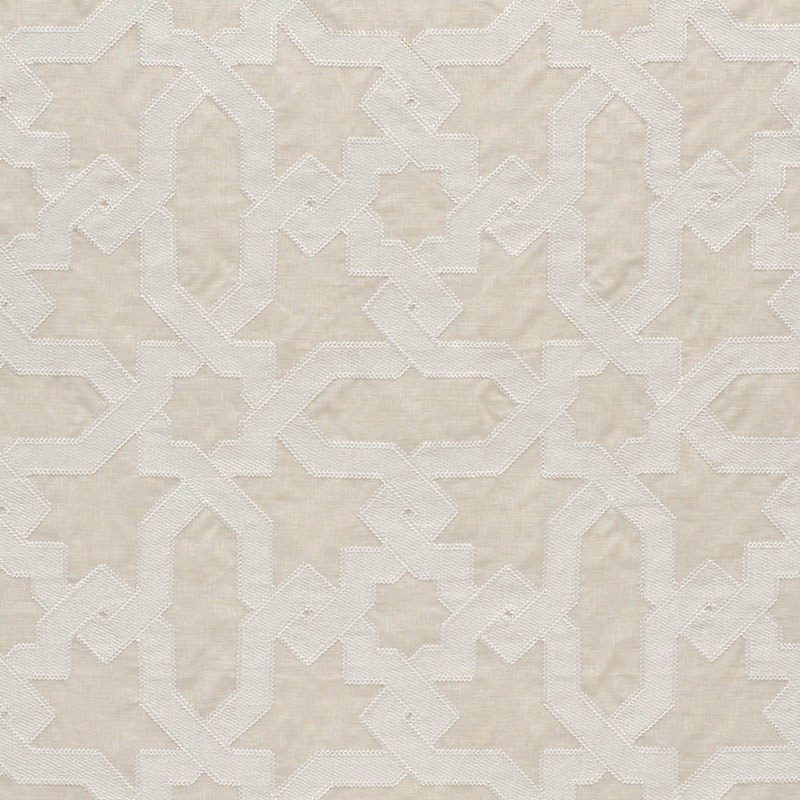
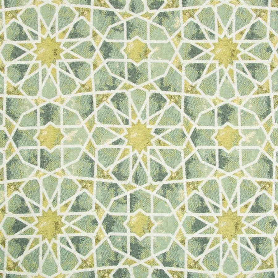
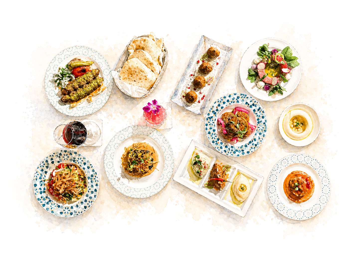
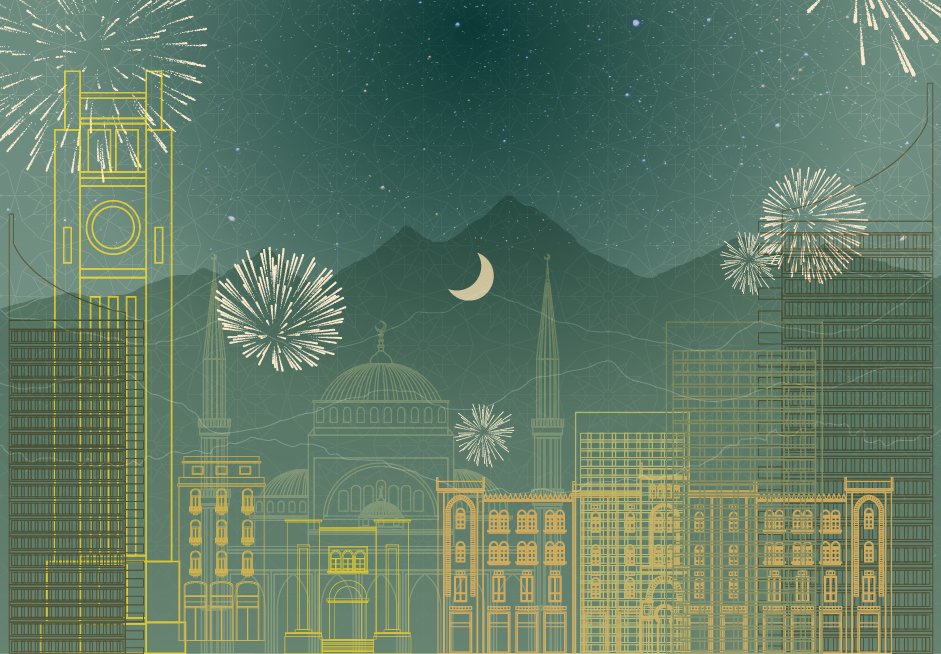
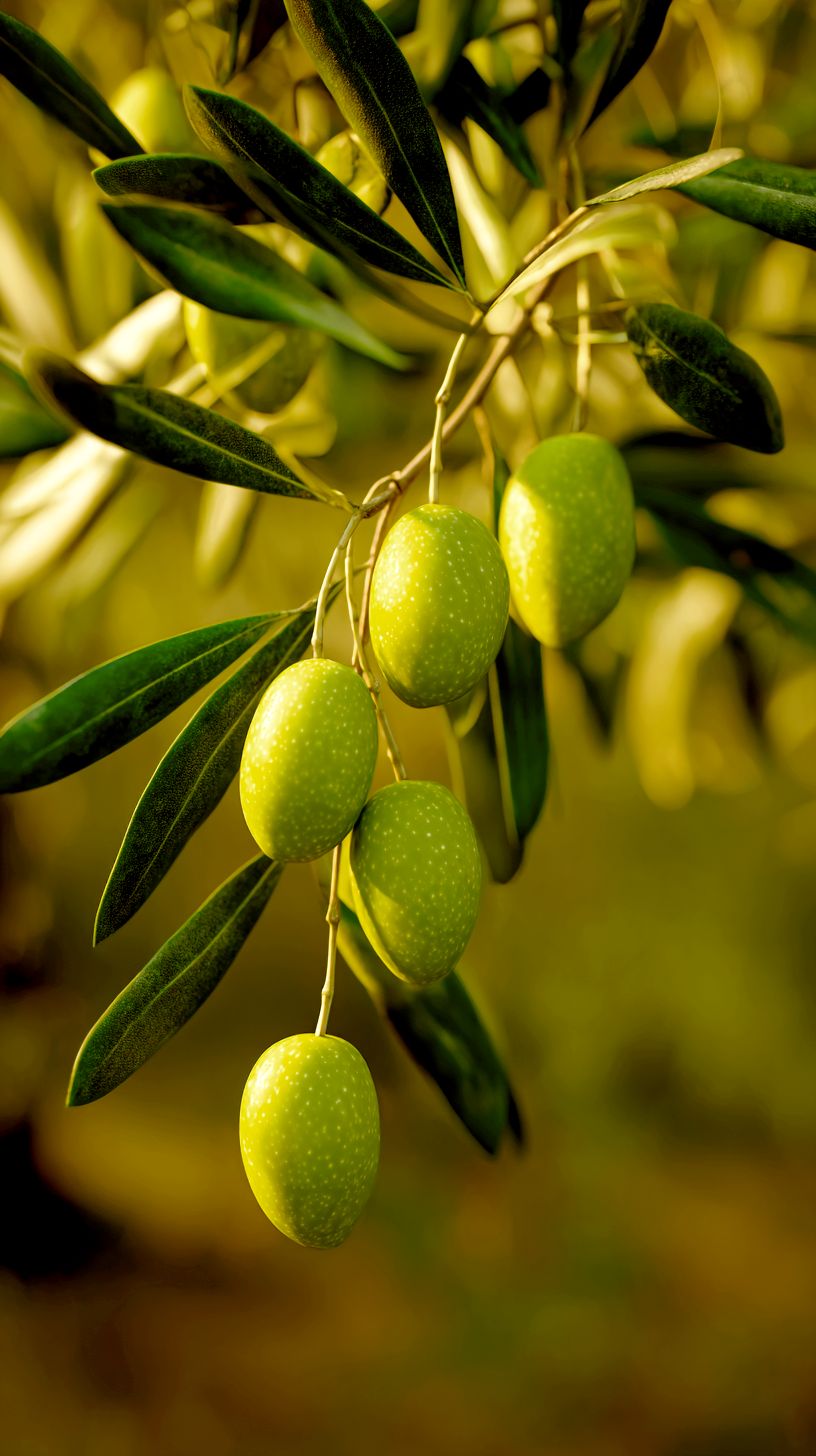
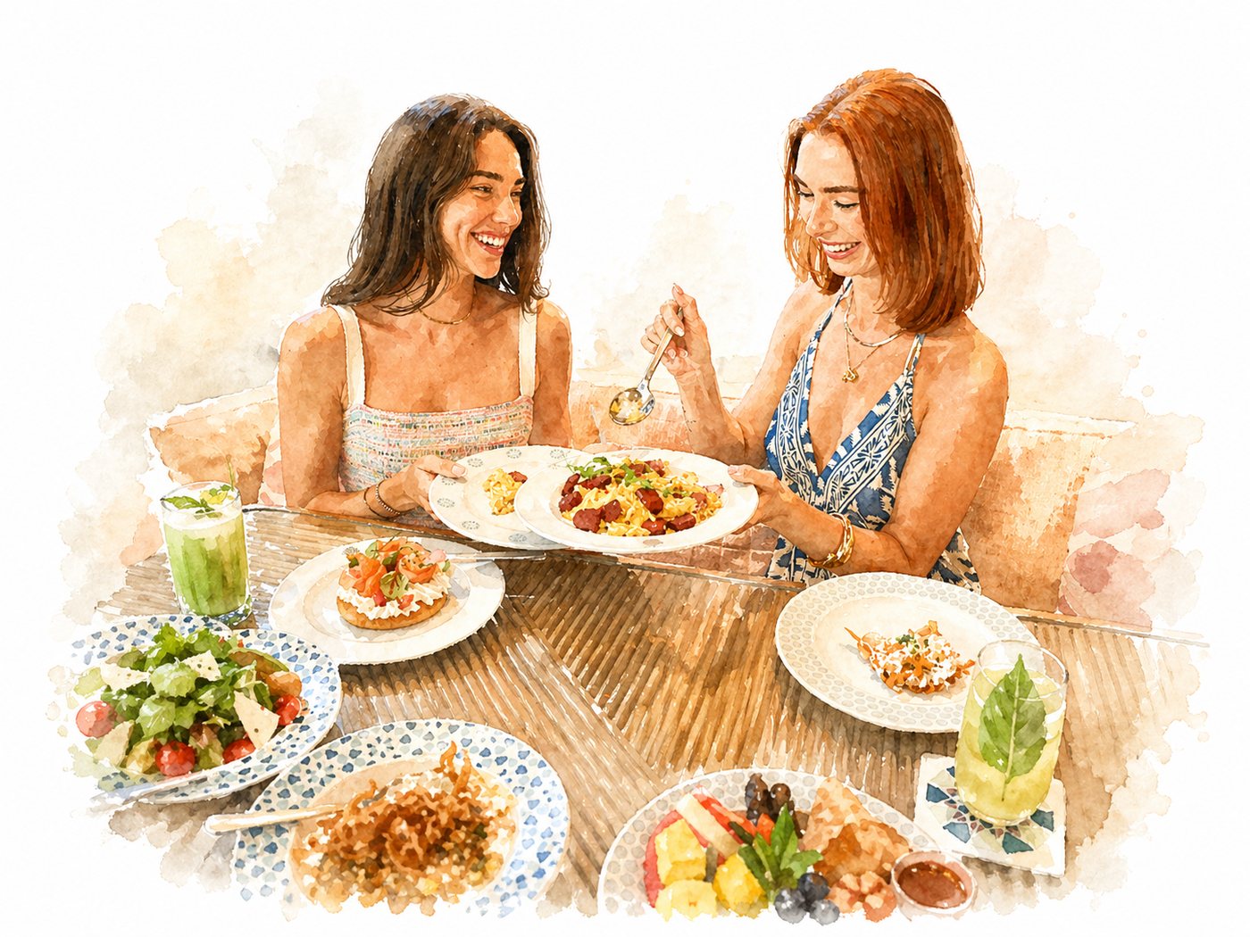
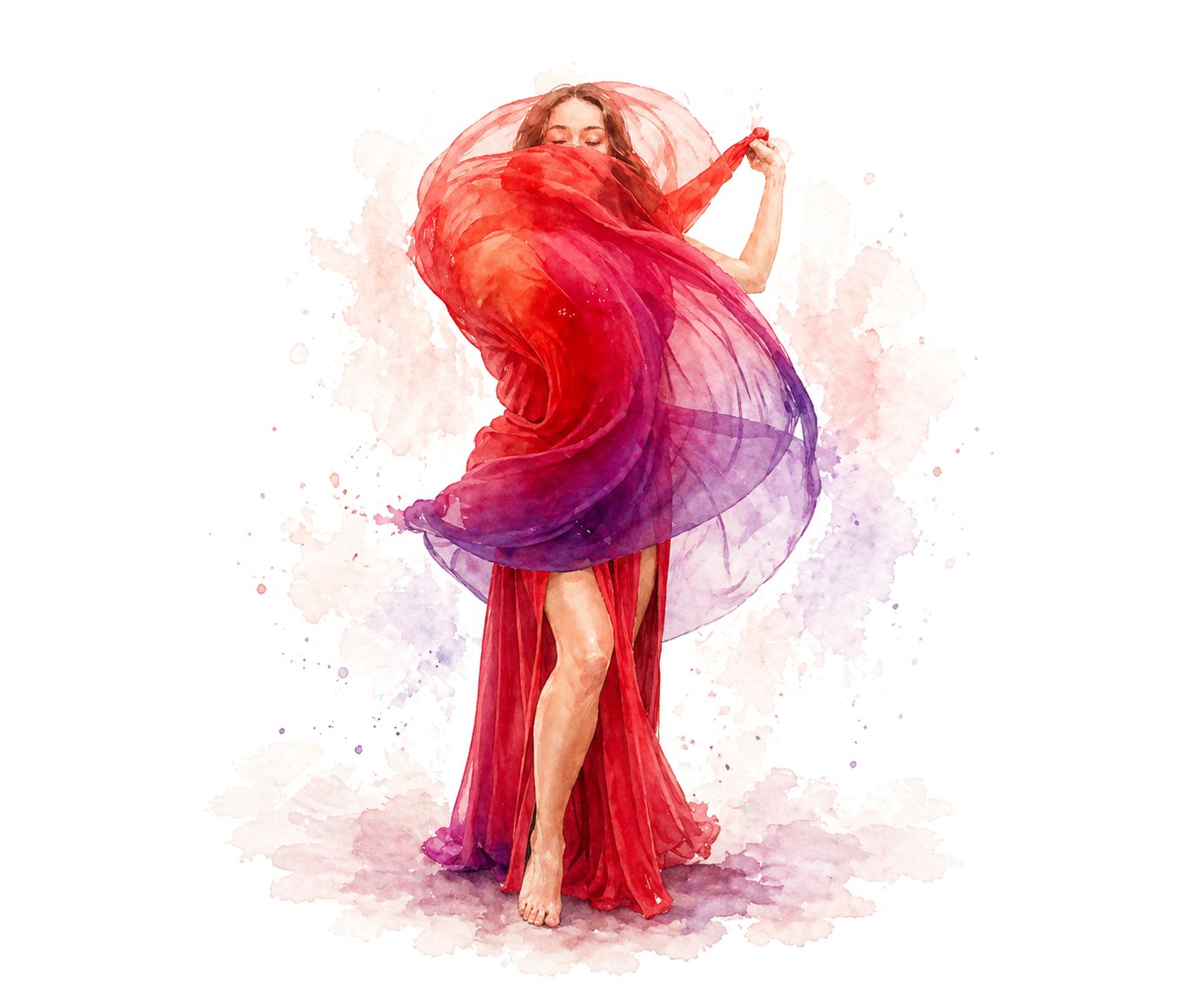
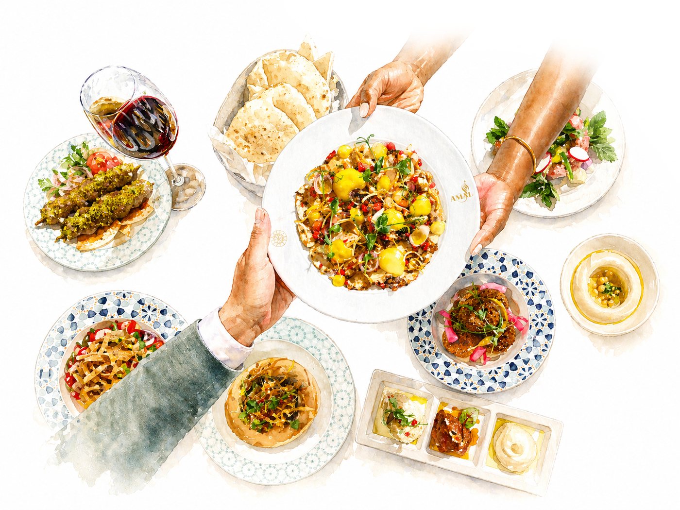
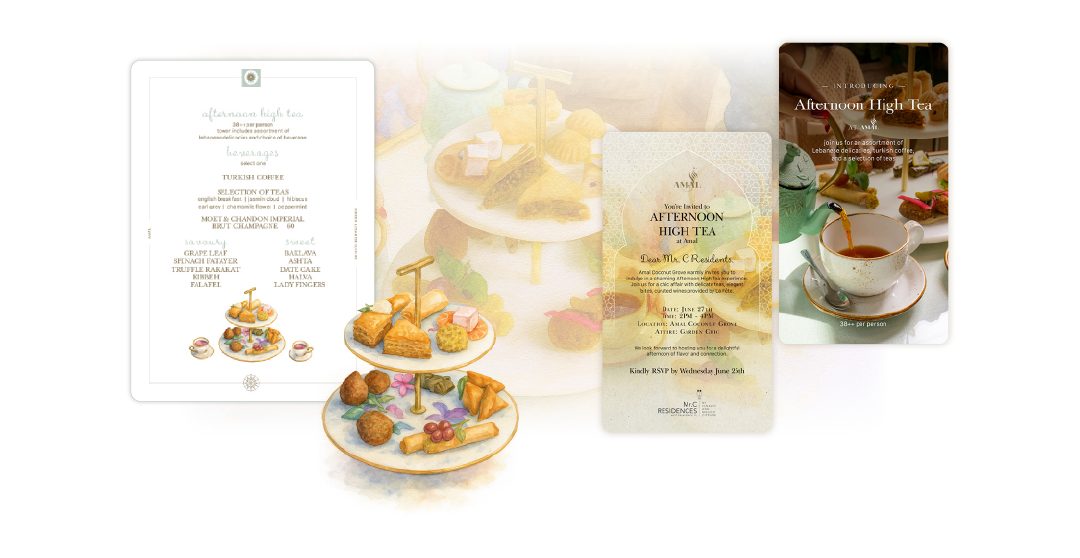
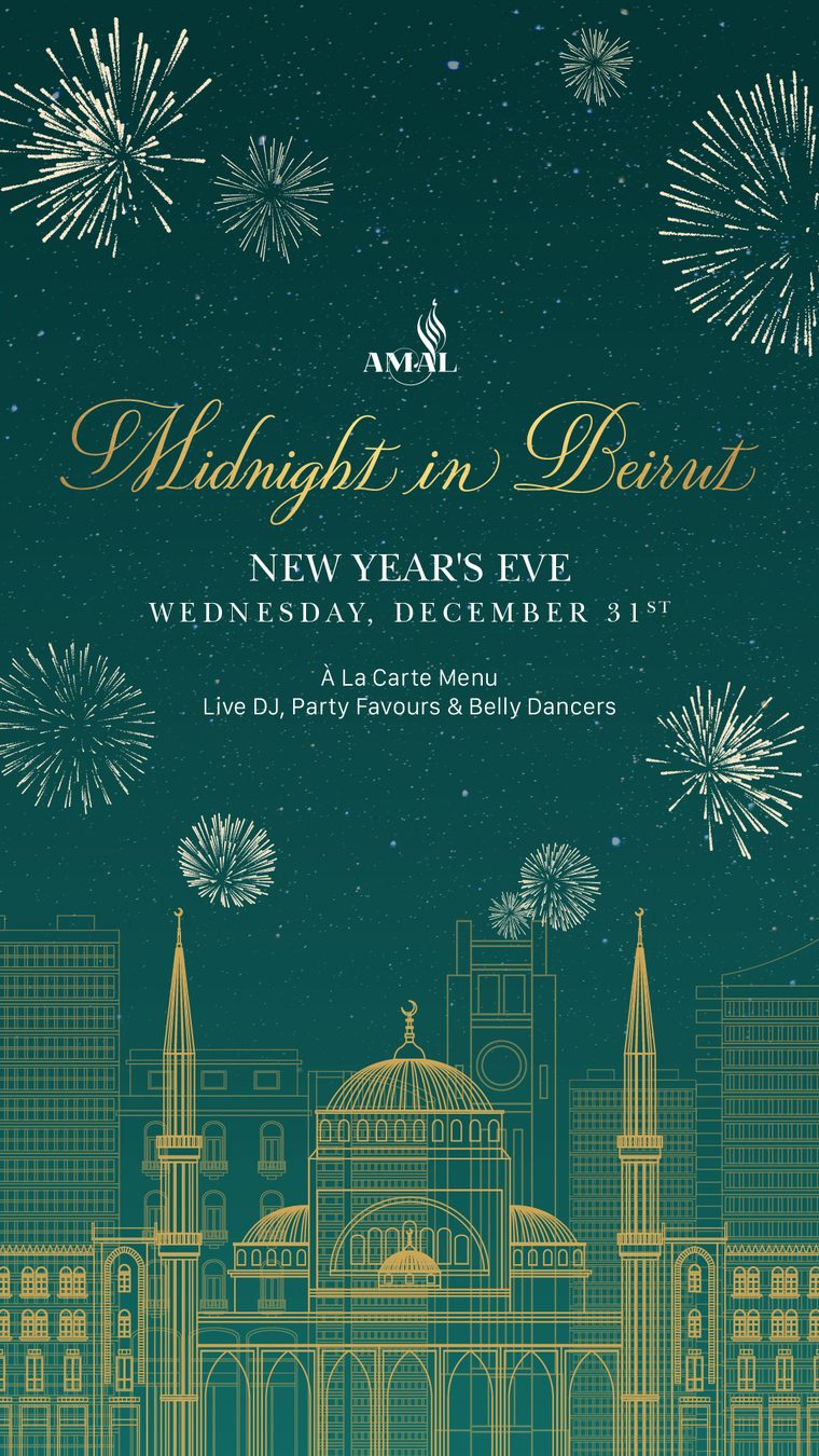
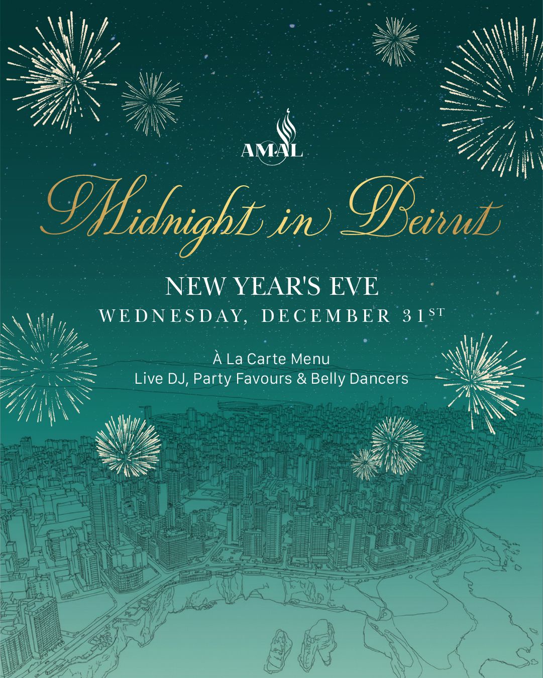
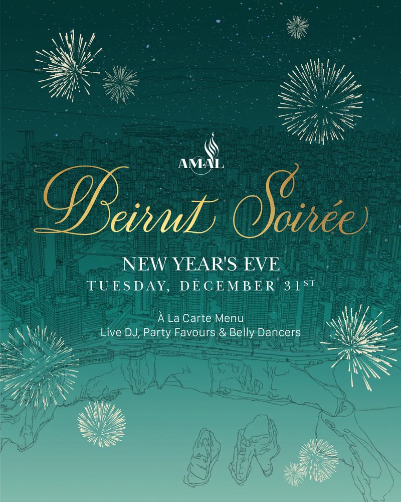
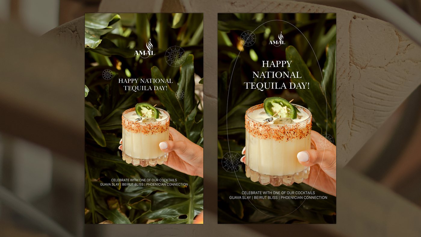
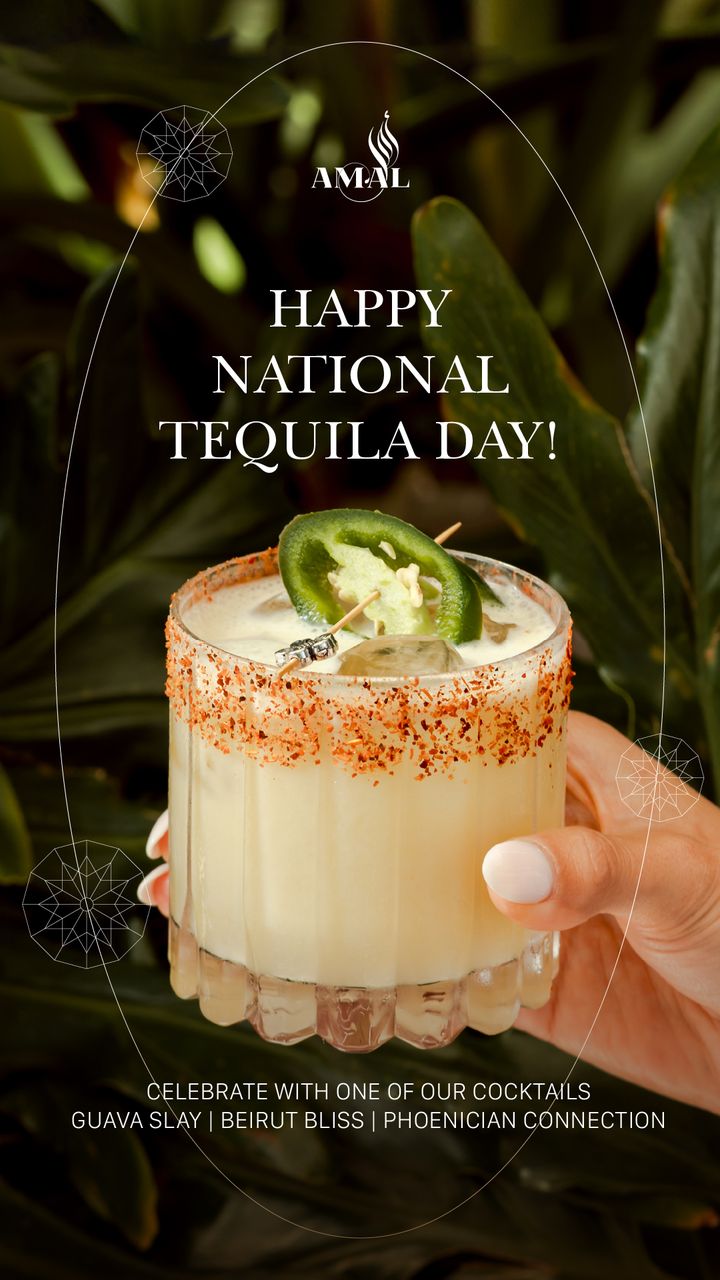
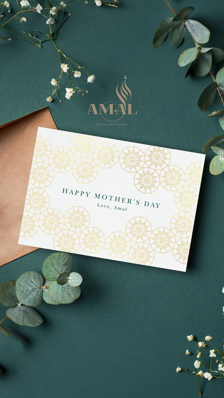
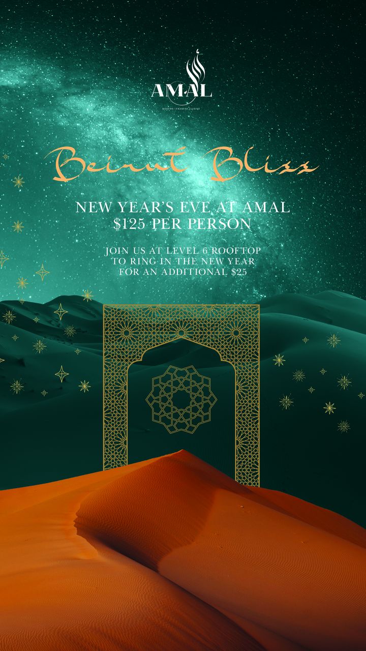
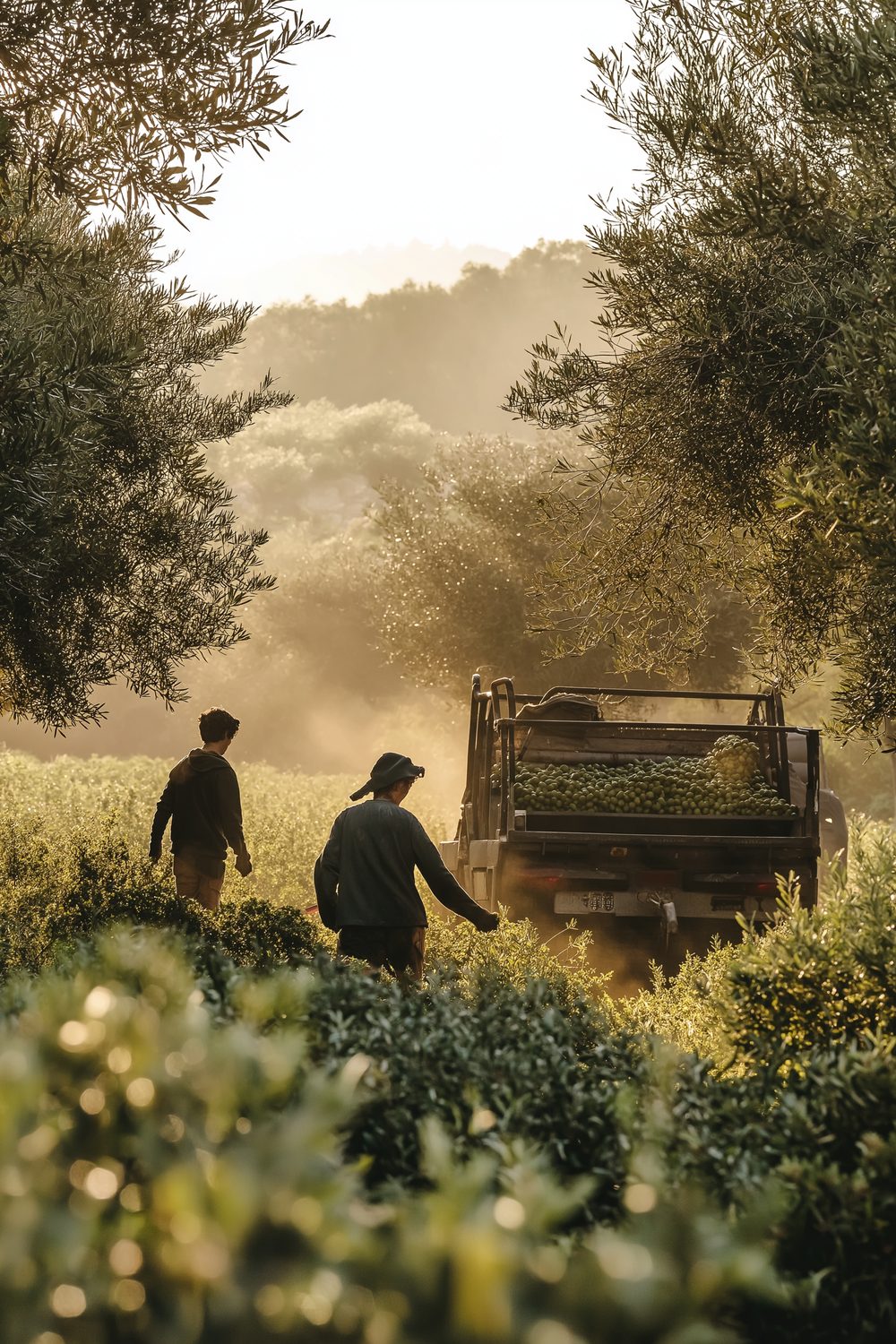
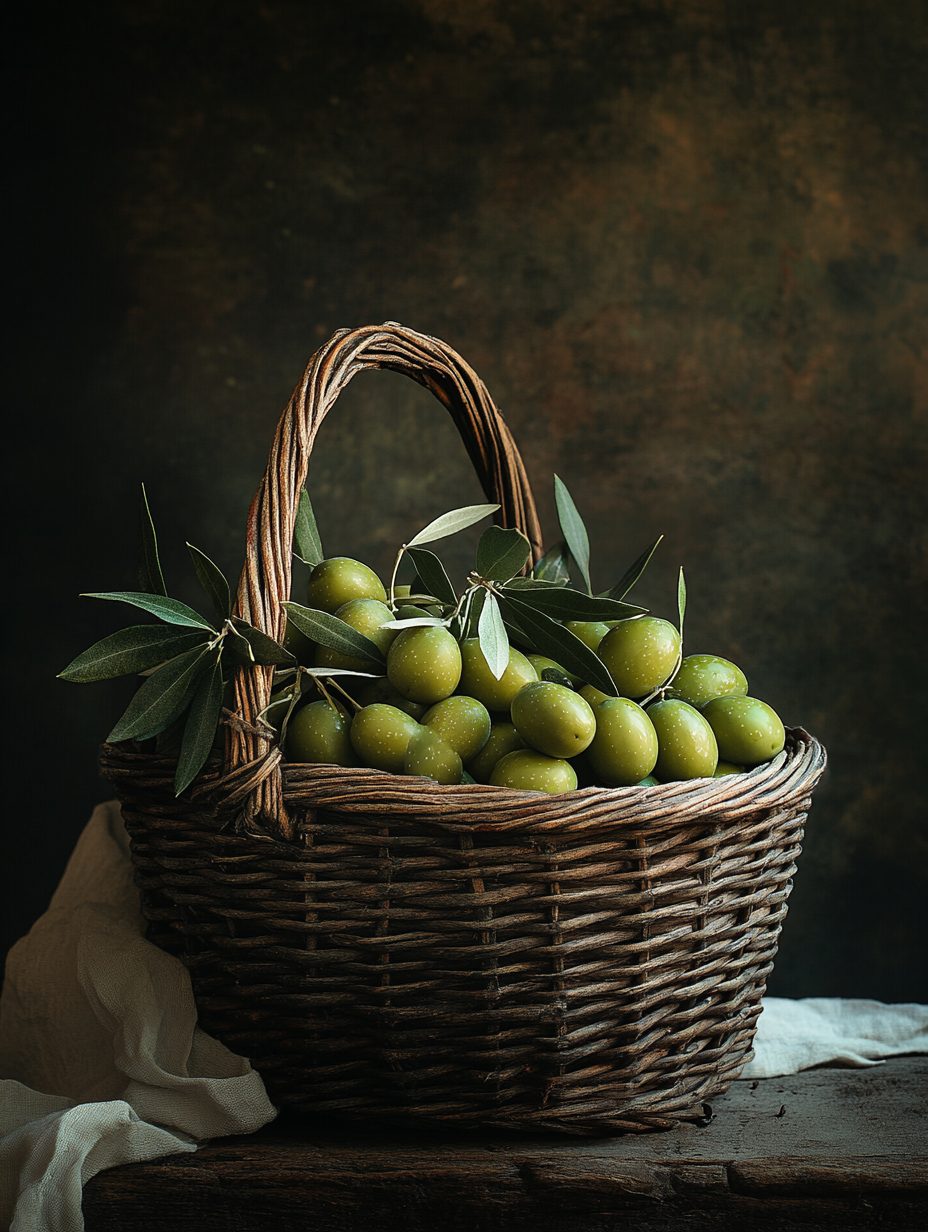
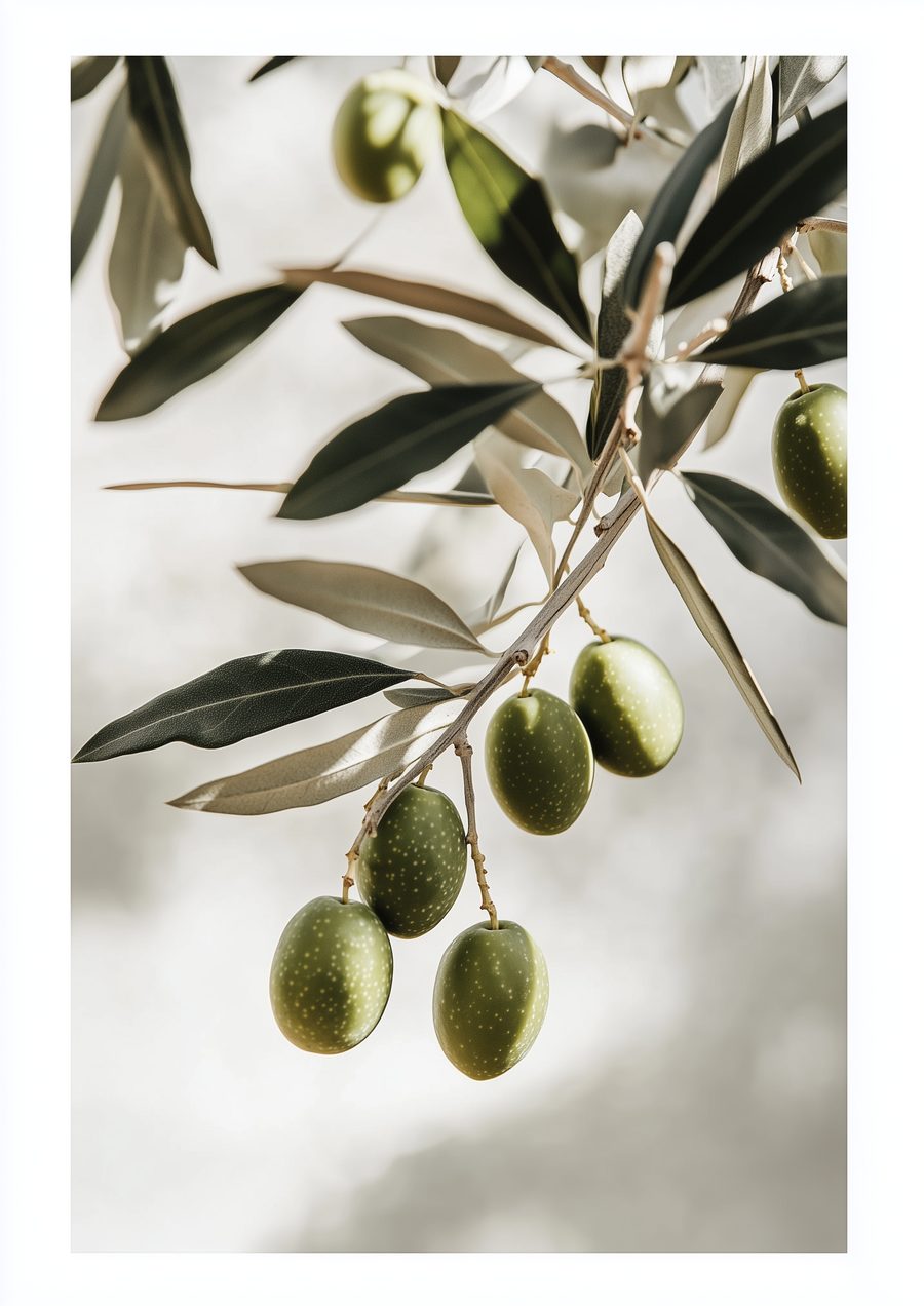
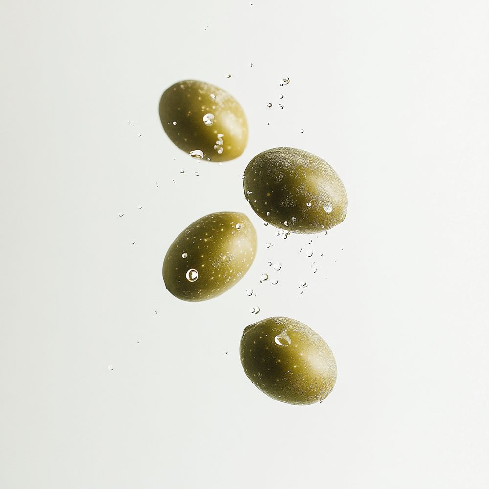
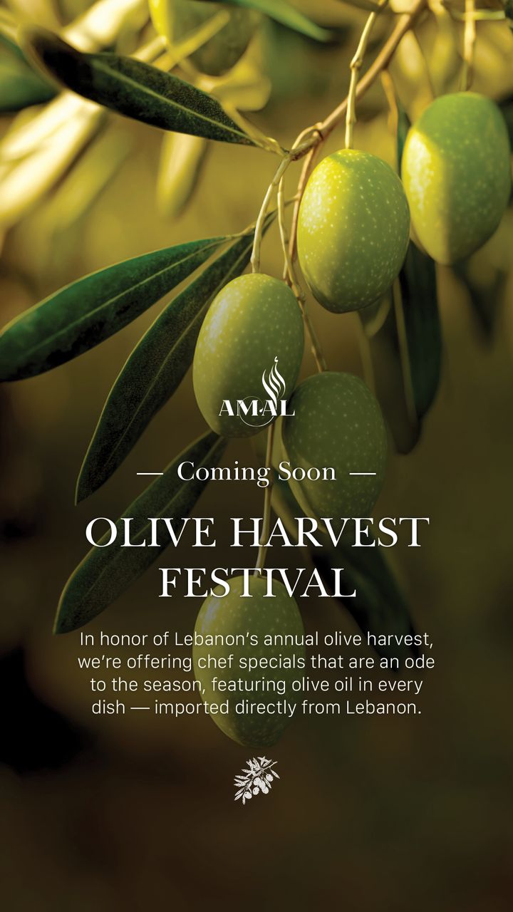
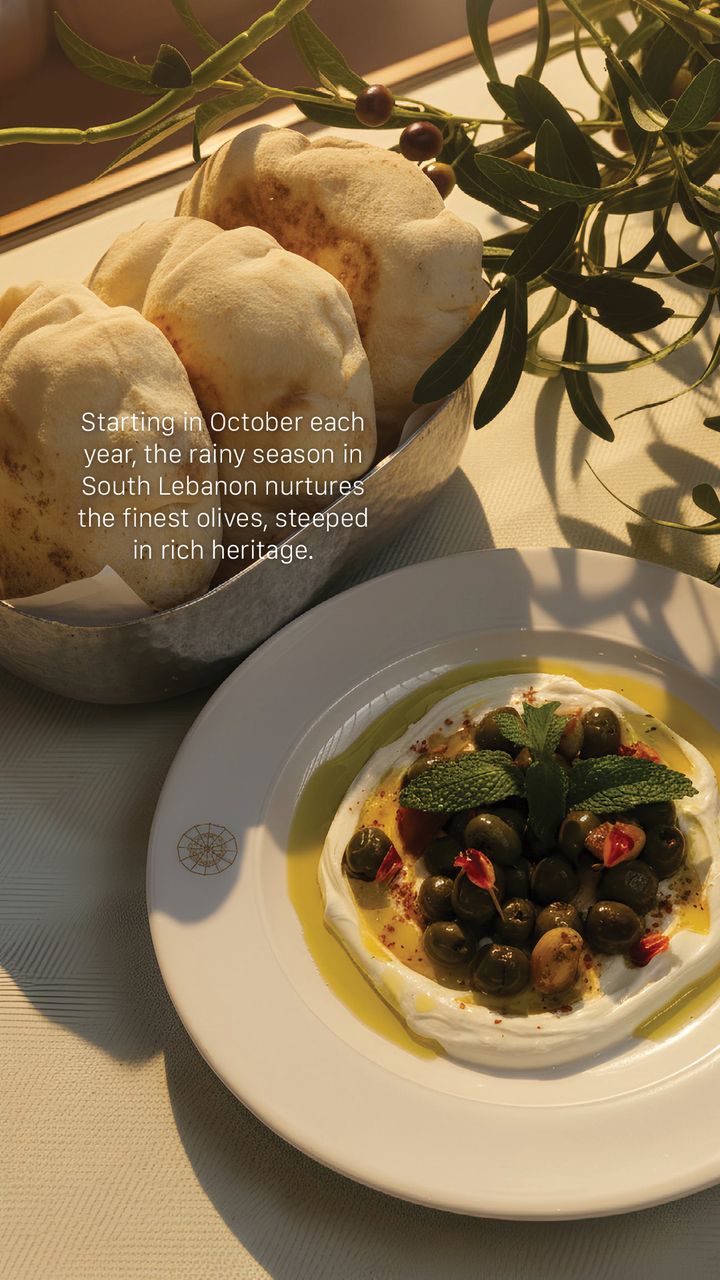
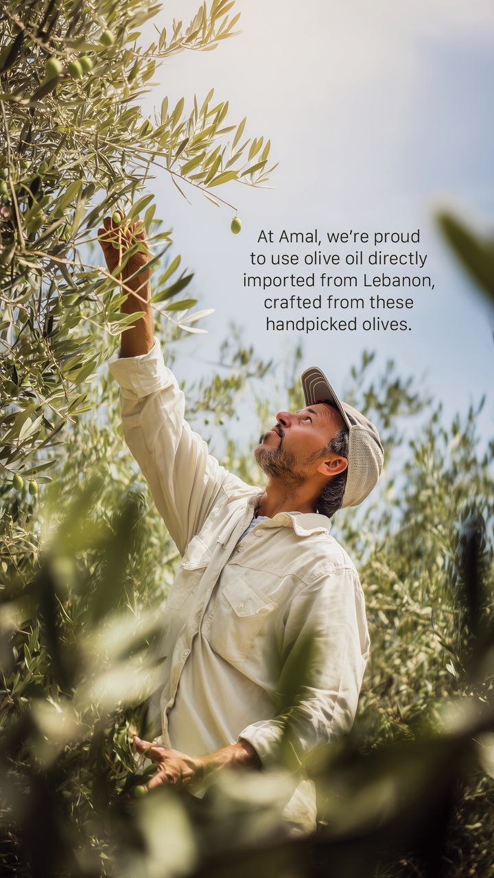
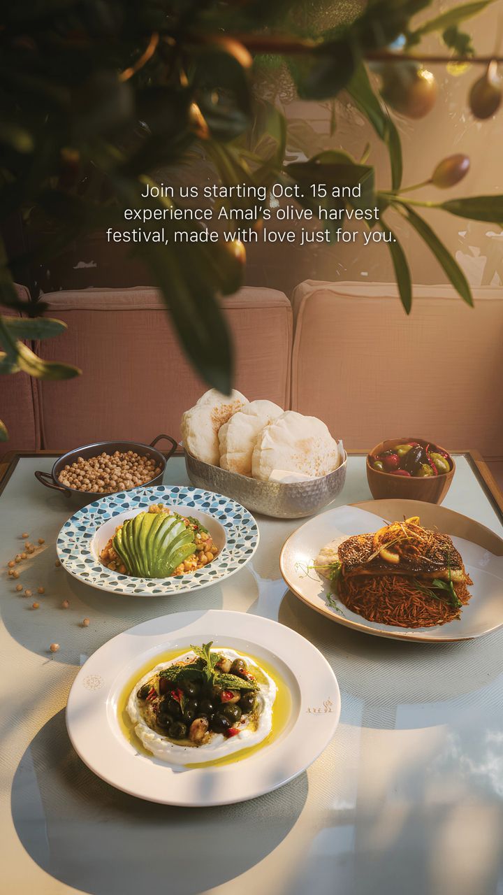
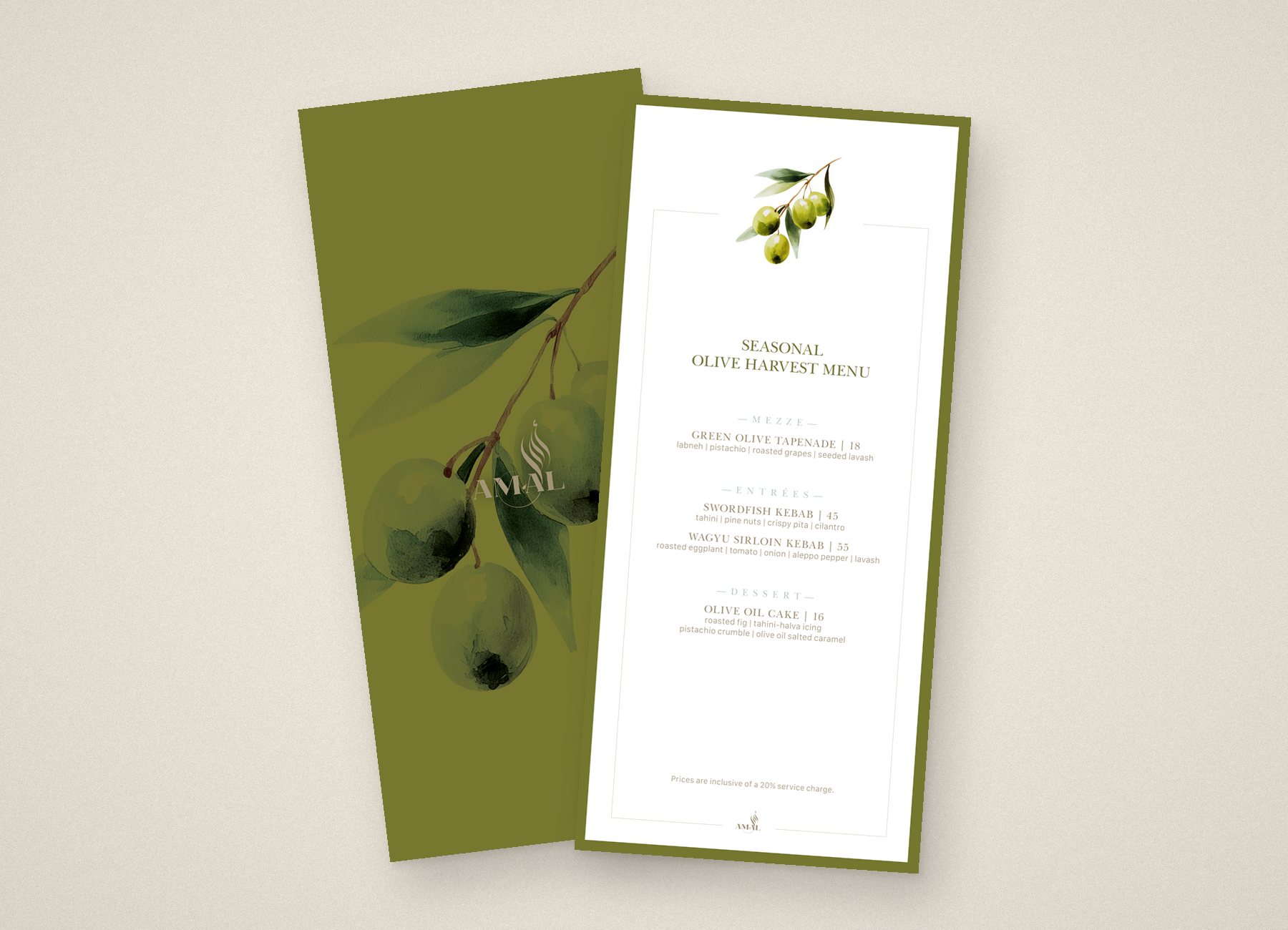
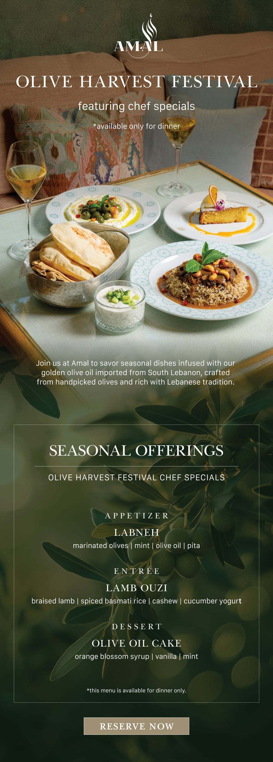
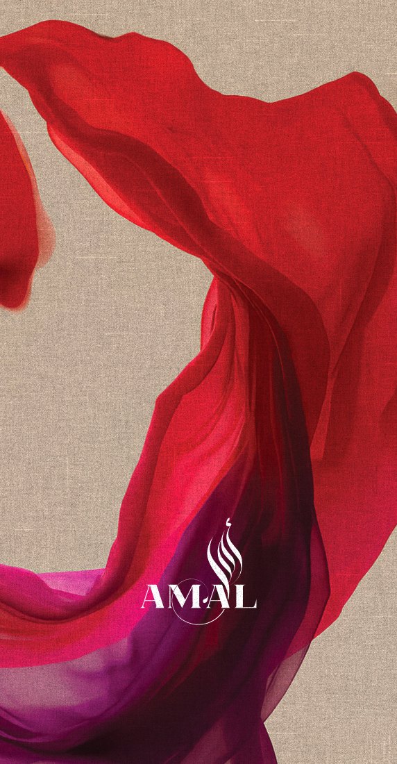
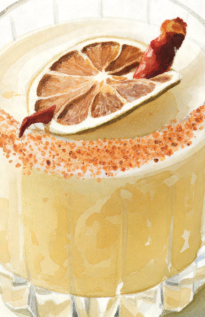
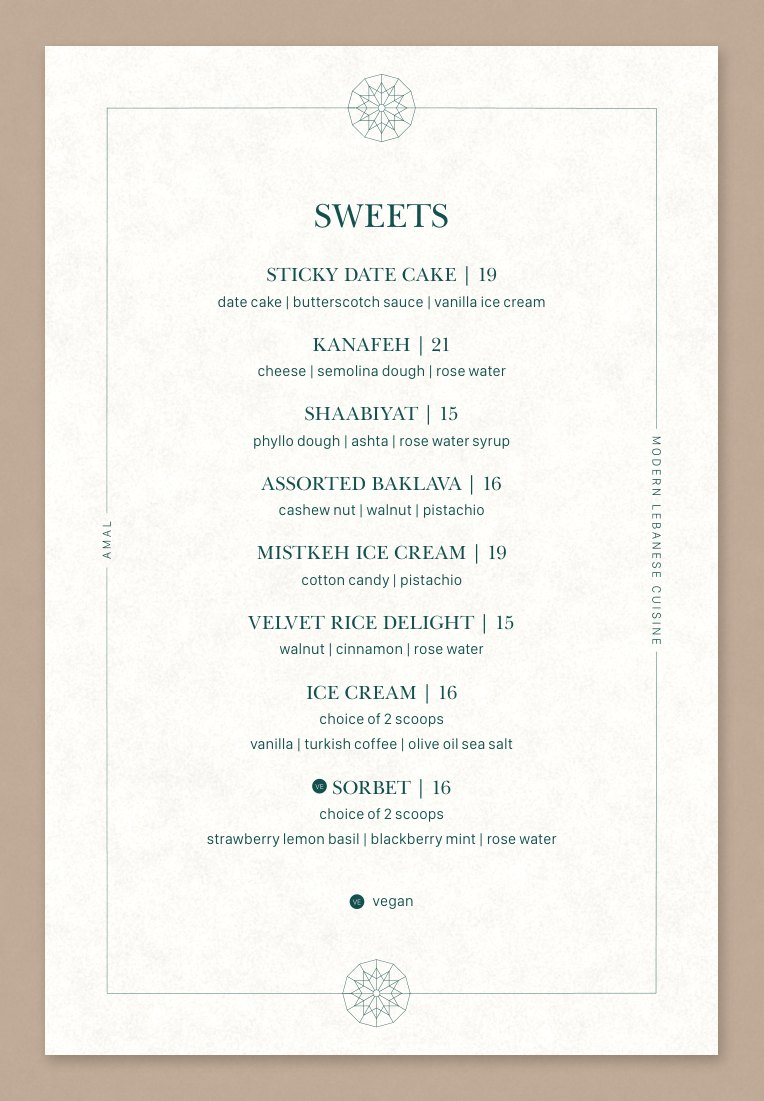
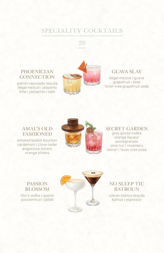
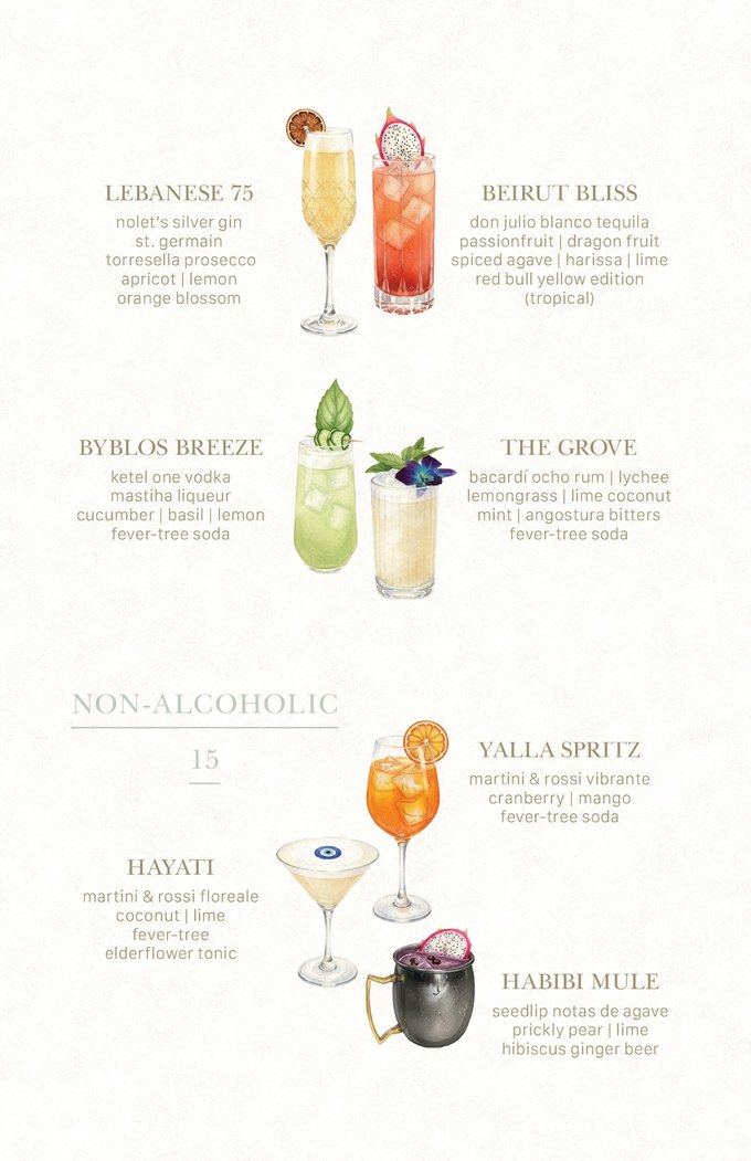
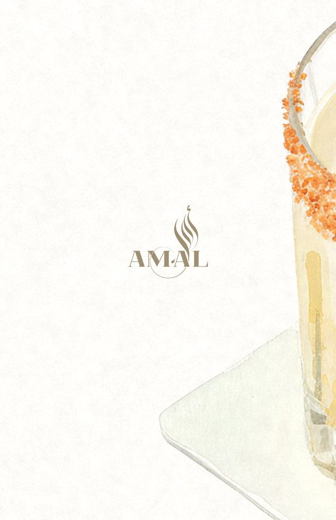
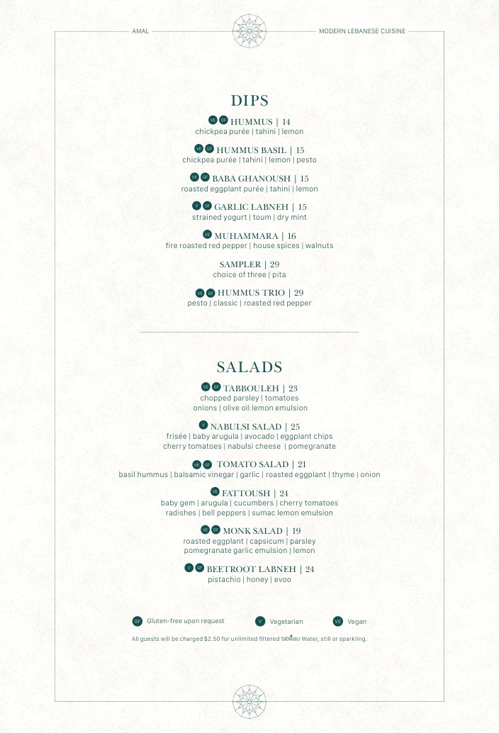
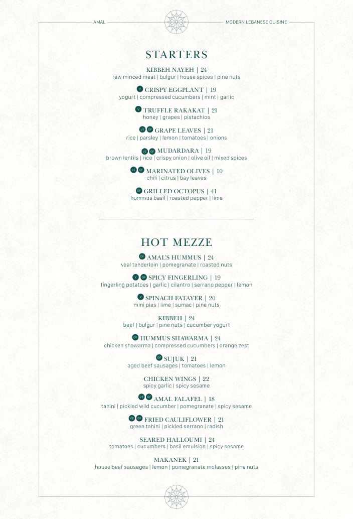
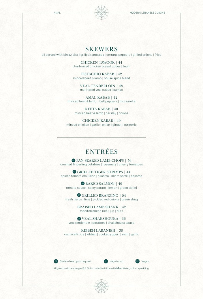
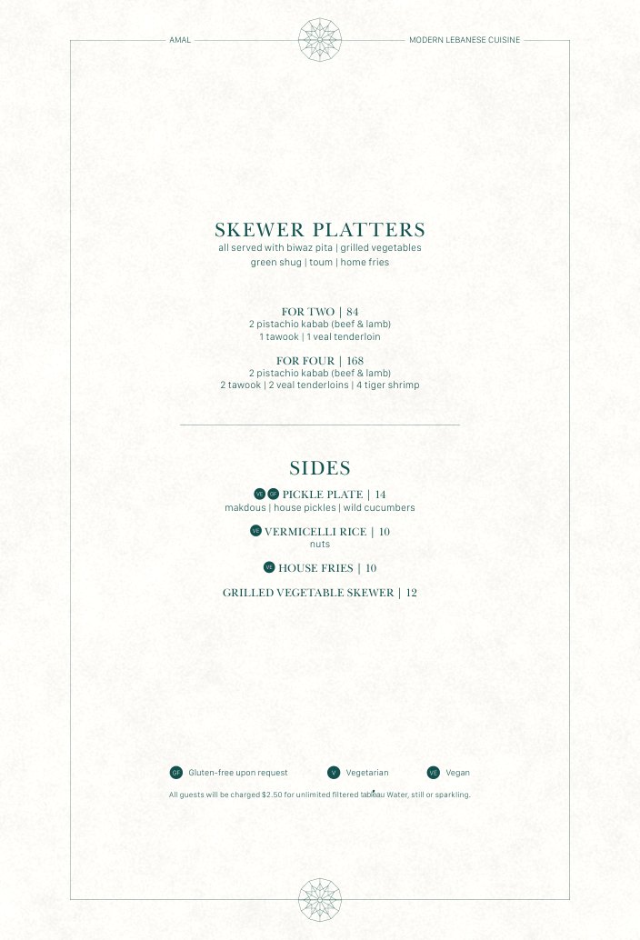
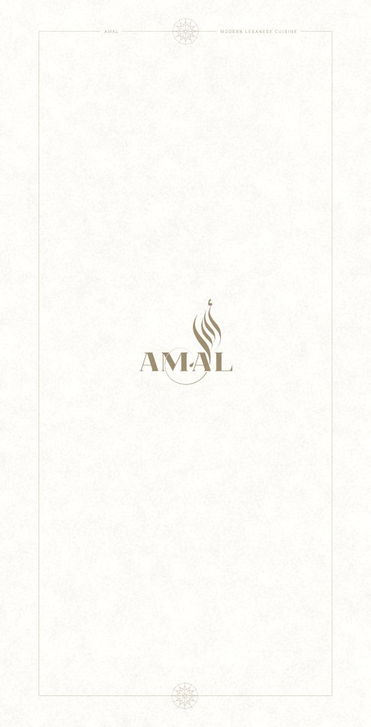
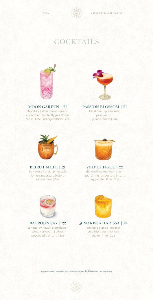
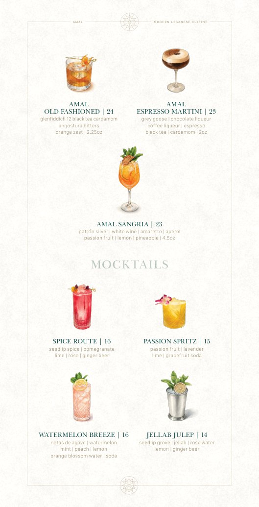
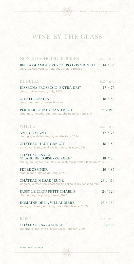
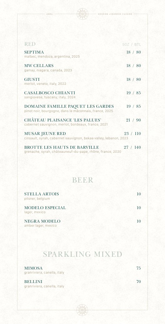
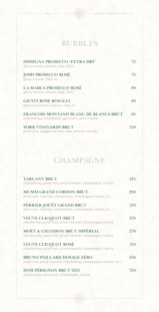
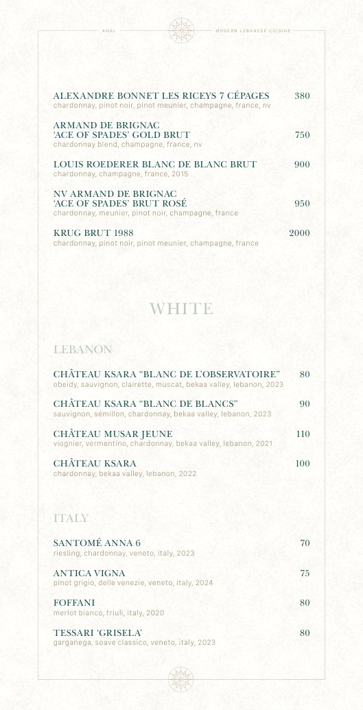
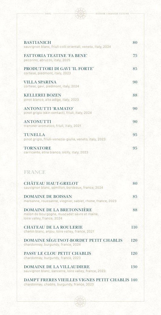
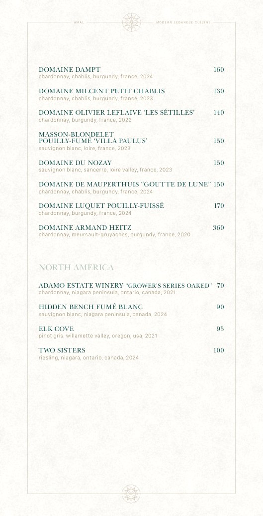
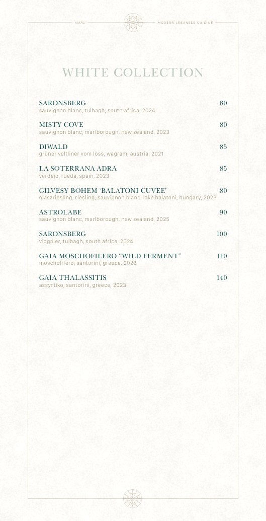
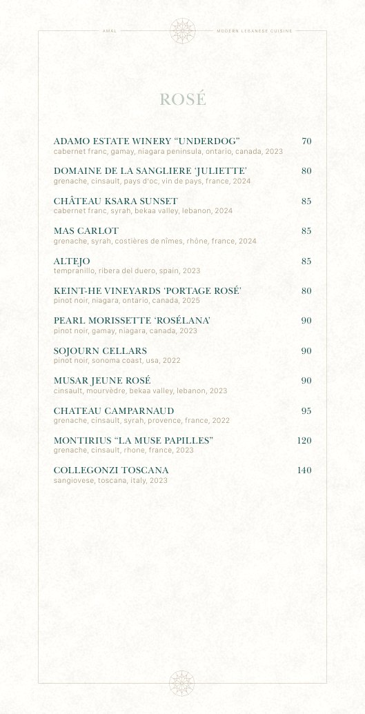
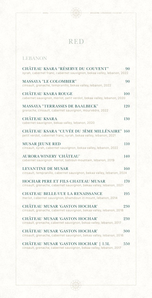
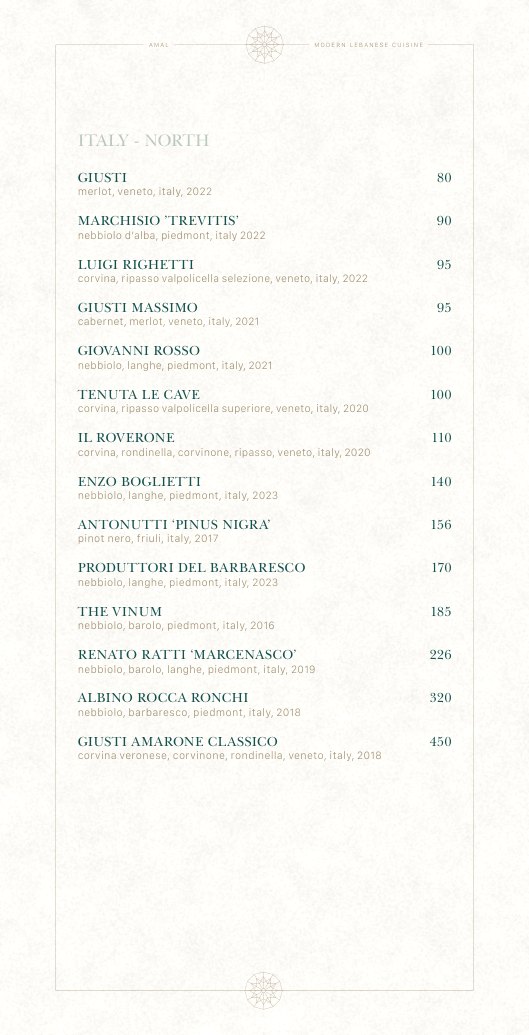
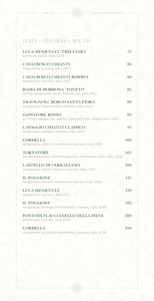
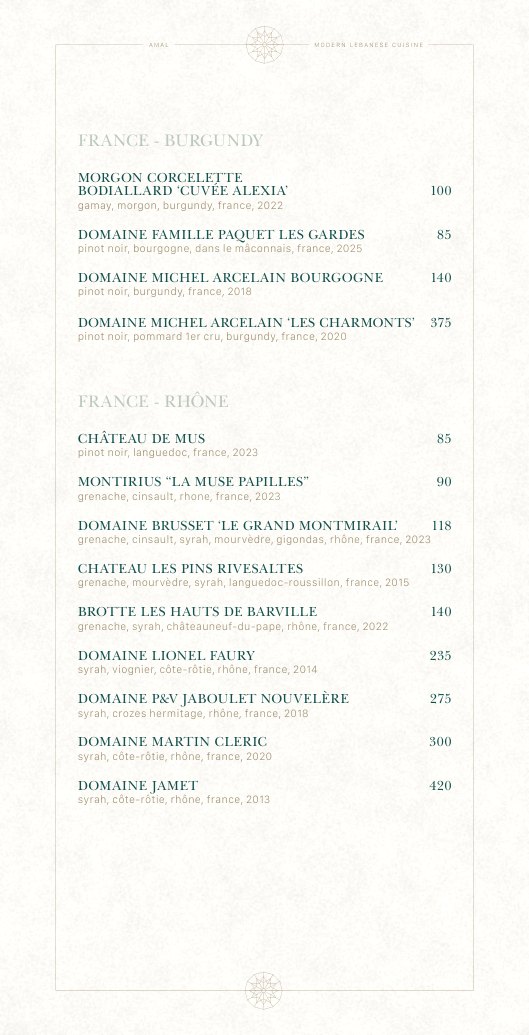
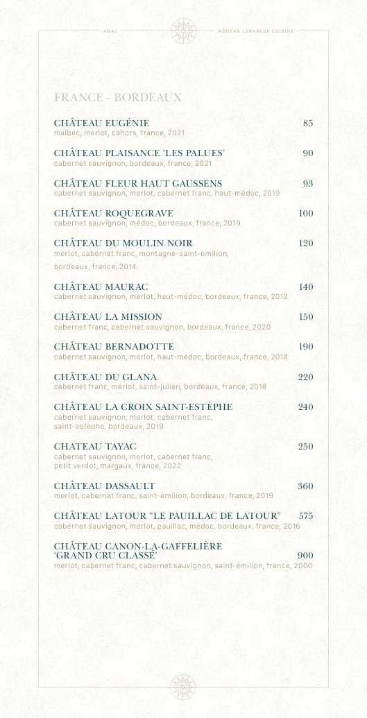
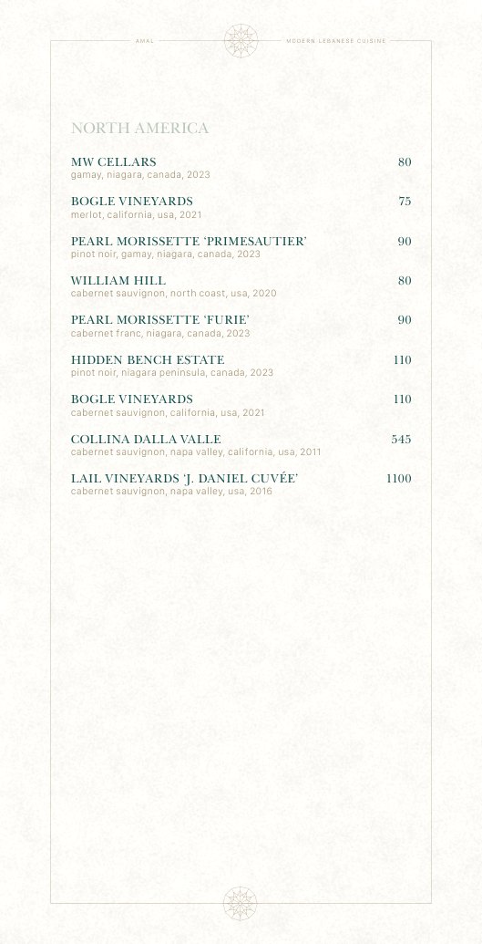
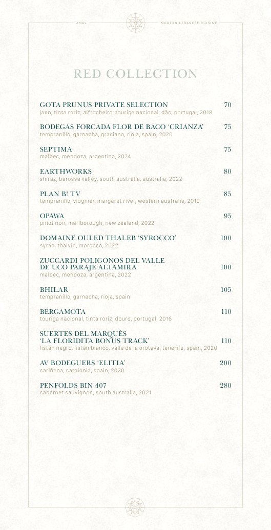
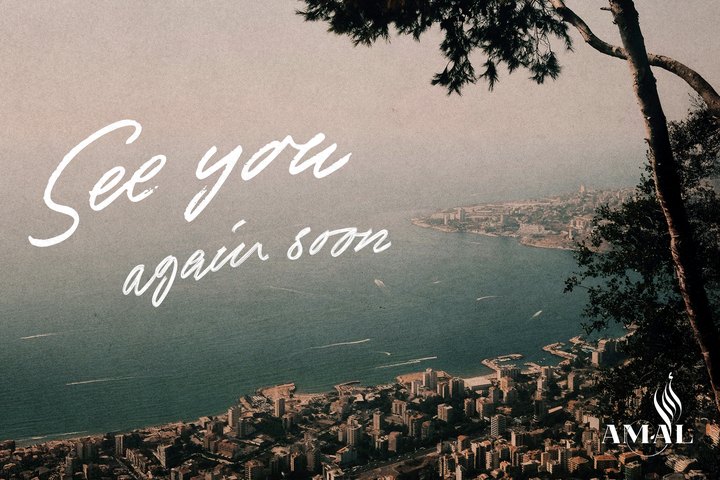
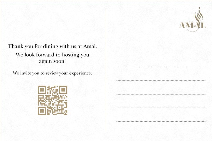
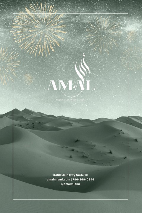
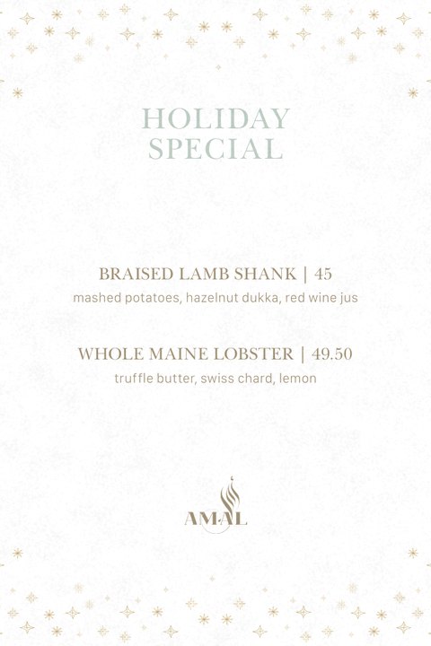
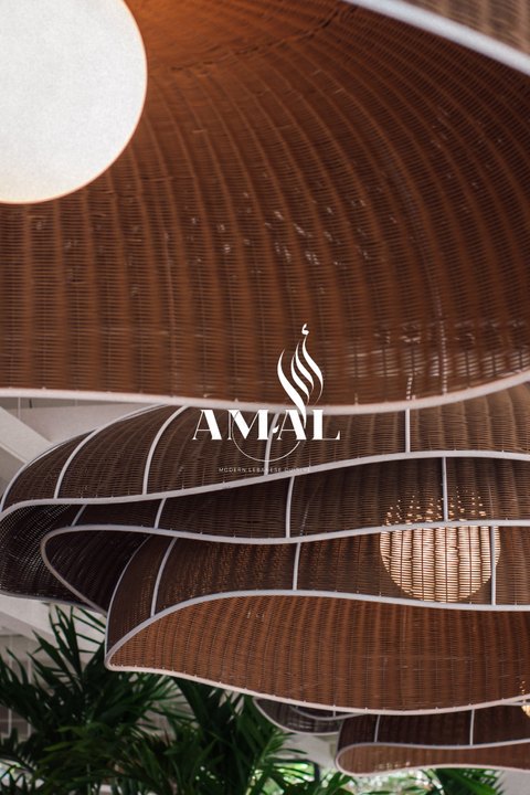
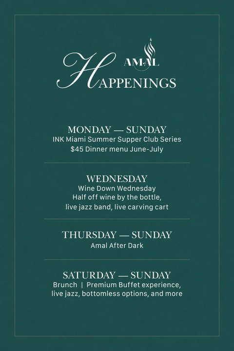
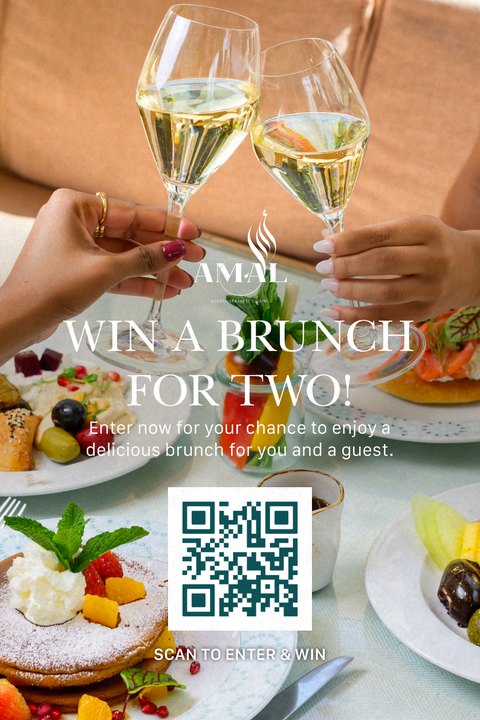
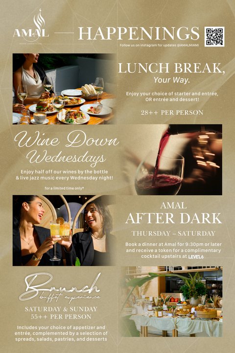
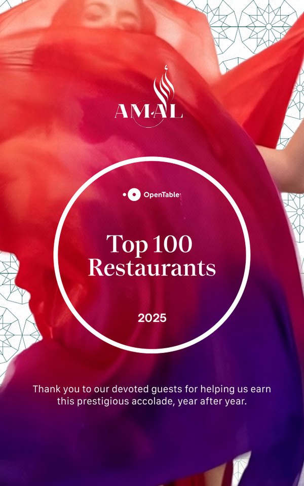
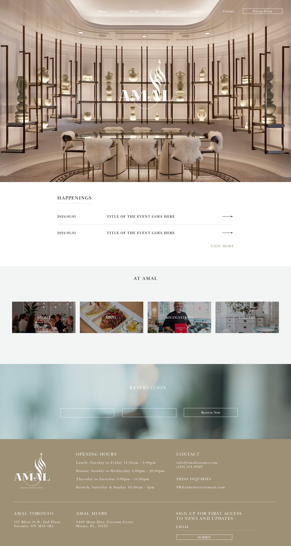
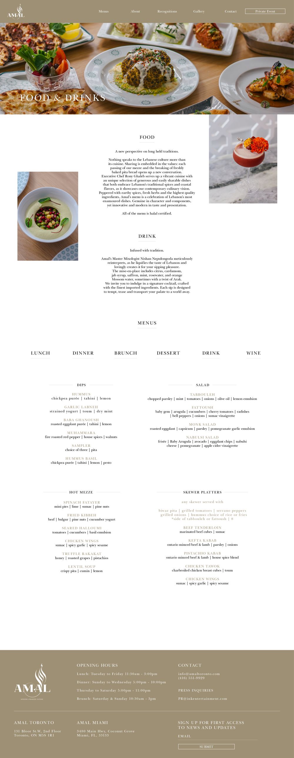
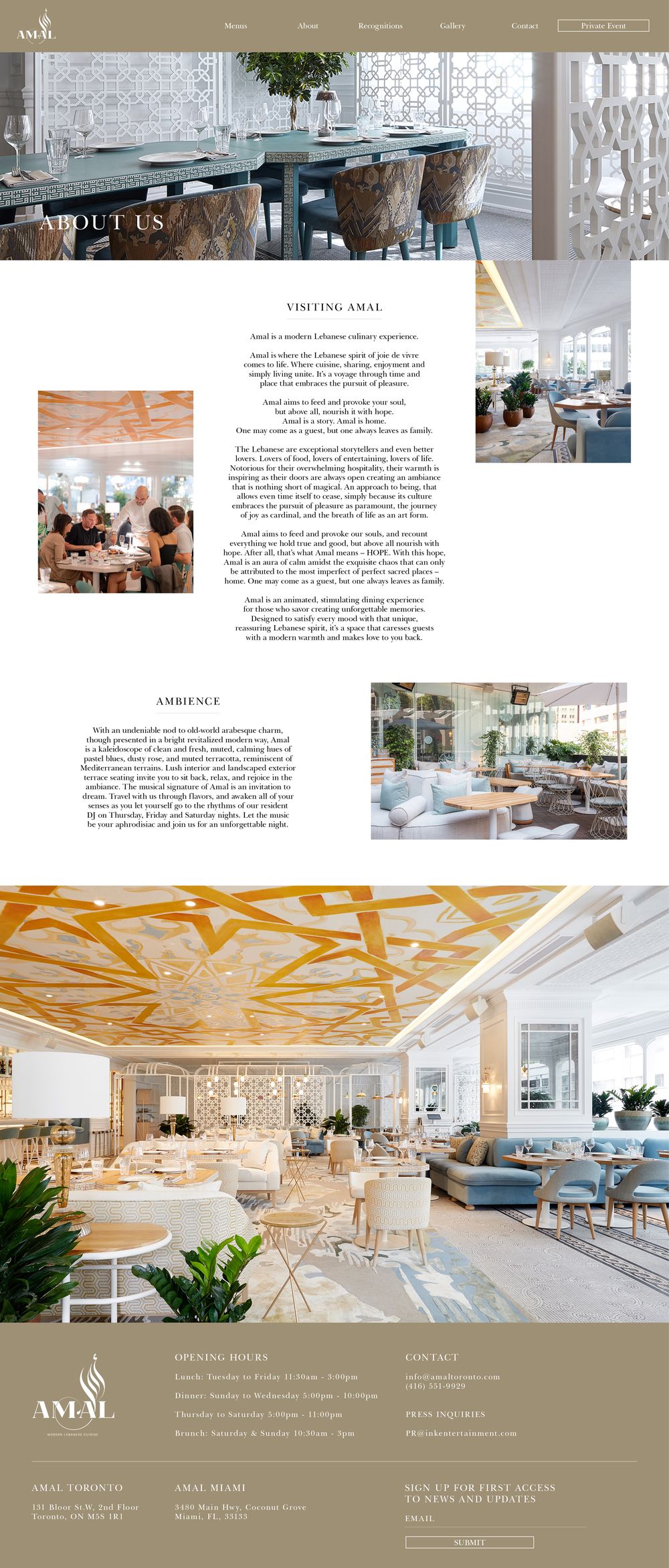
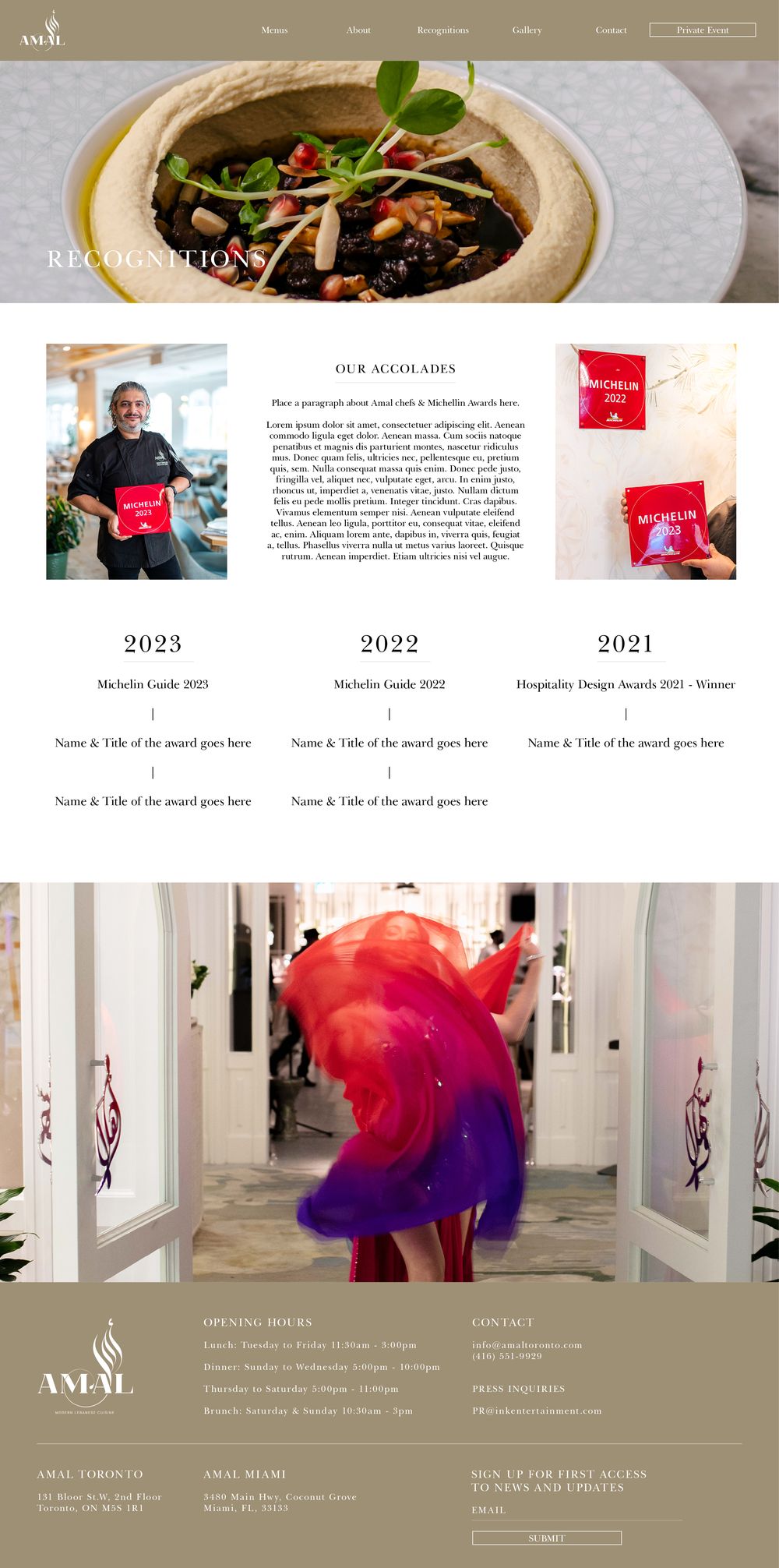
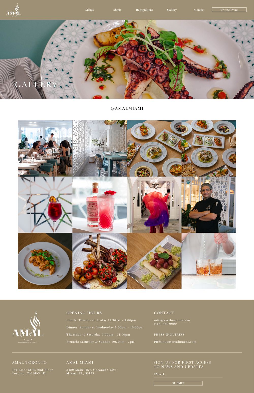
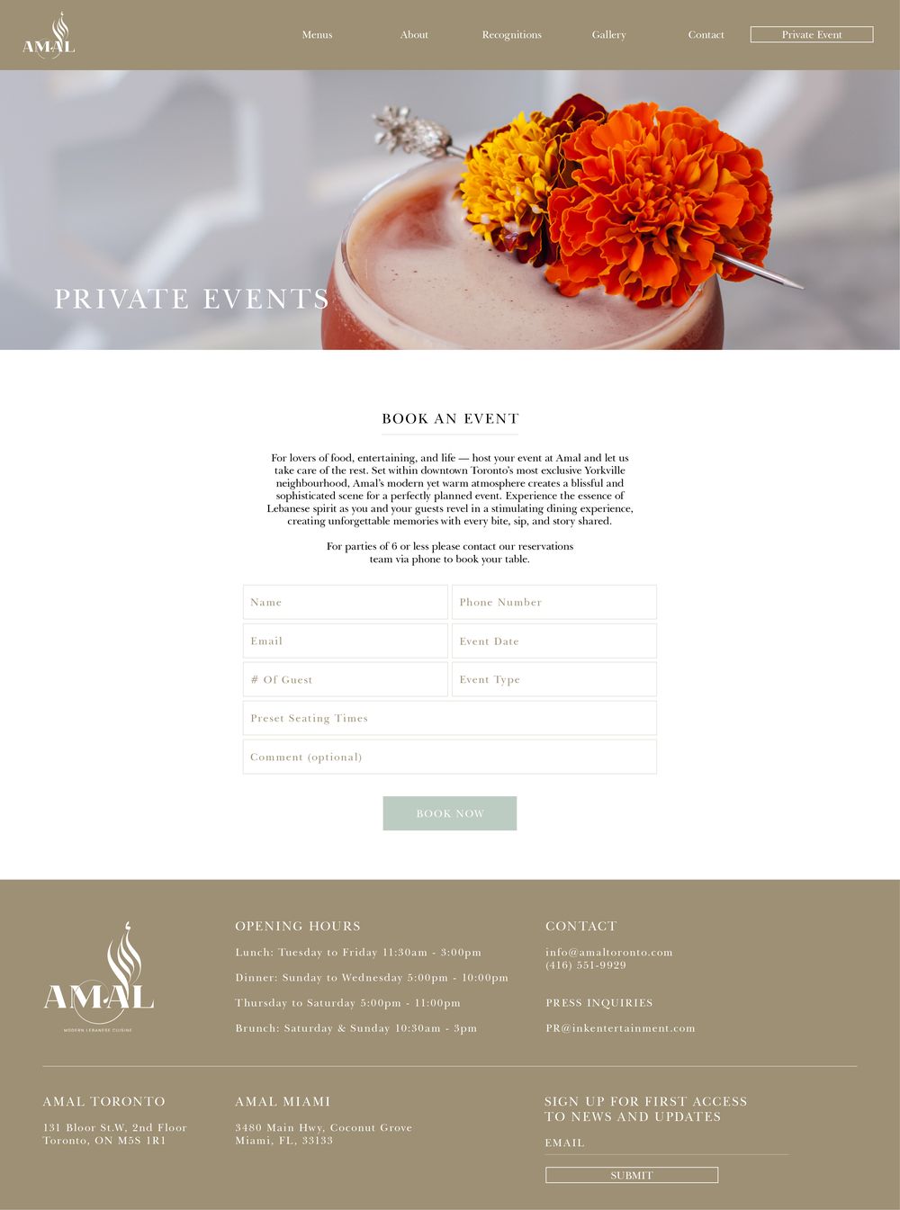
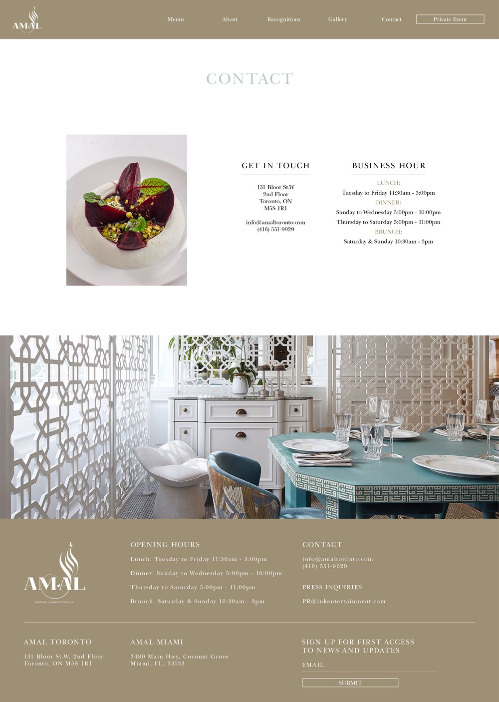
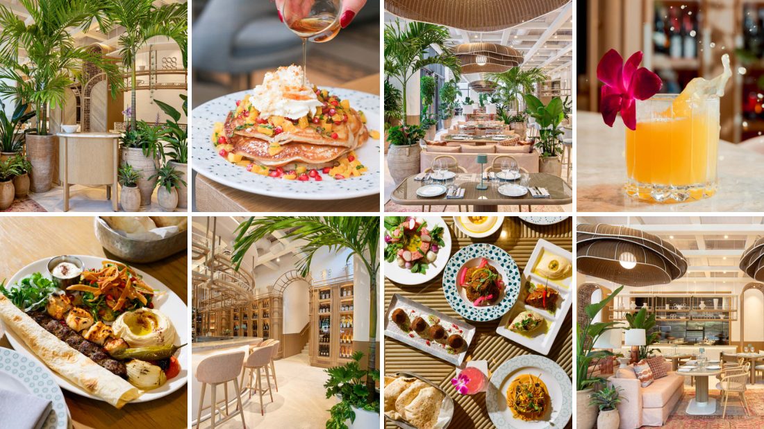
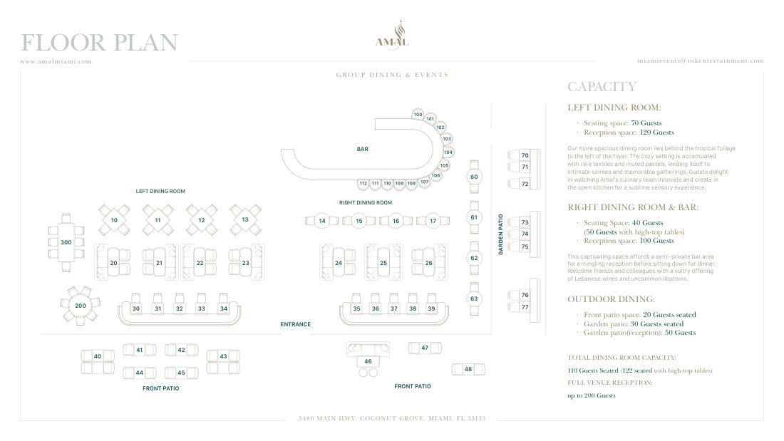
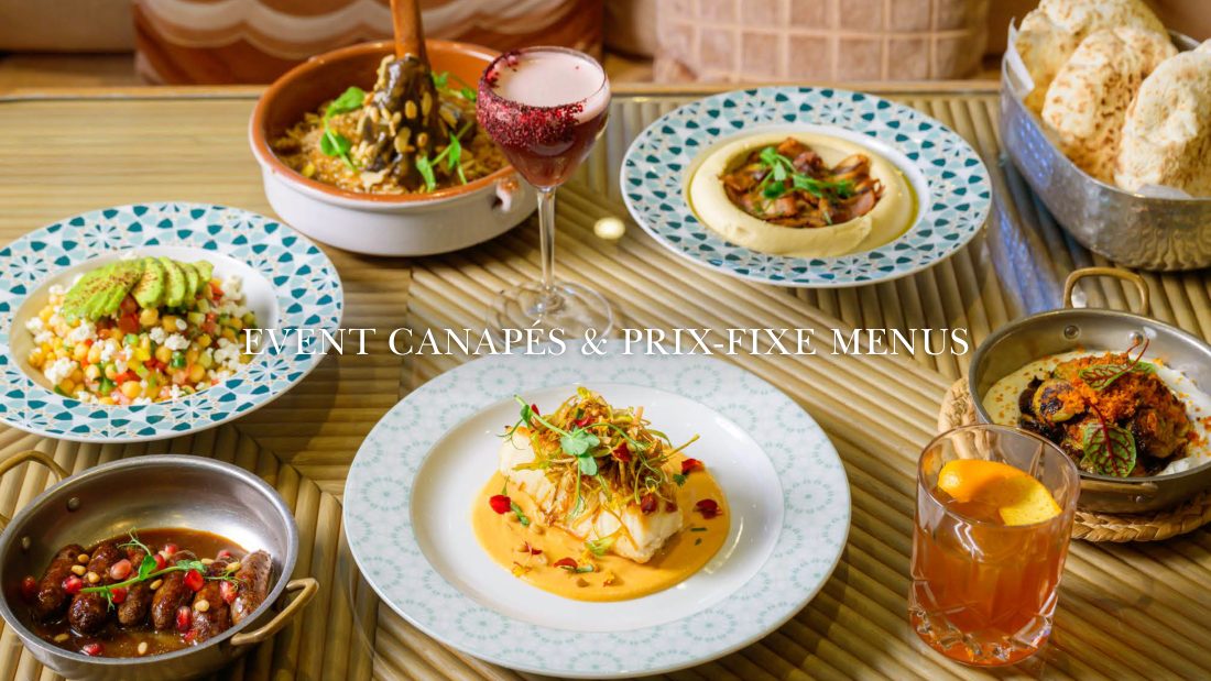
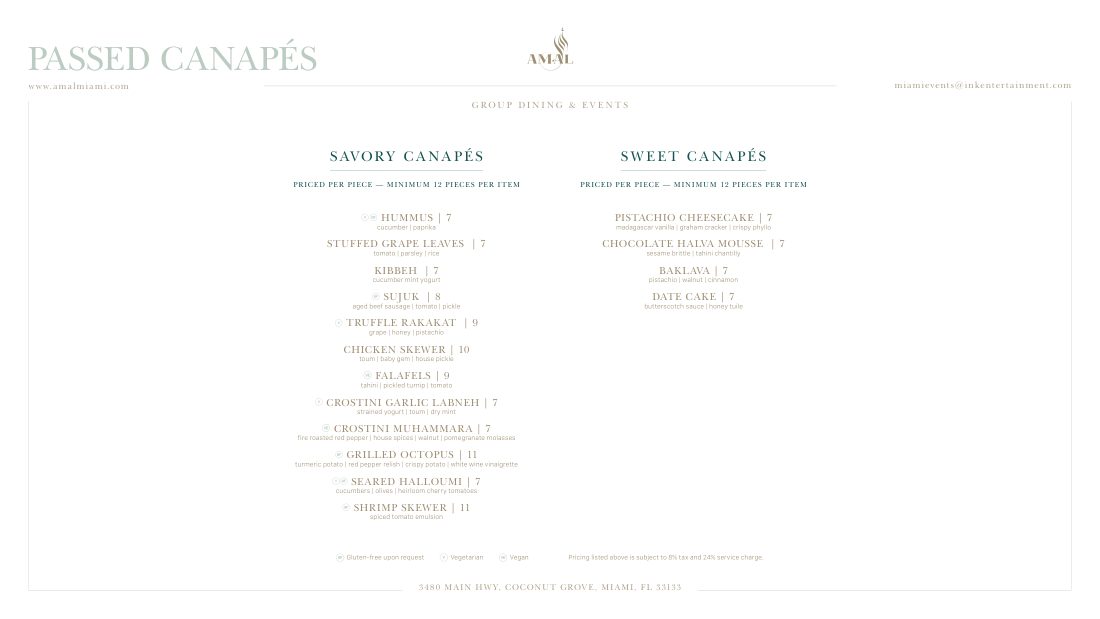
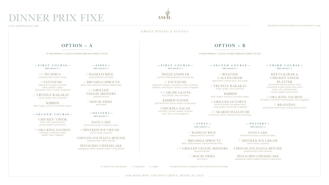
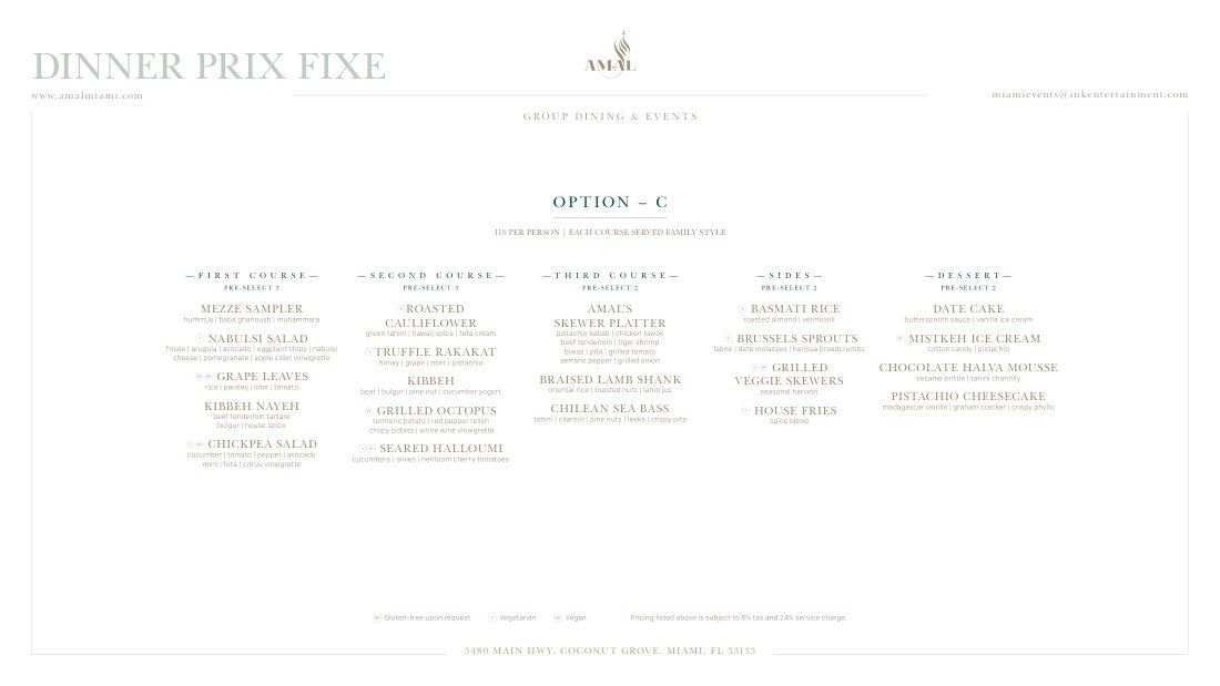
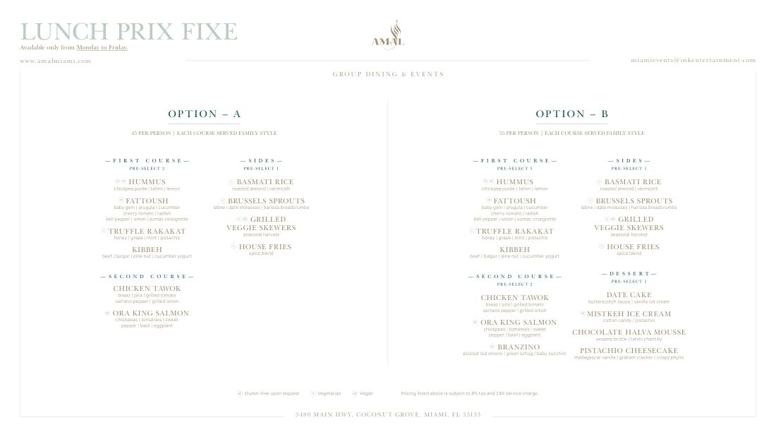
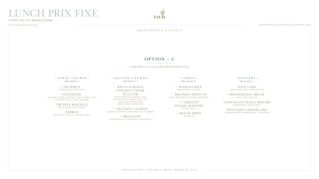
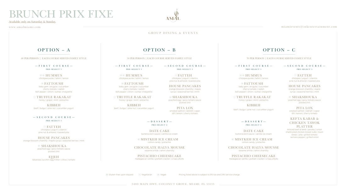
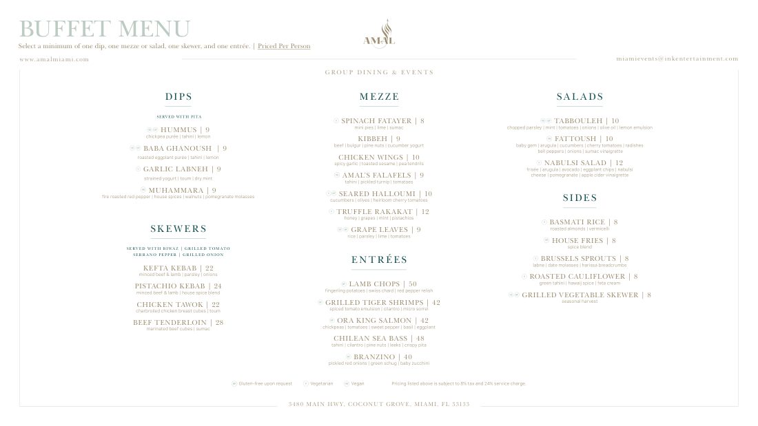
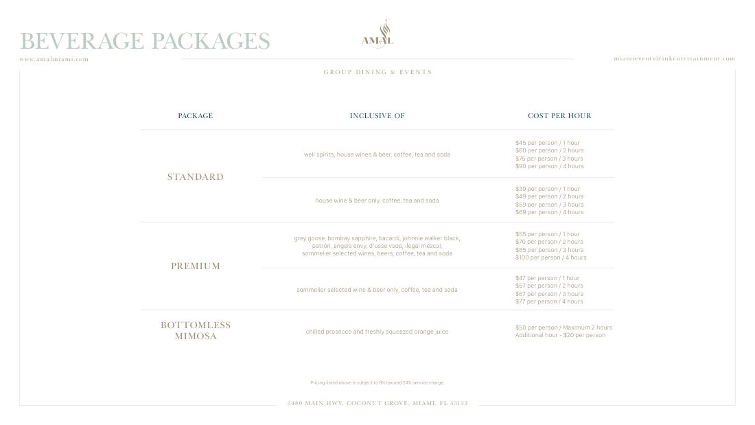
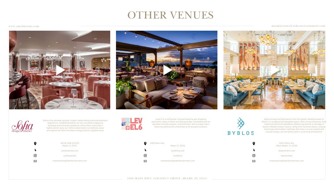
New layers built on top of the brand: a script font for celebrations, a wax seal, watercolour, gold line work and olive imagery. Each one used across menus, print, motion and digital, for three venues.
04The result
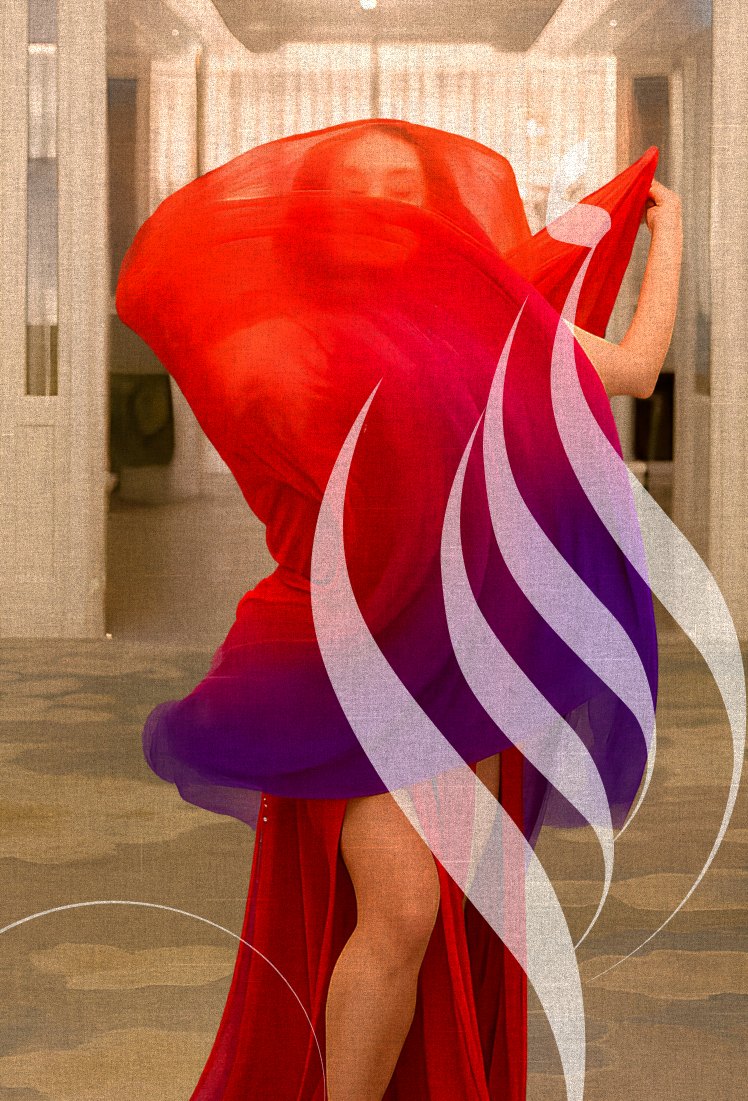
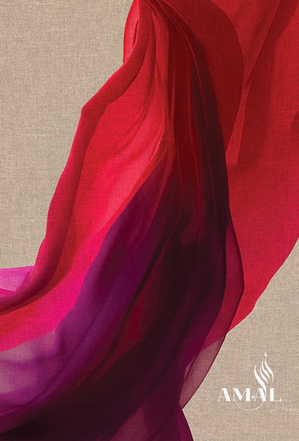
The logo, colours and type stay exactly as they were. The new layers live around them, so every piece feels fresh but still reads as Amal.