
Making 30 Hazelton clear, consistent and recognisable.
My role was to help 30 Hazelton communicate its services and personality through design. Across every touchpoint, I paired clear information with a shared visual identity.
This case study explores how those choices created a more cohesive brand experience, helping guests get to know the spa and explore their next beauty visit.
challenge
Complex treatments, explained simply.
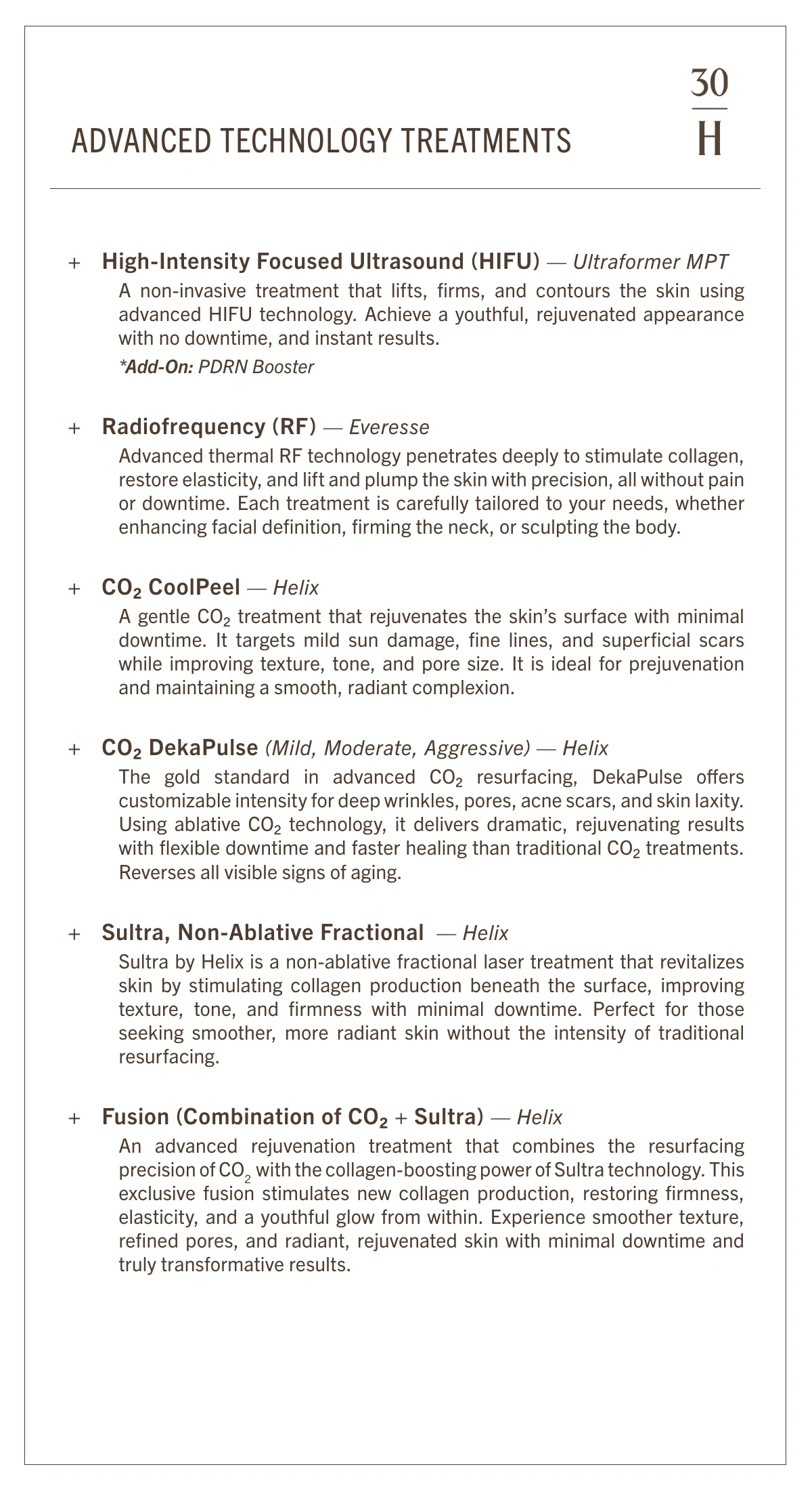
Lasers, ultrasound, radiofrequency, facials. Each one has its own technology and its own words.
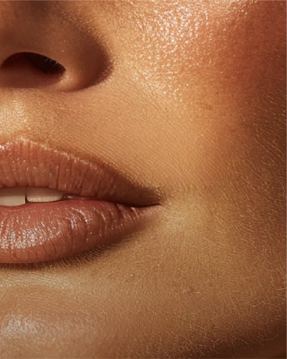
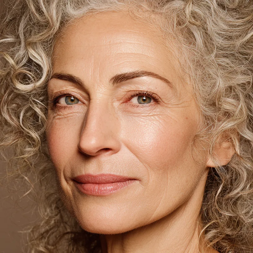
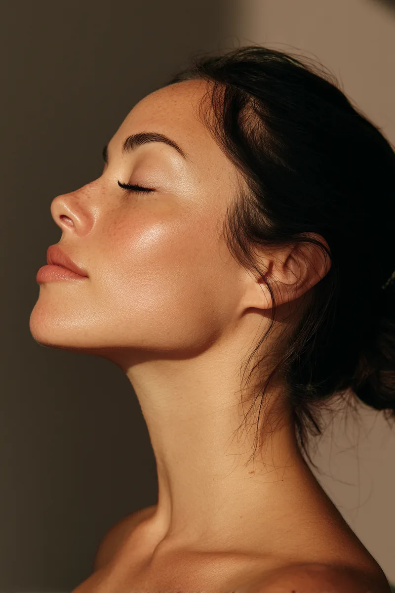
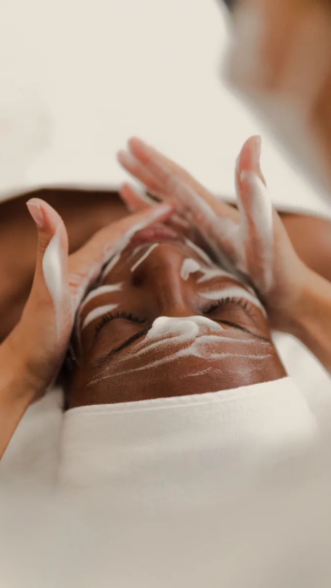
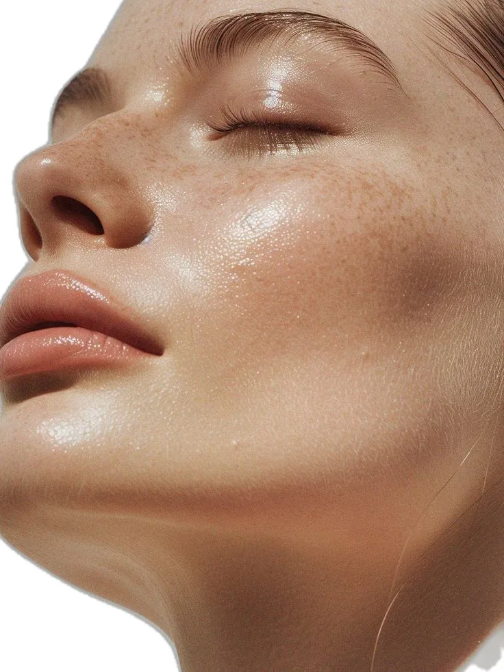
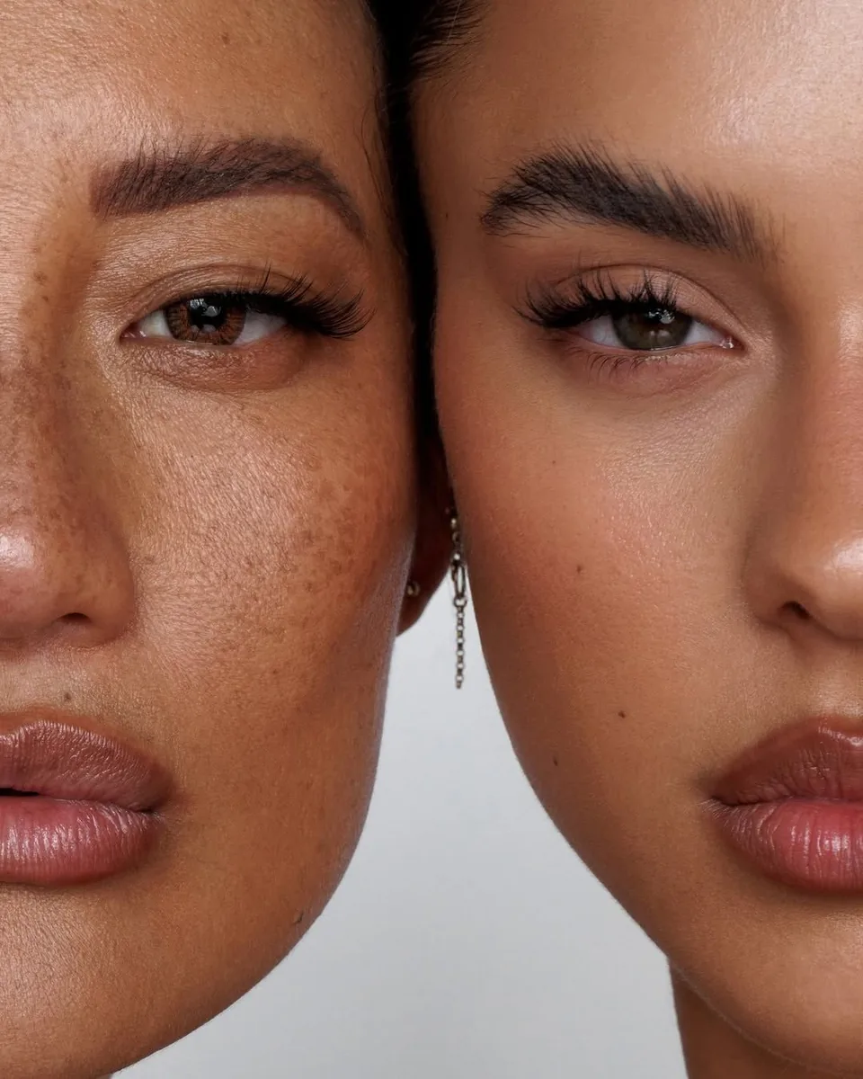
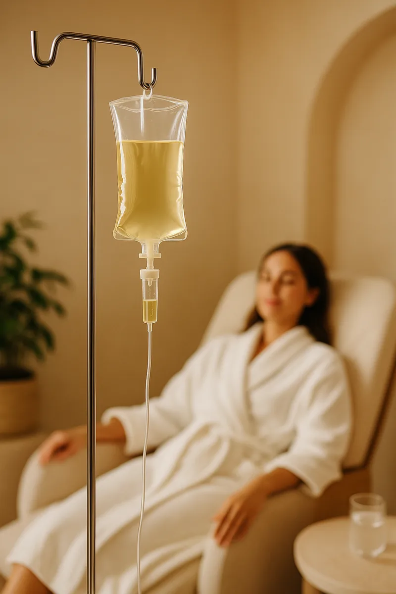
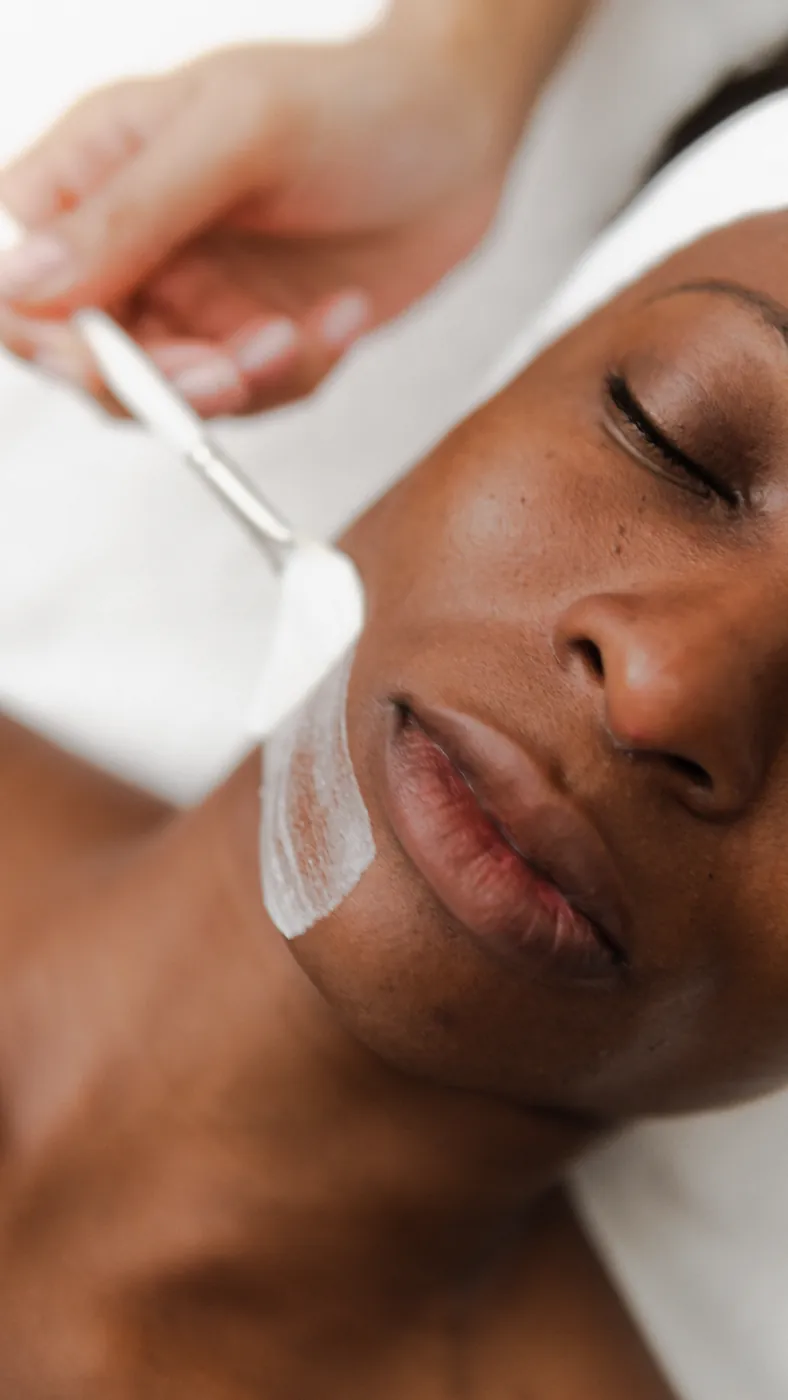
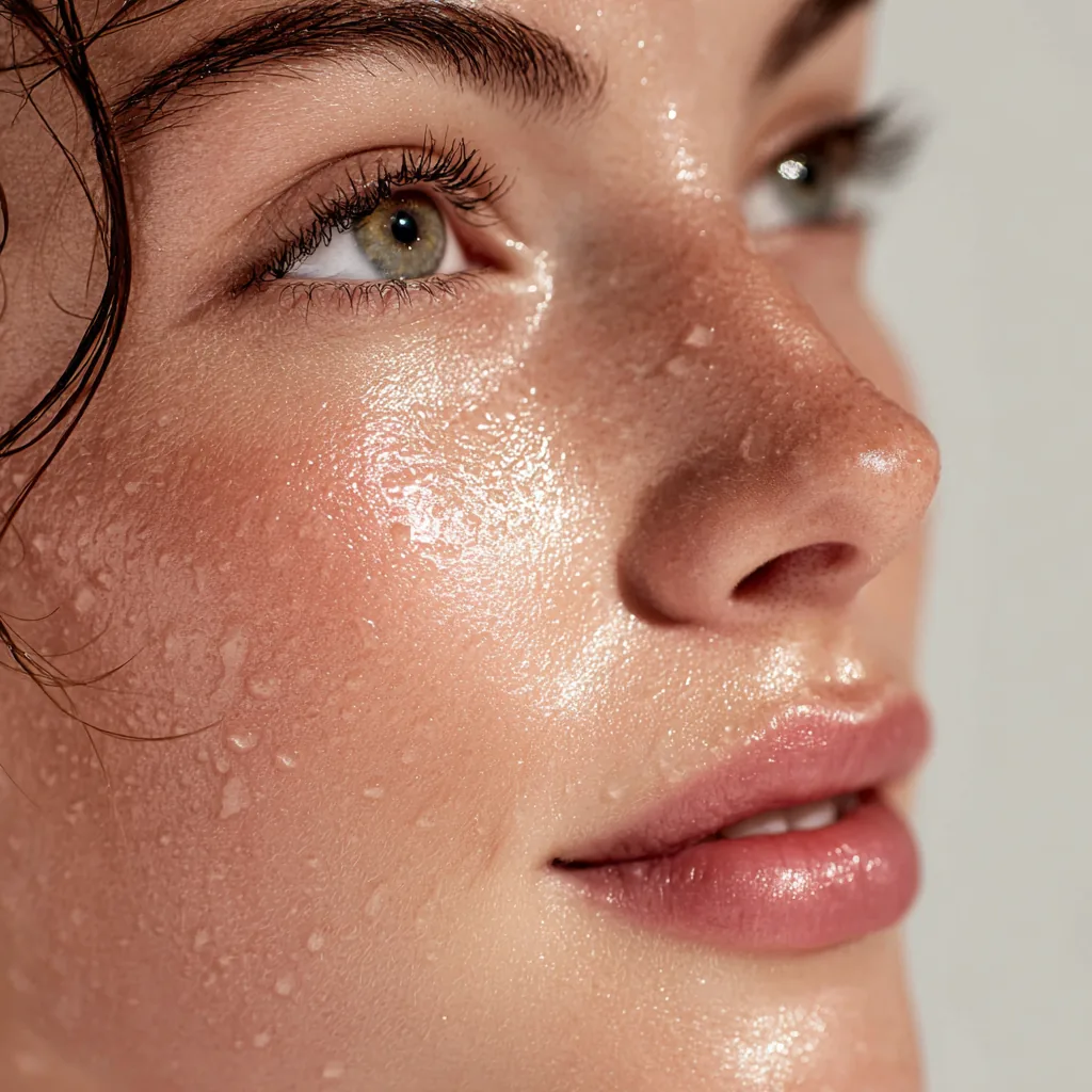
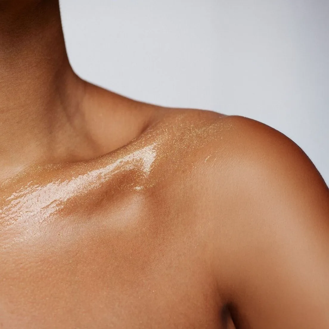
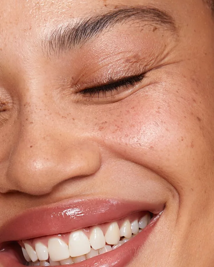
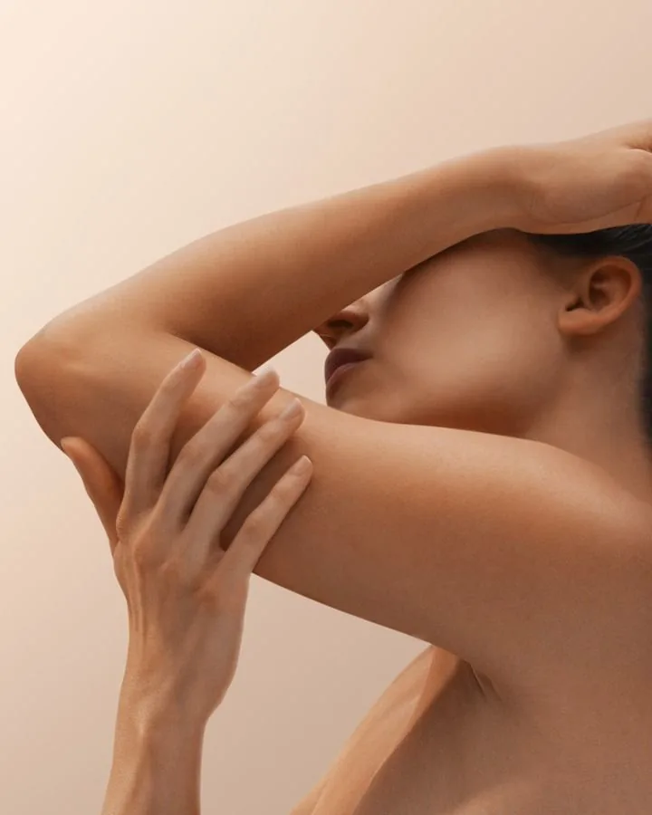
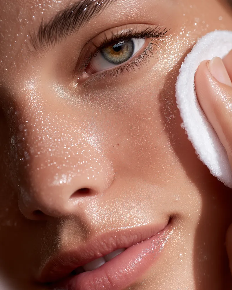
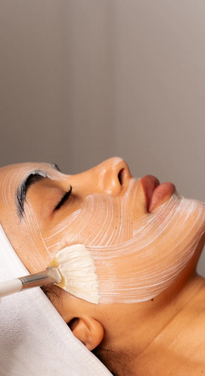
A guest should understand a treatment at a glance. So the images had to show real skin in many tones, look medical enough to trust and warm enough to feel like a spa.
Lead with skin, not machines.
Devices look cold and mean little to a guest. Close-ups of real skin, in many tones, feel warm and still look medical.
role
I didn’t design the brand. I designed everything it went on.
An outside brand agency was contracted to create the logo and brand guidelines. I took it from there and designed everything else.
I decided how the information was organized, which images to use and how the brand worked in each format. Then I refined each piece with the spa team’s feedback.
Starting point · Brand agency
The brand
- Logo and identity
- Brand guidelines
- First application ideas
Input · Spa team
The content
- Treatment knowledge
- Feedback
- Event ideas, like Passport to Seoul
My work · Everything after
The design
- Website layouts (desktop)
- Packaging
- Event collaterals
- Newsletters
website
Every page reads the same way.
It starts with the website. Every treatment page follows one order: what it does, the benefits, how long it takes, who it suits, then book.
Once guests learn the pattern, they know where to look on every page. I designed the website and built these interactive pages. Click the tabs, or the site’s own menu, to move between them.
Book NowThe Science of Subtlety
Relax, Reset and Return to the world entirely at ease.
Explore ServicesWelcome to 30 HAZELTON
Your private sanctuary where advanced aesthetics meet the science of subtlety at the heart of our DNA. Here, timeless sophistication is reflected in every detail, and each treatment is delivered with precision, intention, and complete personalization. Through the seamless fusion of innovation and artistry, we reveal your skin’s most radiant self.
Start Your JourneyMedia
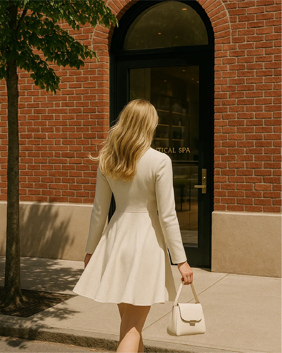
If You Know, You Glow
At 30 Hazelton, our spa is where advanced medical aesthetics meet the elegance of a luxury retreat. Created by INK Entertainment, we bring decades of expertise in hospitality to the world of beauty and self-care, redefining what a med spa experience can be.
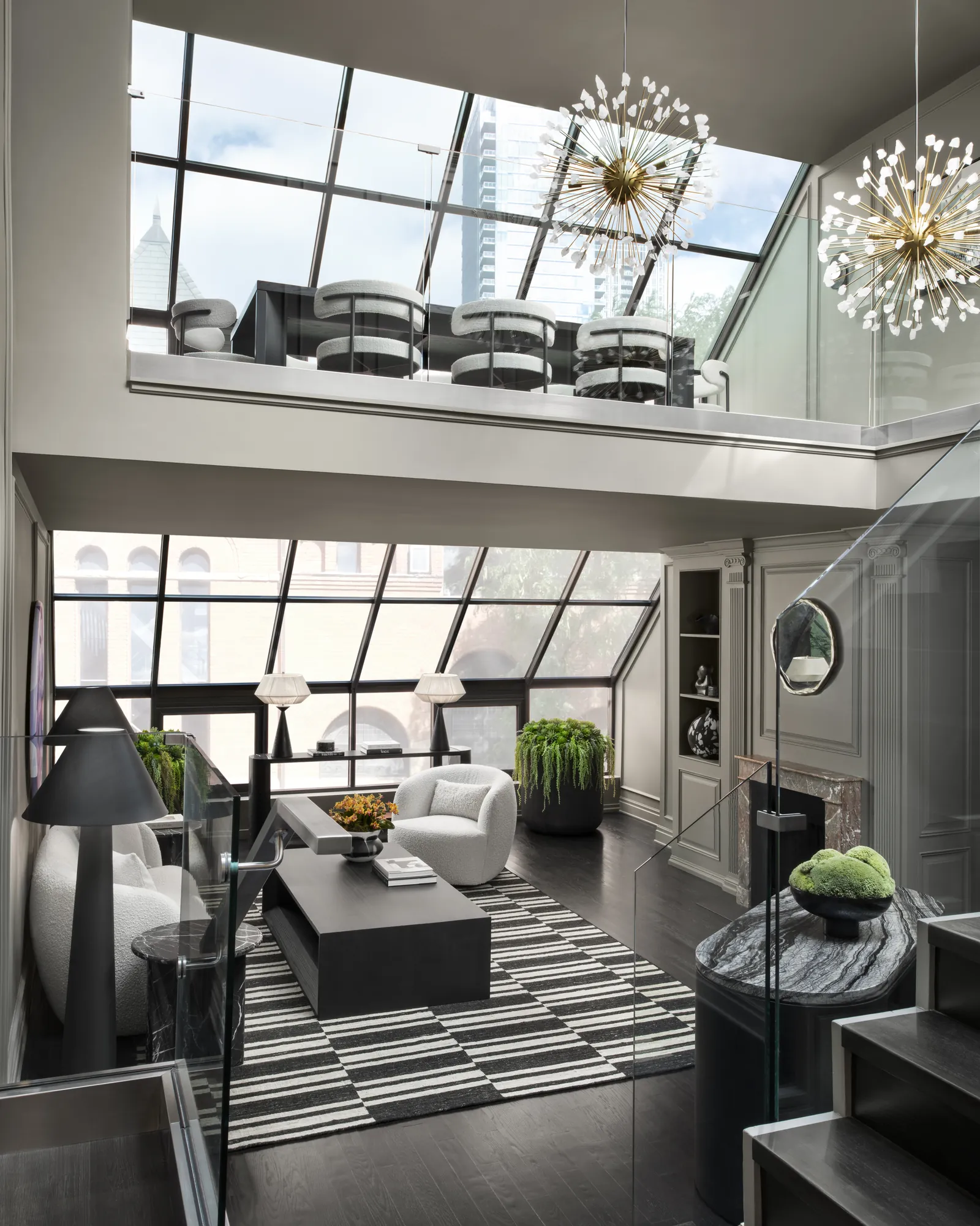
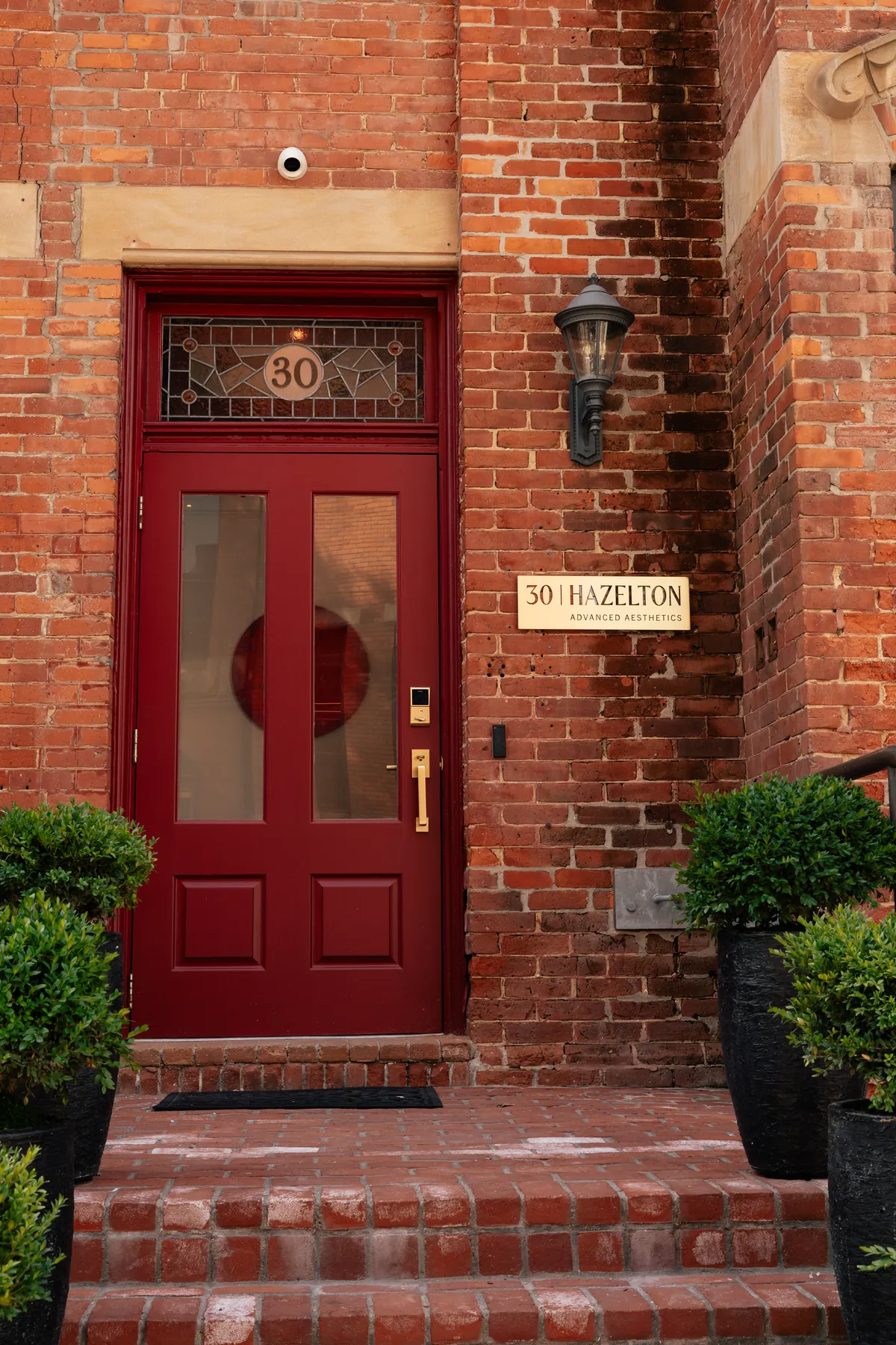
Located in Yorkville, our 4,200 sq. ft. space spans three floors with nine treatment rooms and an exclusive penthouse for private events.
Read MoreTreatments
Skin AnalysisLearn More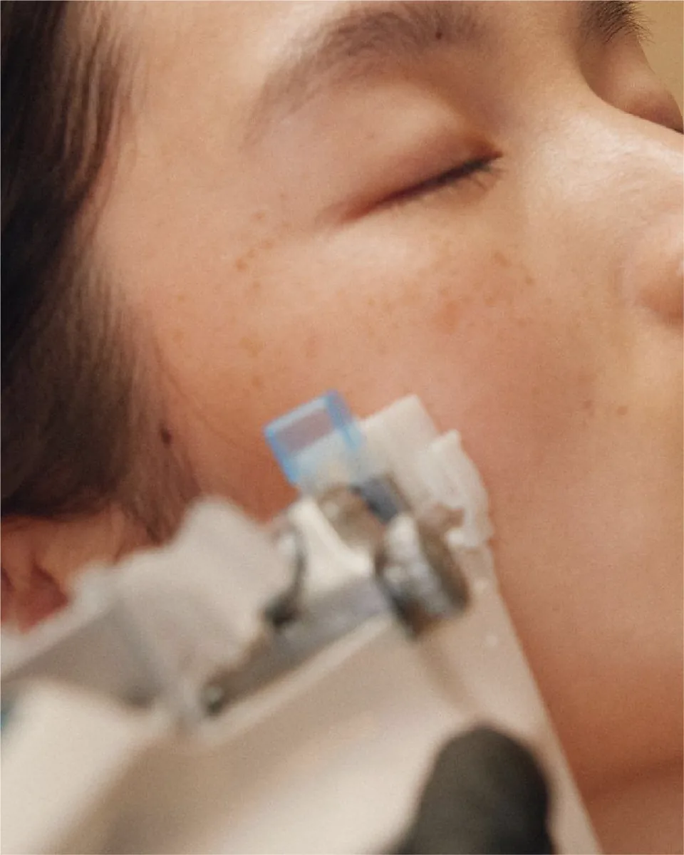 Skin Tightening
& LiftingLearn More
 Volumizing
& PlumpingLearn More
CustomizedFacialsLearn More
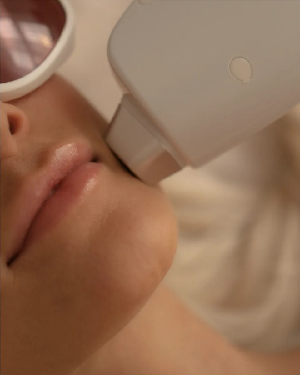 Laser Hair
RemovalLearn More
Strategic Partners
Learn More


Follow Us
@30hazelton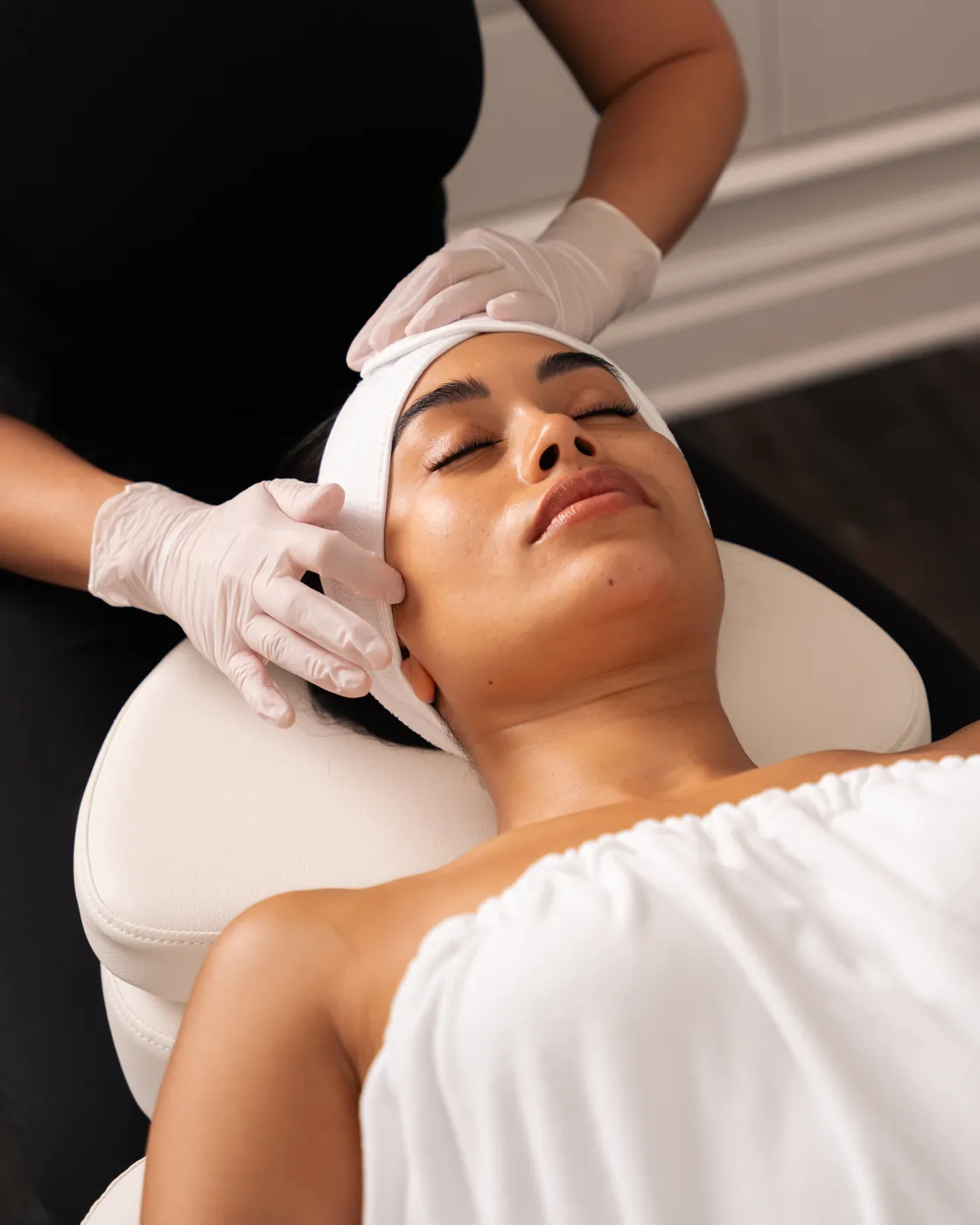
#followus
 Book Now
Our Story
At 30 Hazelton, our spa is where advanced medical aesthetics meet the elegance of a luxury retreat. Created by INK Entertainment, we bring decades of expertise in hospitality to the world of beauty and self-care, redefining what a med spa experience can be.
Located in Yorkville, our 4,200 sq. ft. space spans three floors with nine treatment rooms and an exclusive penthouse for private events. Every detail, from our contemporary design to our curated menu of globally renowned treatments, is crafted to deliver results while offering a deeply restorative experience.
Our Services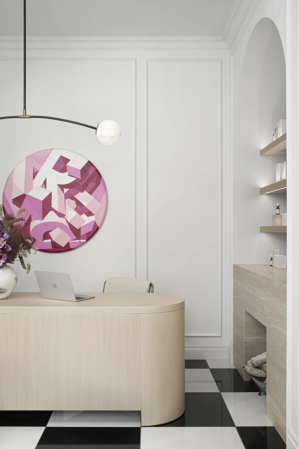
What Makes Us Different?
Inspired by the innovation of South Korea’s skincare philosophy, our approach focuses on layering and customizing treatments for long-term, transformative results. With state-of-the-art technology, white-glove service, and an environment designed for comfort, our spa is a sanctuary where beauty, science, and luxury come together.
Reason 01
Korean philosophy
Treatments are layered and customized for long-term, transformative results.
Reason 02
Hospitality by INK
Decades of hospitality expertise, brought to beauty and self-care.
Reason 03
Three floors in Yorkville
Nine treatment rooms and an exclusive penthouse for private events.
Book NowServices
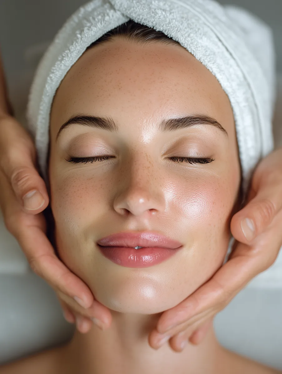 Customized
FacialsLearn More
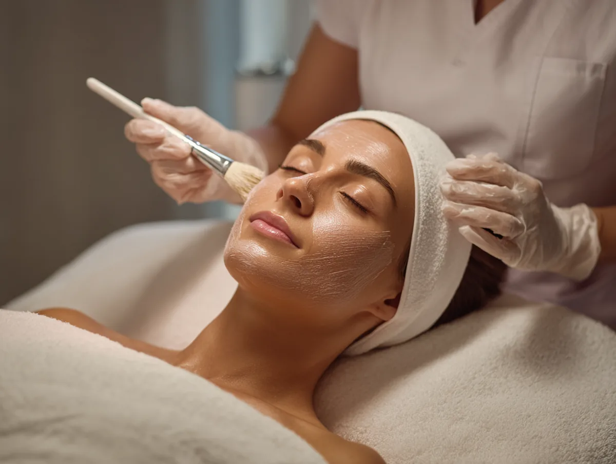 Hollywood
Carbon FacialLearn More
Semi-PermanentMakeupLearn More
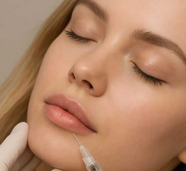 Cosmetic
InjectablesLearn More
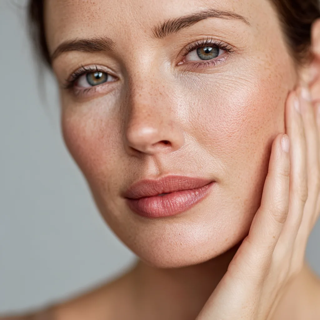 MicroneedlingLearn More
Technology
EveresseLearn More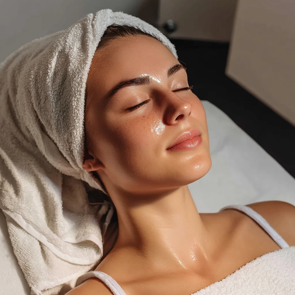 Ultraformer MPTLearn More
 HelixLearn More
 Motus AZ+Learn More
 Red TouchLearn MoreBook Now
Concerns
At 30 HAZELTON, we believe that true beauty is personal and bespoke. Every treatment we offer is thoughtfully tailored to your individual needs, goals, and lifestyle. Whether your desire is to restore youthful volume, achieve subtle yet defined lift and contour, refine skin texture with resurfacing, or address pigmentation concerns with precision, our cutting-edge technologies are expertly combined with refined techniques to deliver results that not only enhance your natural beauty but also feel as exquisite as they look.
 Volumizing
& PlumpingLearn More
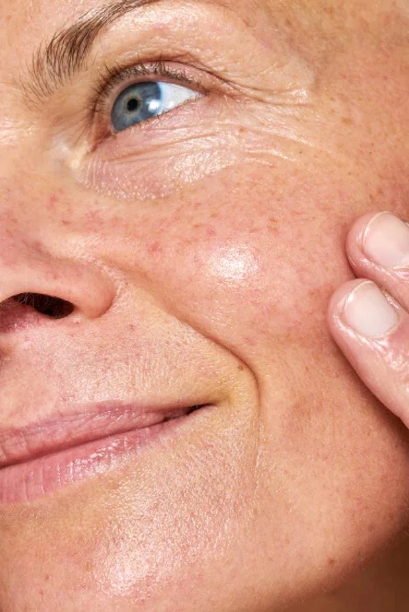 Lifting, Firming
& ContouringLearn More
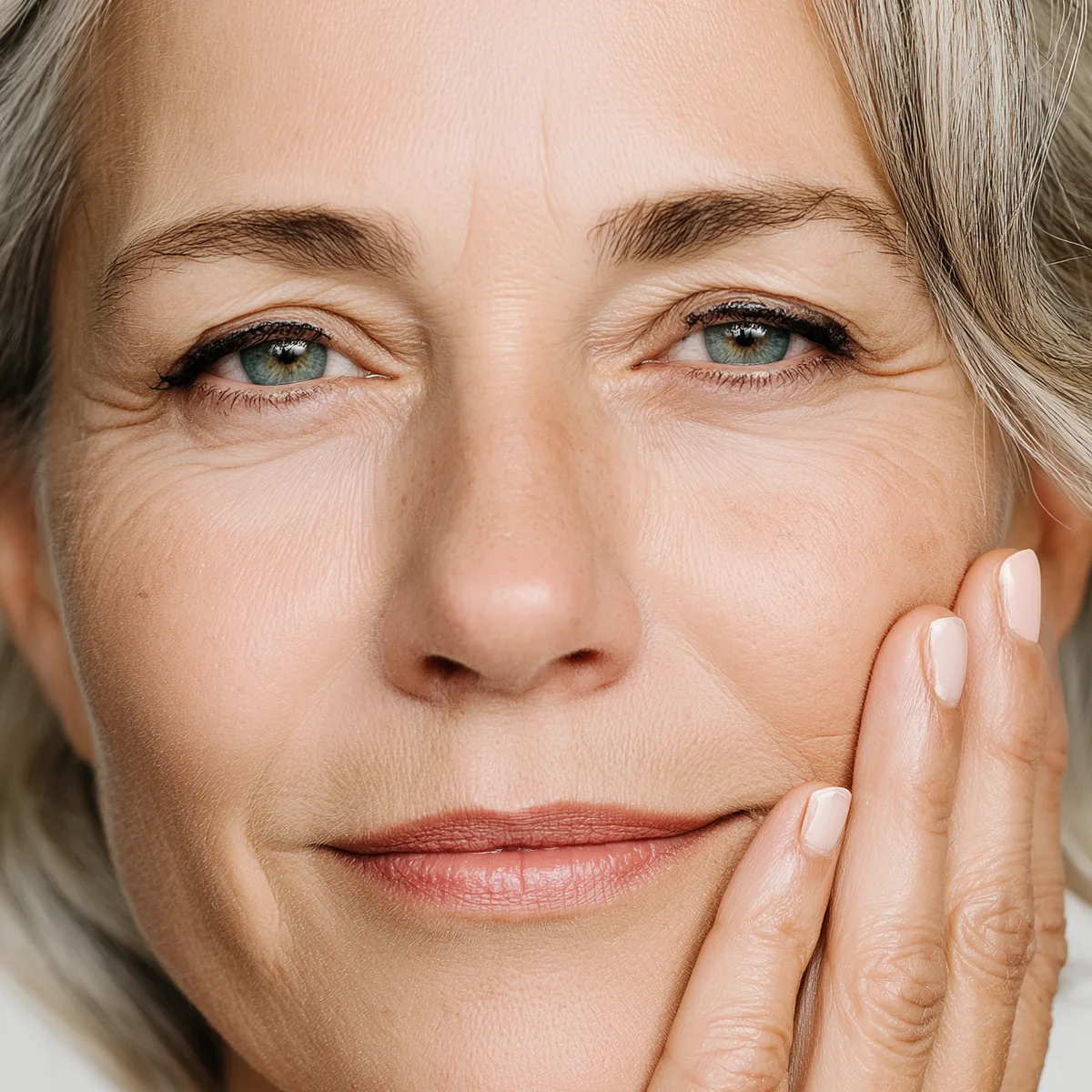 Collagen
ProductionLearn More
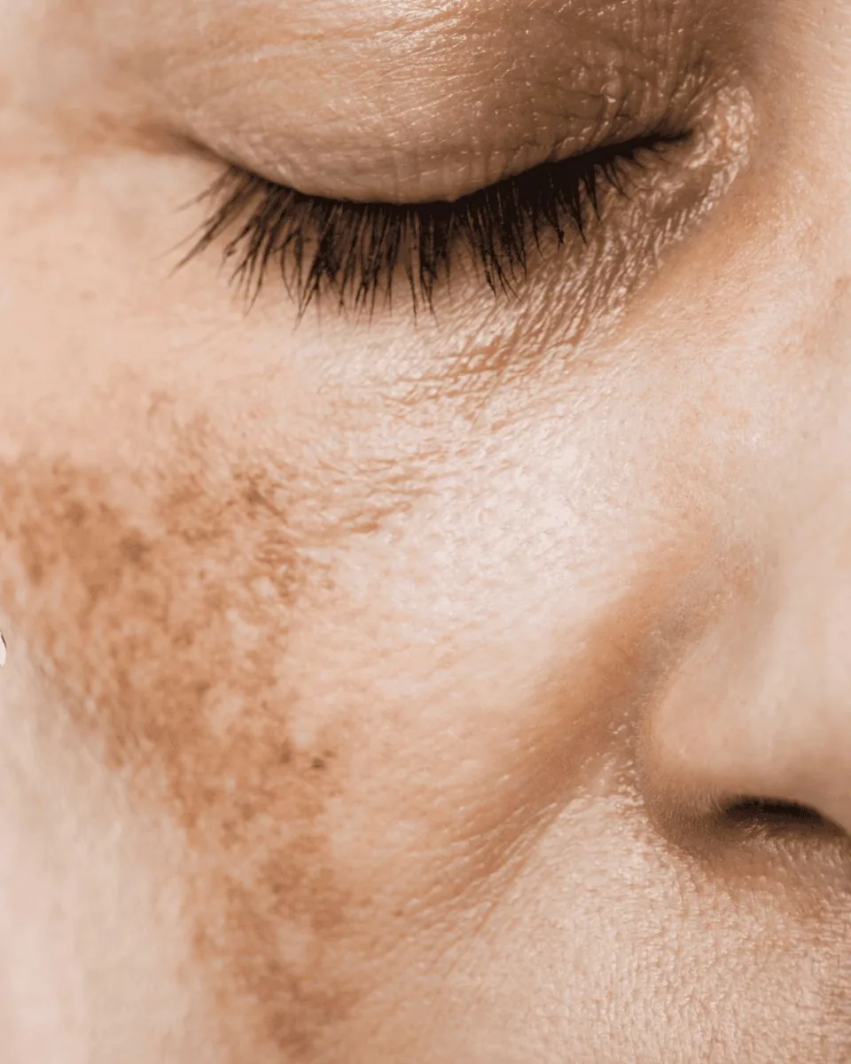 Target
PigmentationLearn More
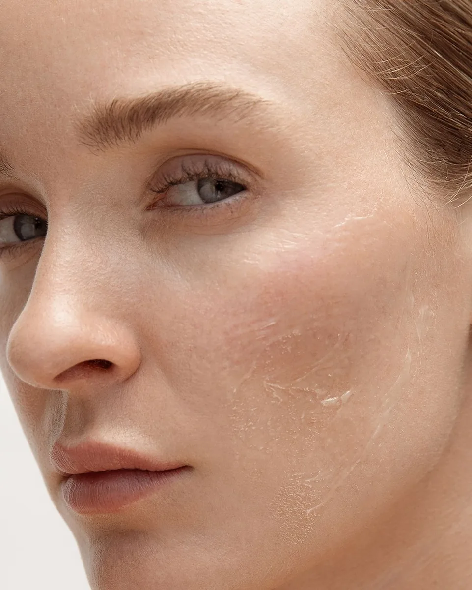 ResurfacingLearn MoreAcne ScarsLearn More
 Laser Hair
RemovalLearn More
All Treatments
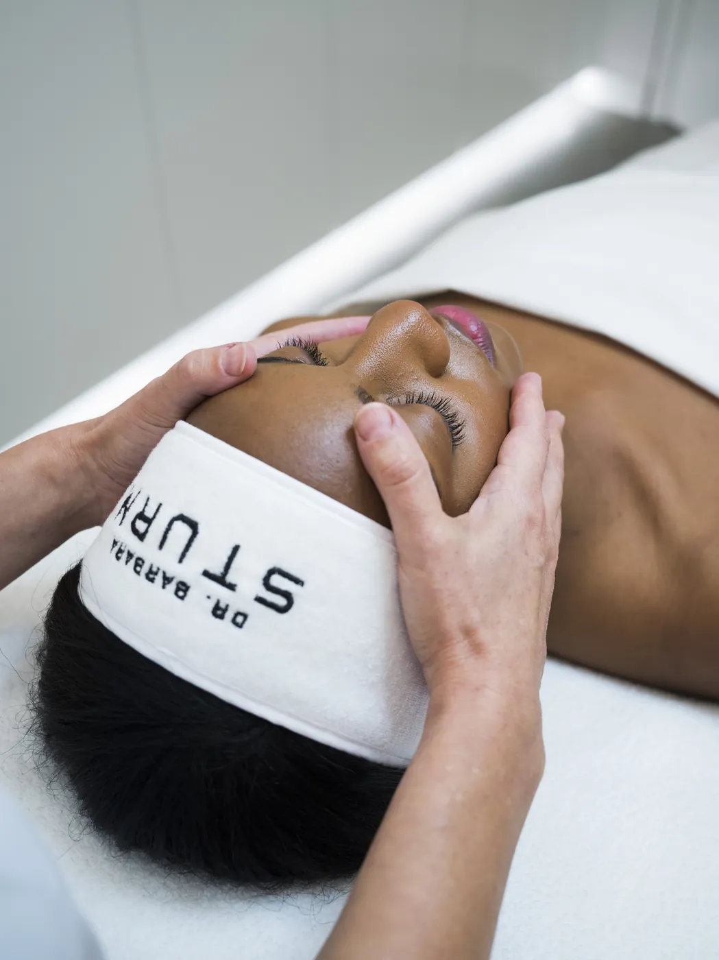
Book NowSturm Glow Facial
The world-renowned facial that leaves skin luminous, refreshed, and glowing with Dr. Sturm’s signature radiance.
- Key Benefits
- Leaves the skin radiant, refreshed and with the sought-after signature sturmglow™
- Boosts and strengthens skin barrier function
- Improves overall skin health and skin matrix
- Time
- 60 mins
- Suitable For

Treats stressed skin 
Evens skin tone 
Hydrating skin
Dr. Barbara Sturm Facials
 30H Exclusive
FacialLearn More
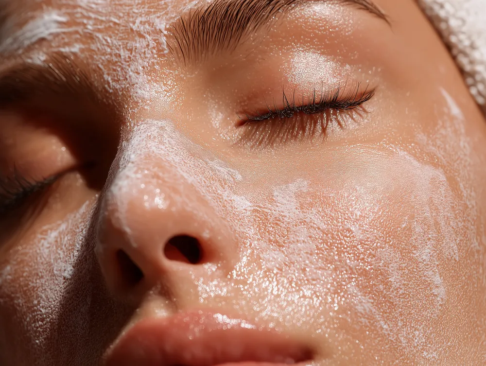 Bespoke
FacialLearn More
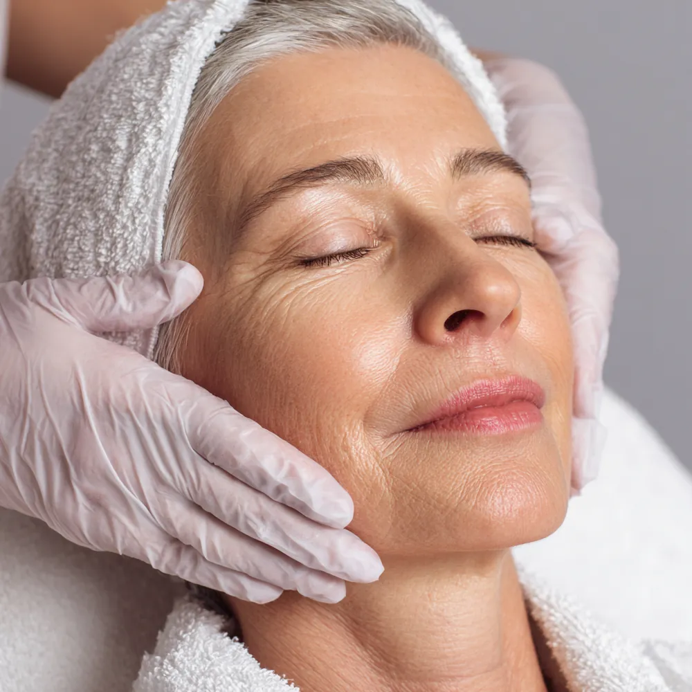 Super Anti-Aging
FacialLearn More
Book NowMembership
Tier 1
Select 1 service
Monthly Package
- Laser Hair Removal1 area per visit
- Microneedling + Booster
- Customized Facial
- Moveo Treatment
- Carbon Peel Facial
- Botox35 units
- Stylage Filler0.5 syringe
- Tattoo Removal
- $100 Credit toward Semi-Permanent Makeup
Add-Ons
- NucleoSkin or VTech · $100
- NucleoSkin & VTech · $150
- NAD Therapy · $200
- IV Drip (Boost) · $100
Tier 2
Select 1 service from Tier 1 & 2
Premium Package
- Red Touch Treatment
- Q-Switch Laser
- PRP Full Face
- Laser Hair Removal2 areas per visit
- Customized Facial
- Moveo Glo
- Carbon Peel Facial + Q-Switch
- Botox50 units
- Stylage Filler1 syringe
- IV Drip
- $200 Credit toward Semi-Permanent Makeup
Tier 3
Select 1 service from Tier 1, 2 & 3
Elite Package
- CoolPeelevery 6 weeks
- Pico Laser
- MesoAesthetics Chemical Peelevery 6 weeks
- Laser Hair Removal3 areas per visit
- Microneedling with BoosterNucleo + VTech
- Customized Facials
- Moveo Glo + Red Touch
- Carbon Peel Facial + Pico
- Botox70 units
- Stylage Filler2 syringes
- IV Drip
- $300 Credit toward Semi-Permanent Makeup
- Navigation
- The same five links and Book Now.
- Footer
- Same links, address and mailing list.
- Buttons
- Outline to browse. Filled to book.
- Tiles
- Serif name and Learn More, in full rows.
- Ending
- A Book a Consultation band.
journey
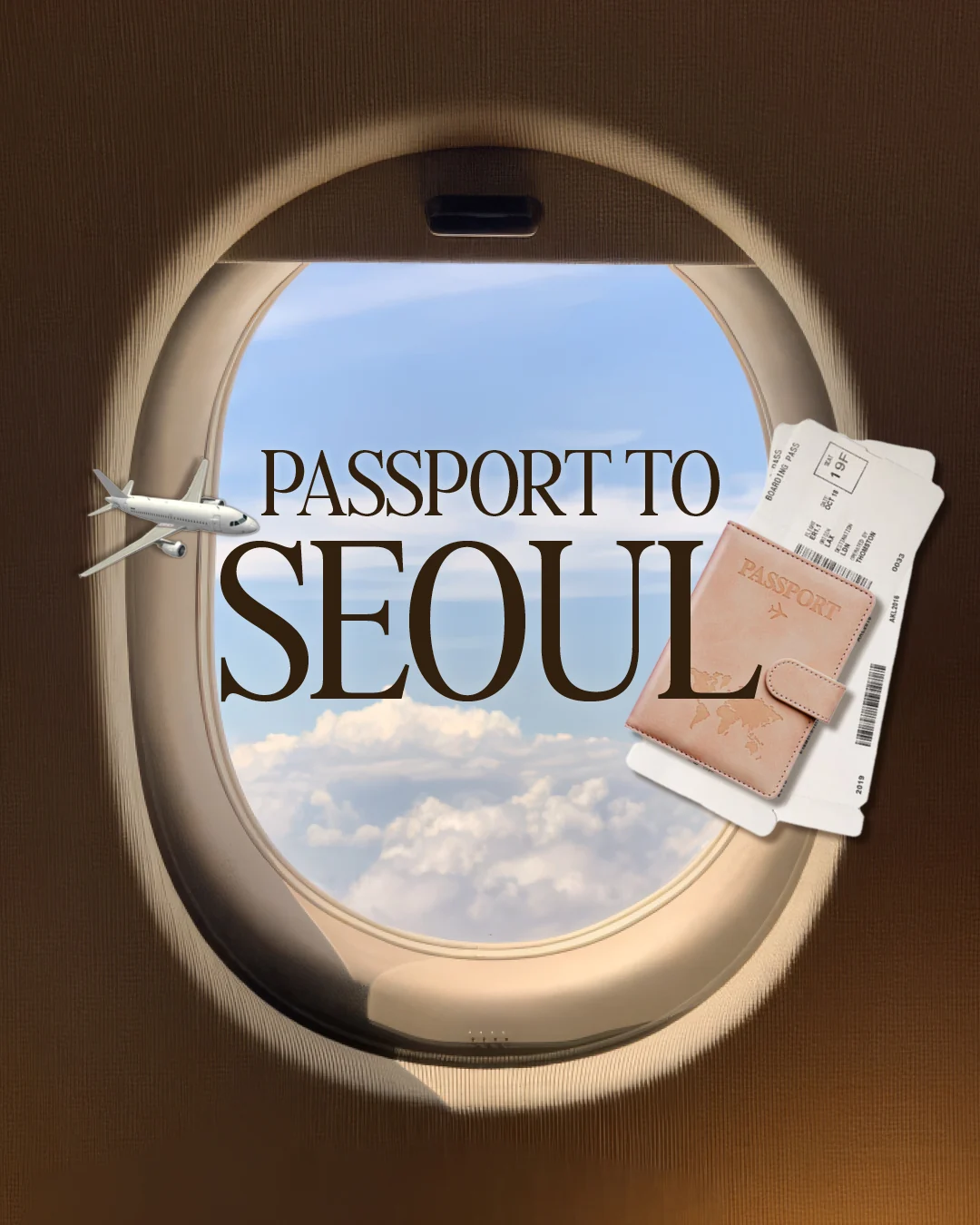
A trip through Korean skincare, without leaving Yorkville.
For the spa’s first anniversary, guests moved room to room to try Korean skin technology, then picked treatments to book at event prices.
The spa team’s brief: make it feel like flying to Korea for treatments, without having to travel.
Treatments became destinations.
Each treatment is a destination that invites guests to book the trip and get that treatment at a special event price.
Invitation
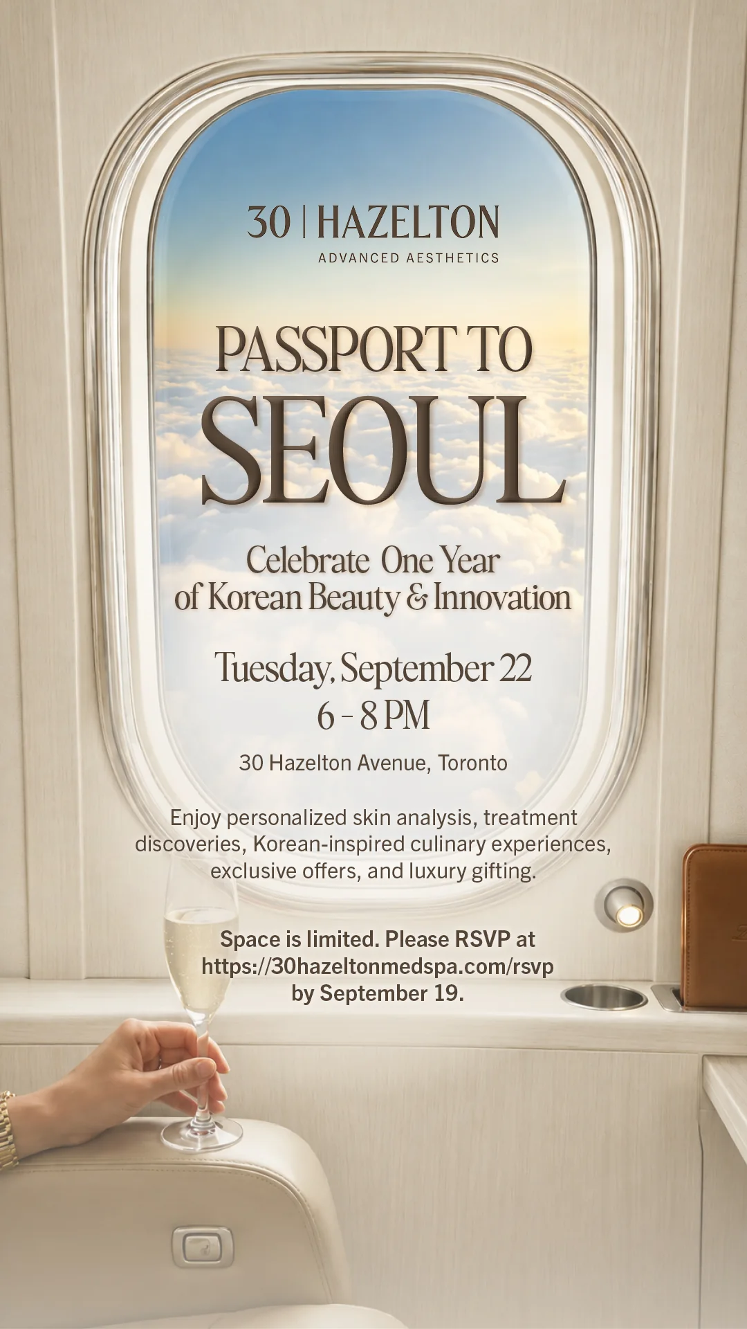
A plane window tells guests they’re going somewhere.
Looking out over the clouds puts them on the way to Korea before they read a word, and sets up the travel theme for the whole night.
Digital invitation, 1080 × 1920 px.
Passport
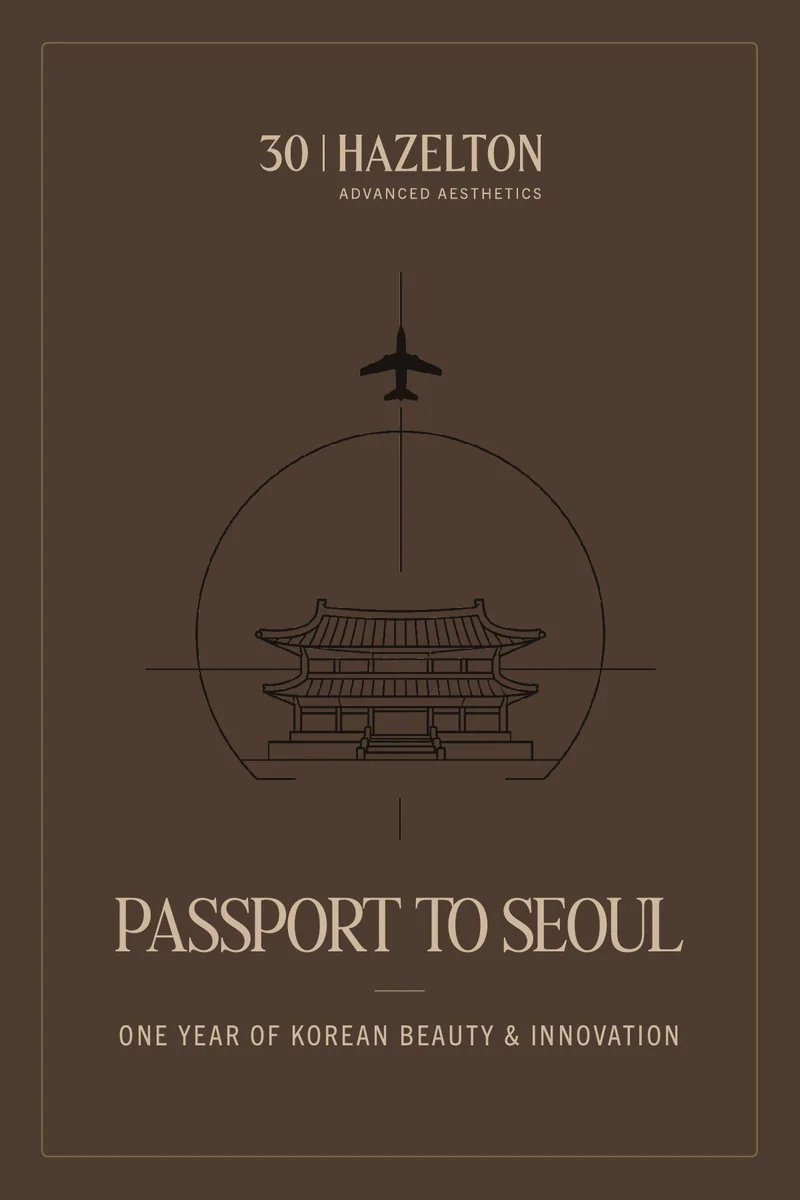

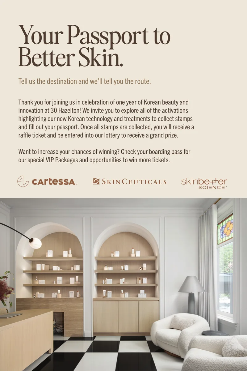
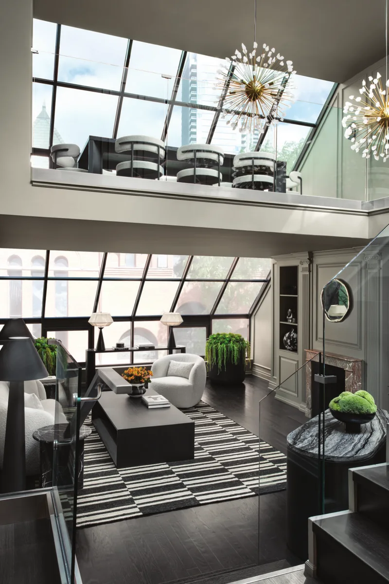
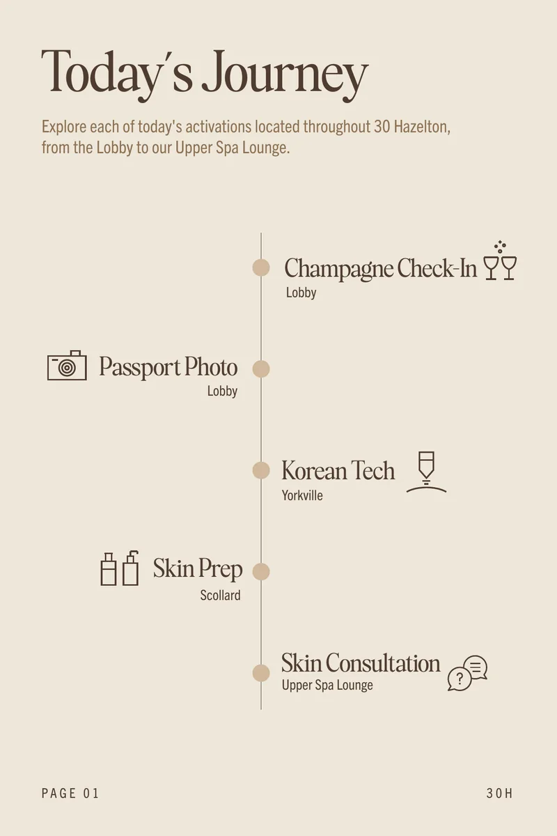

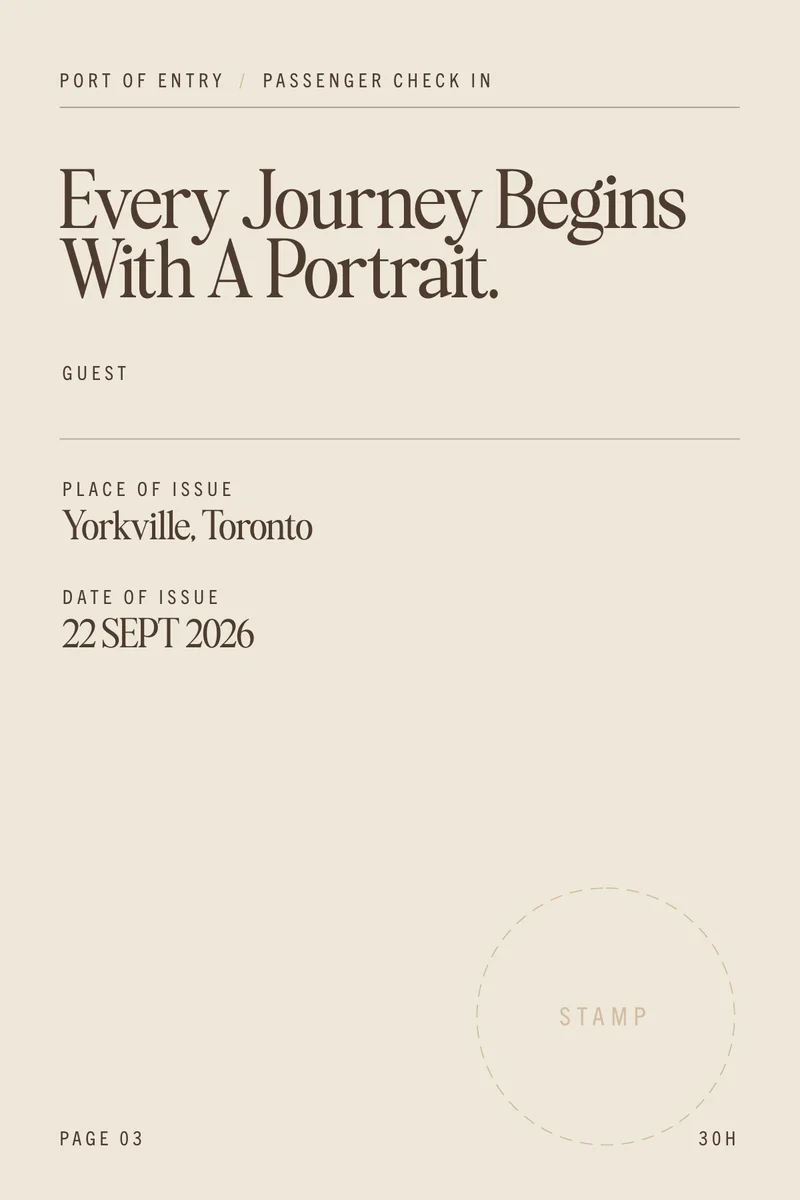
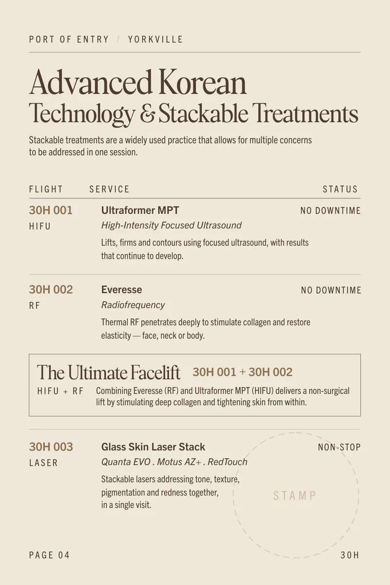
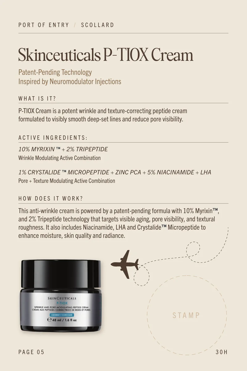
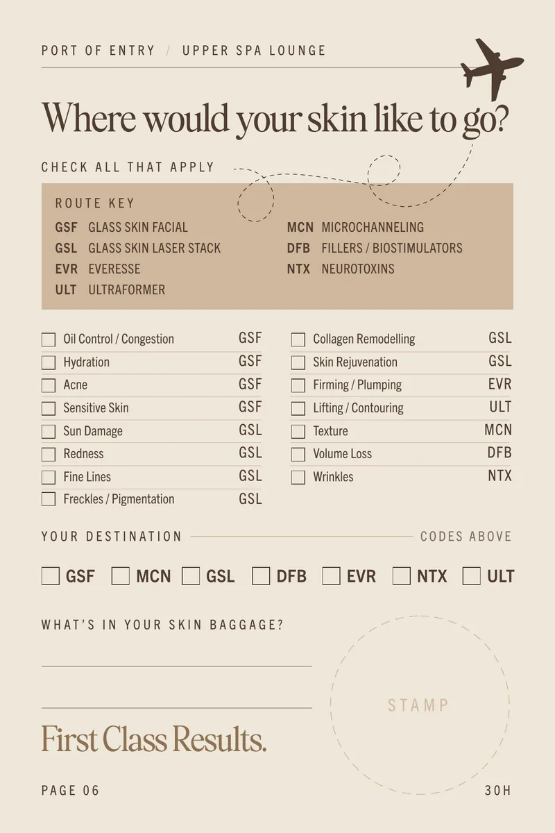


4 × 6 in, 12 pages.
Boarding pass
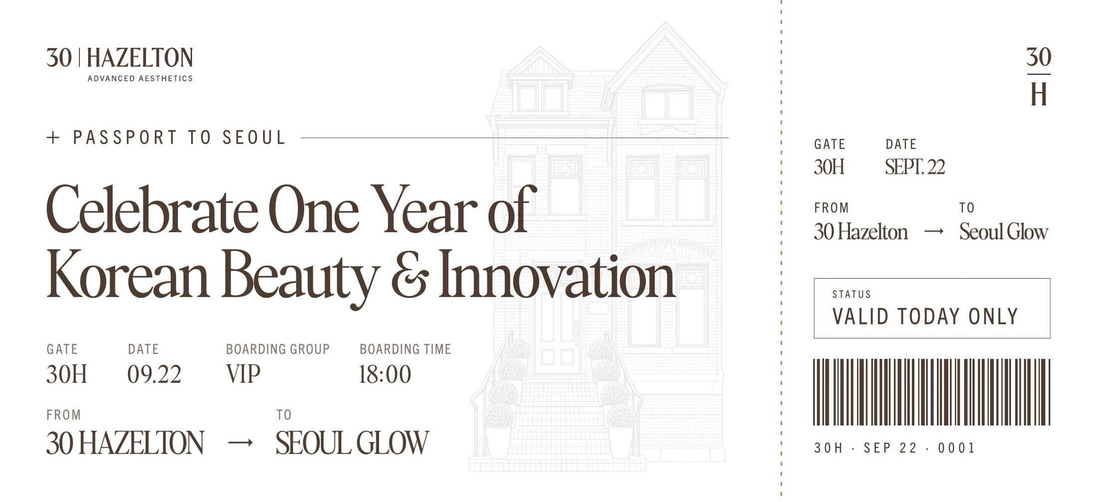
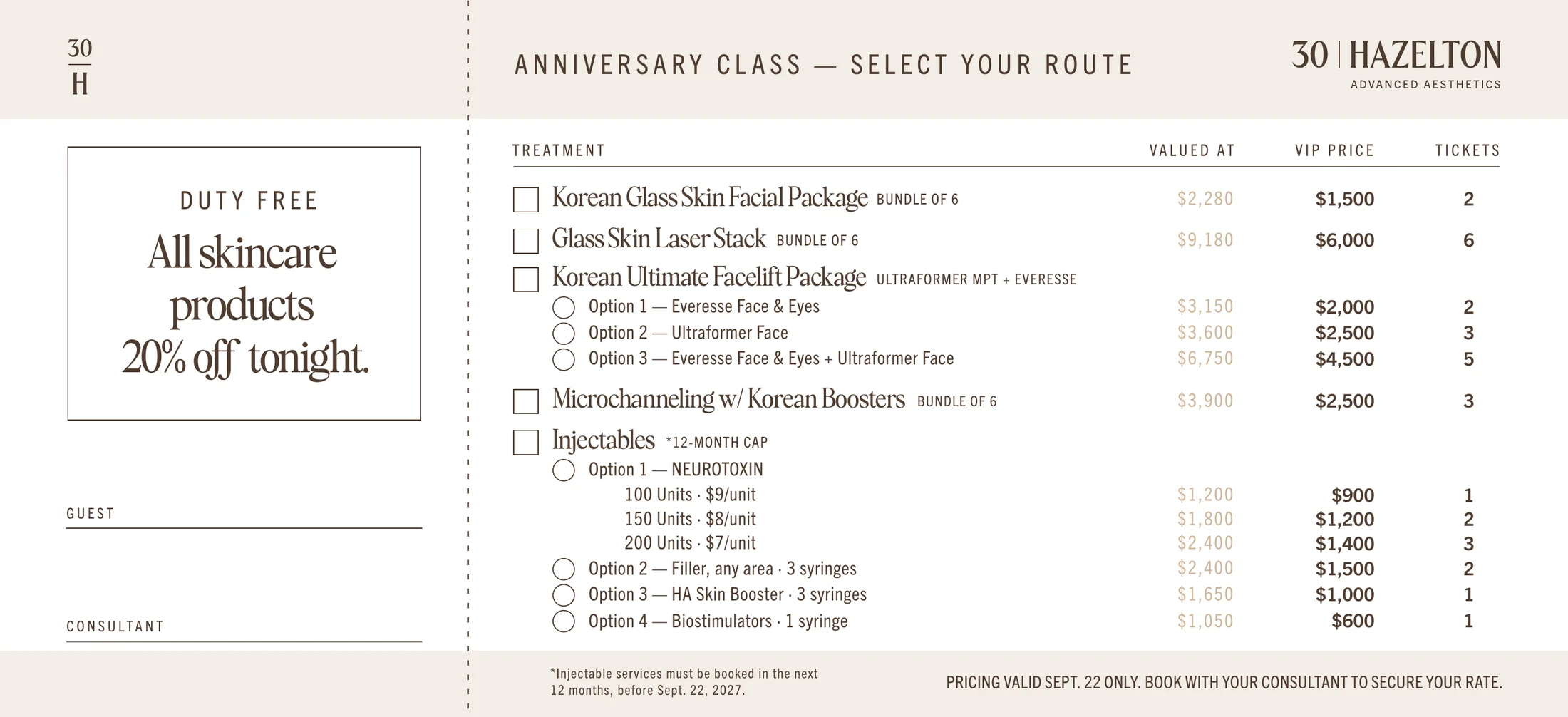
8.75 × 4 in, two sides. The back is a checklist of treatments and event prices. Rounded corners added for this presentation.
packaging
Two products, one family.
On a shelf, two products need to be told apart at a glance. Colour does that. Type and layout keep them in the same family.
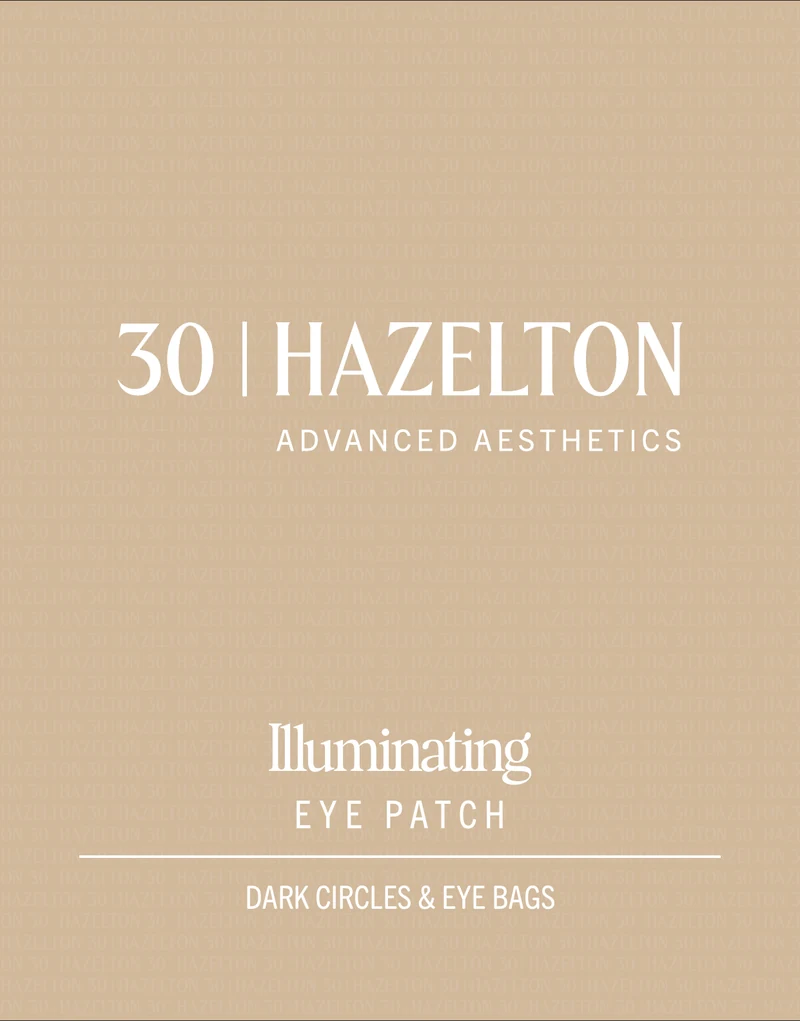
Carton and sachet artwork for Age Reset and Illuminating.
Dusty rose · Age ResetSand · Illuminating
Same layout, different colour.
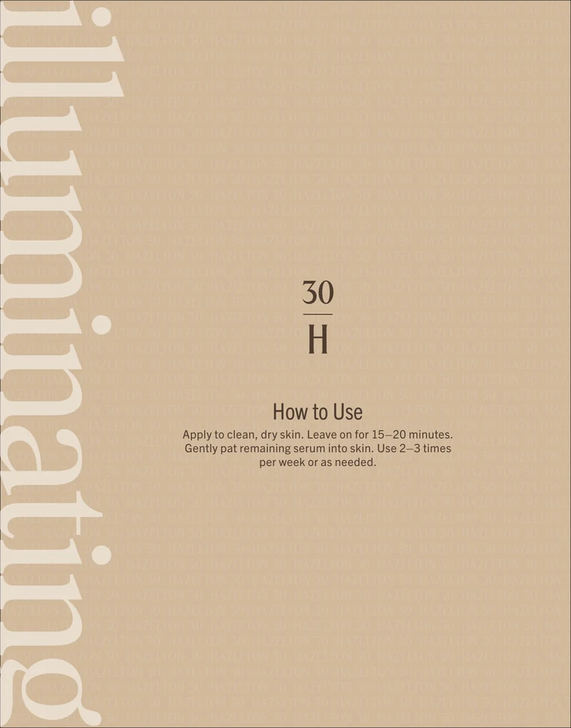
Guests can tell the two patches apart at a glance and still see one brand. The product name runs up the back, so it reads even when the box is turned.
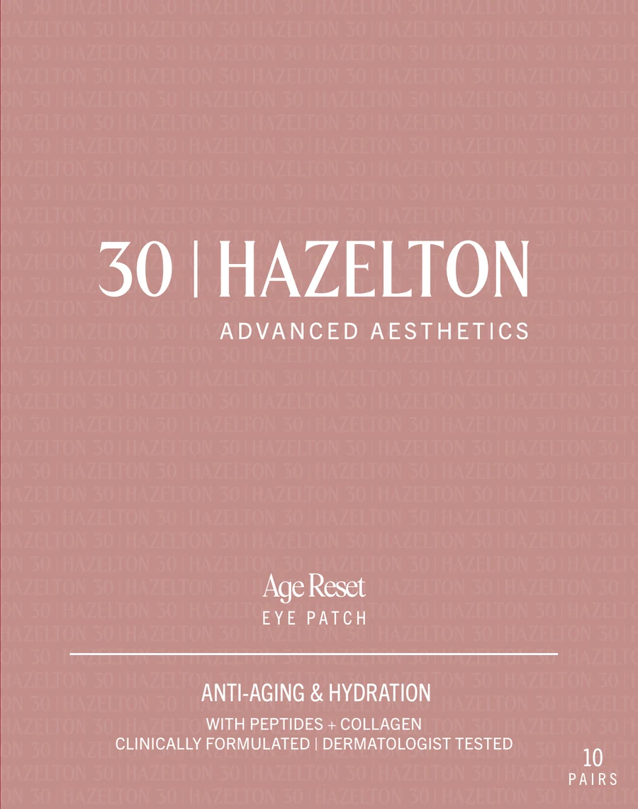
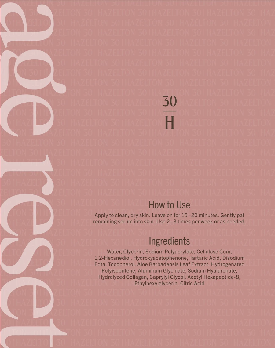
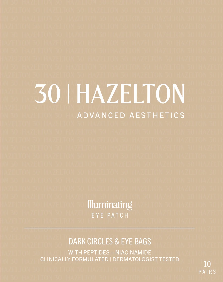
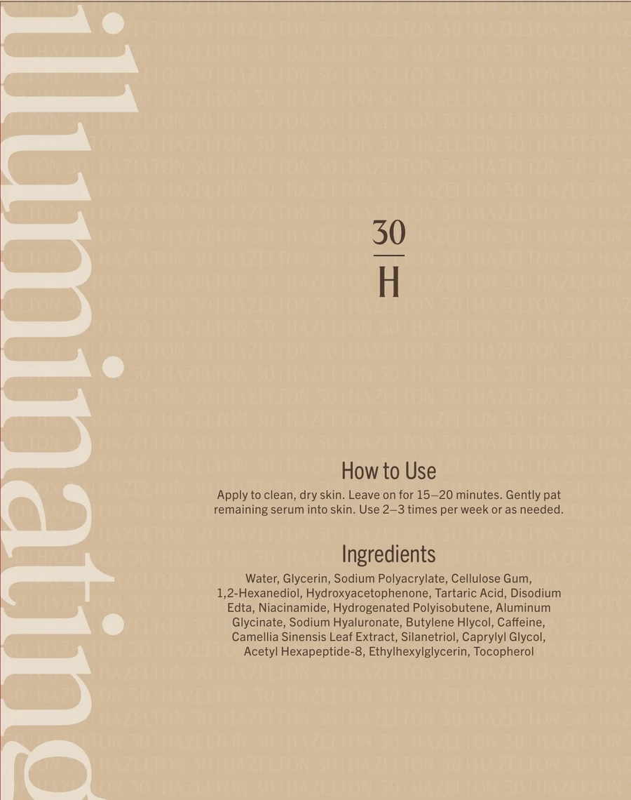
The product name runs up the back of every carton and sachet.
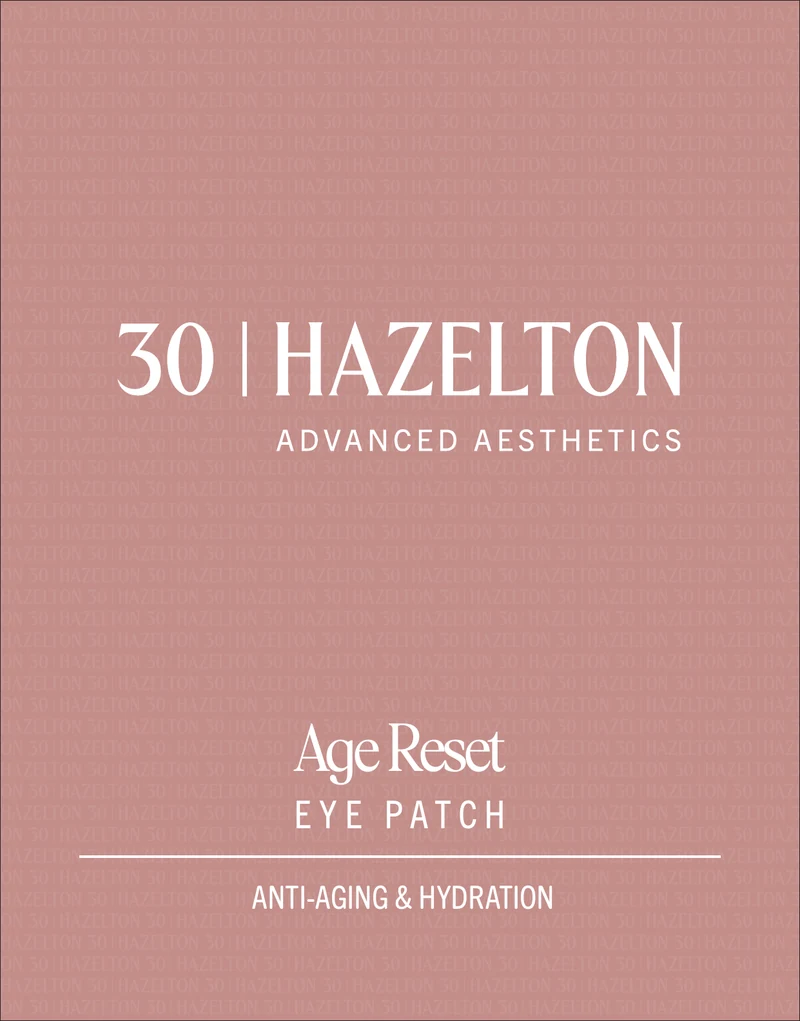
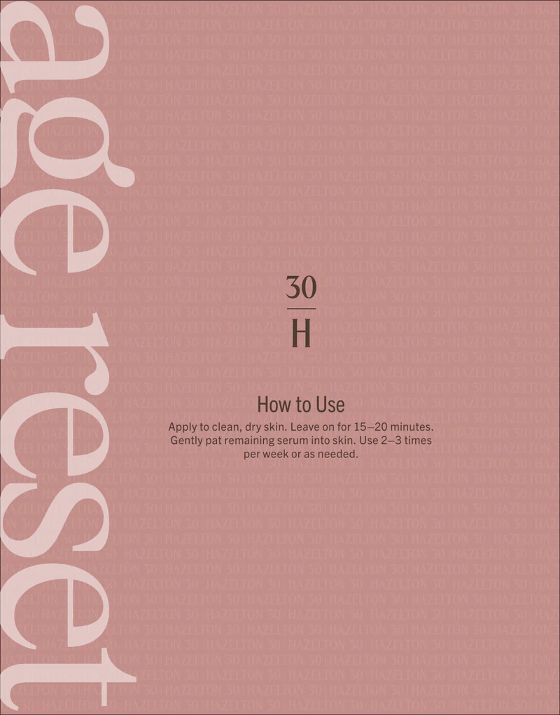
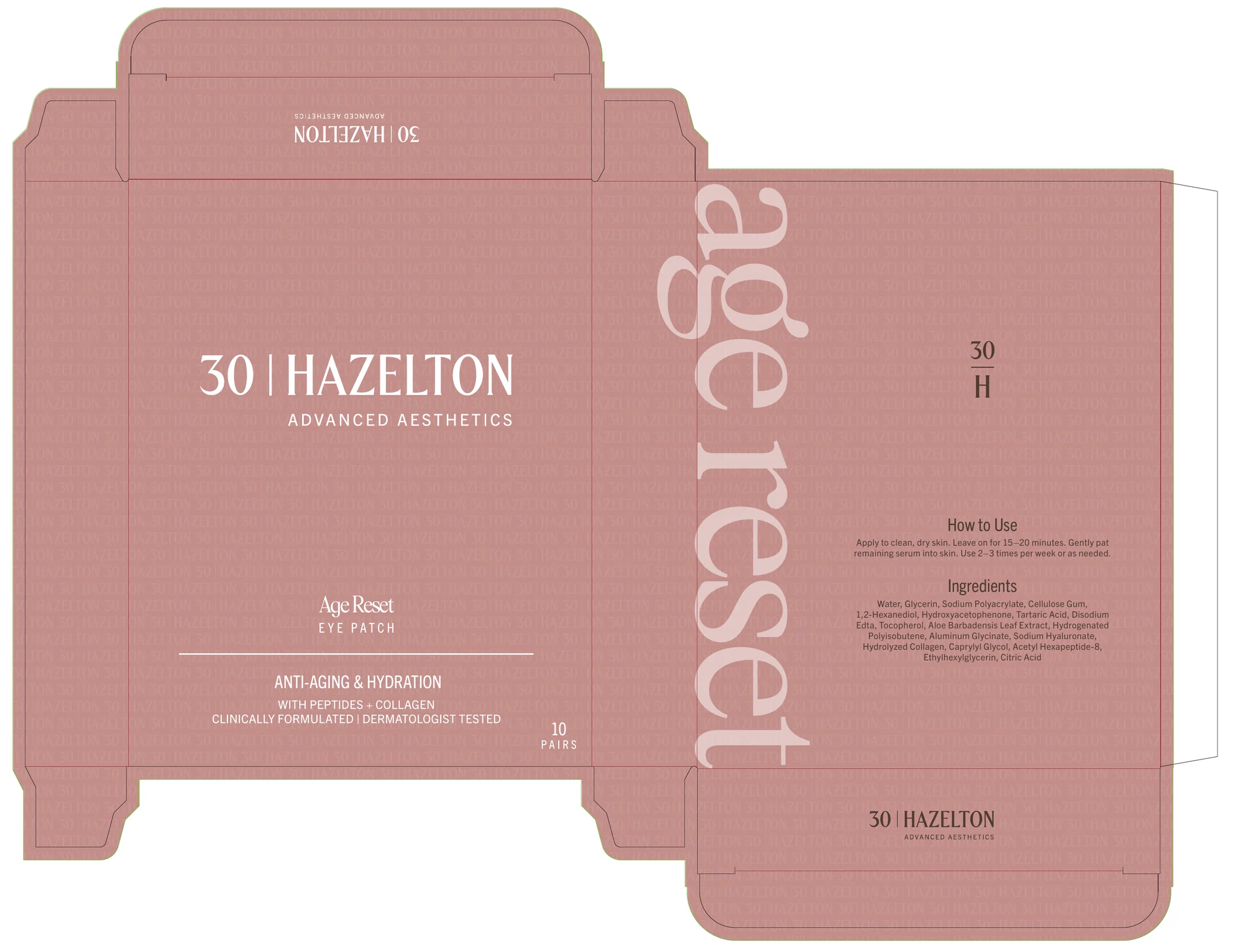
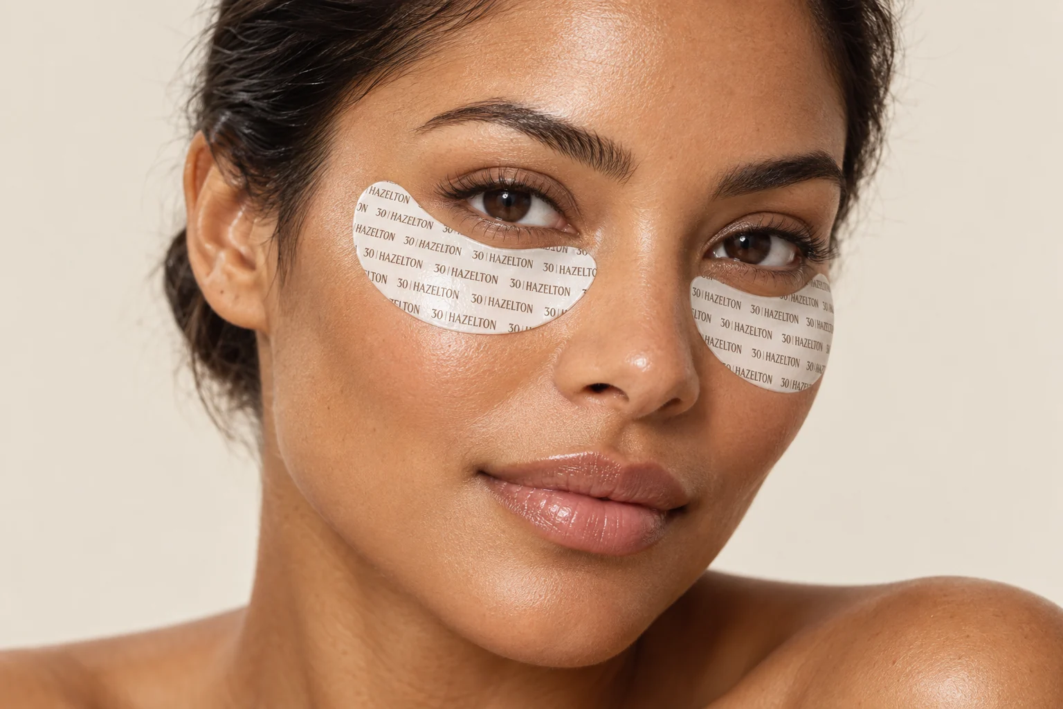
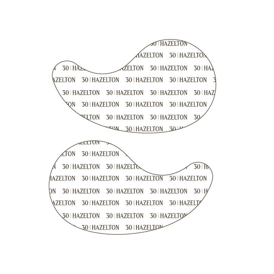
Carton dieline, and the logo pattern printed on the patch.
The same clear system, every month.
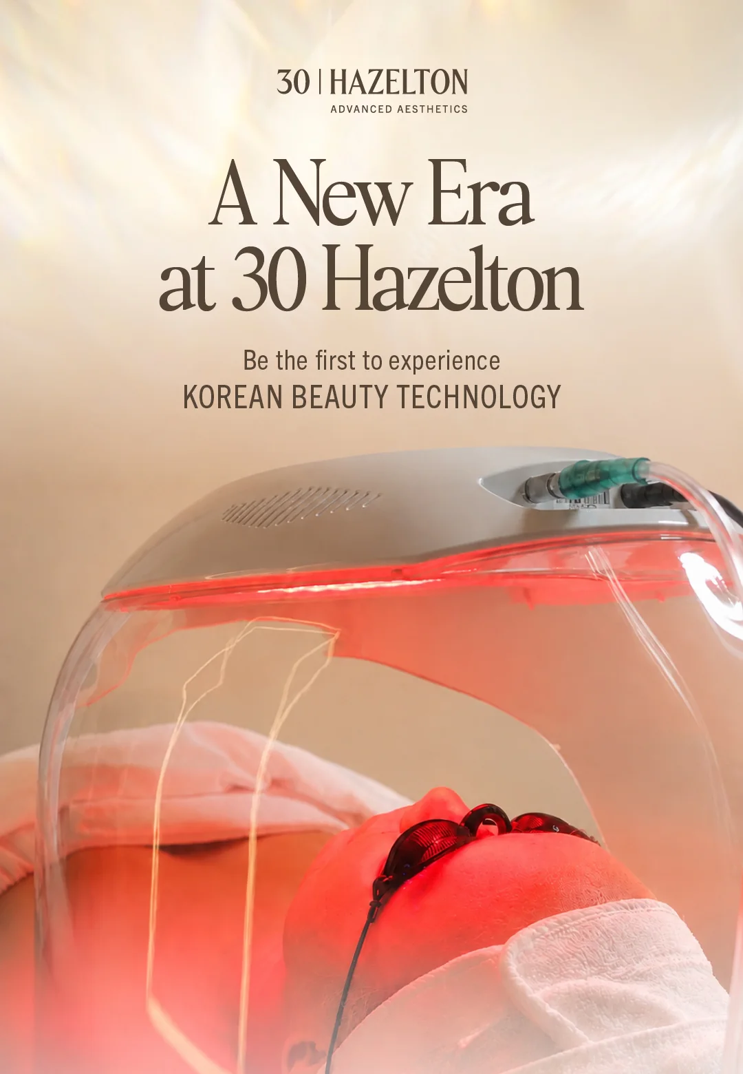
One headline, one image, then the treatments, grouped.
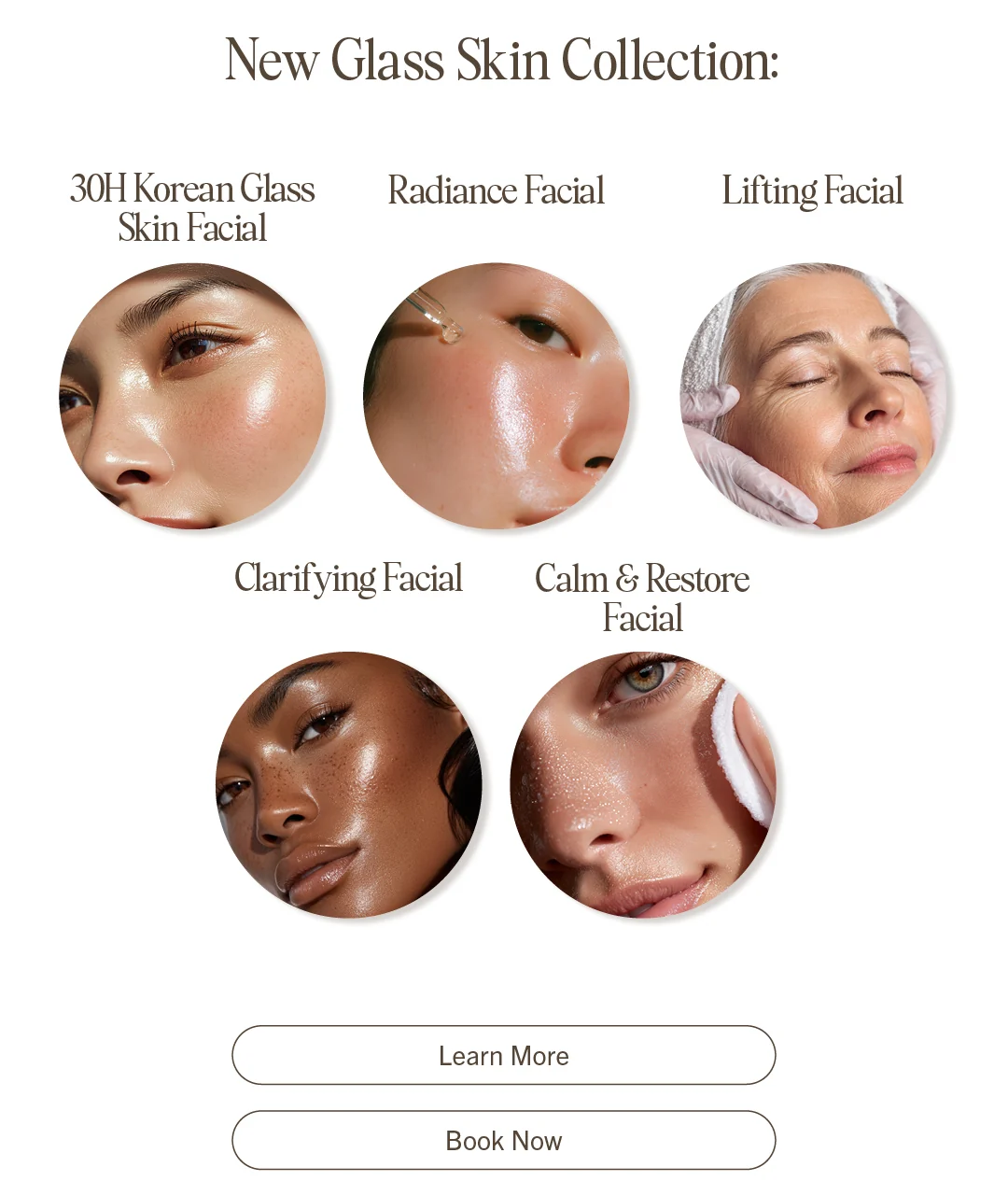
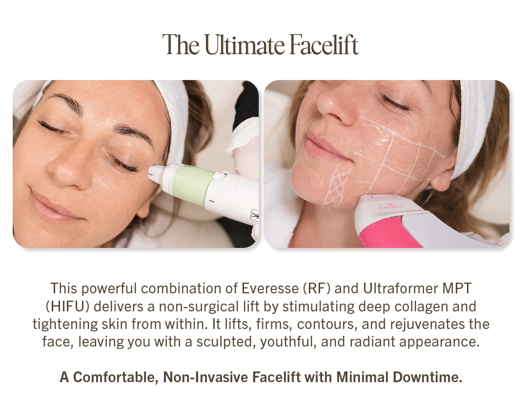
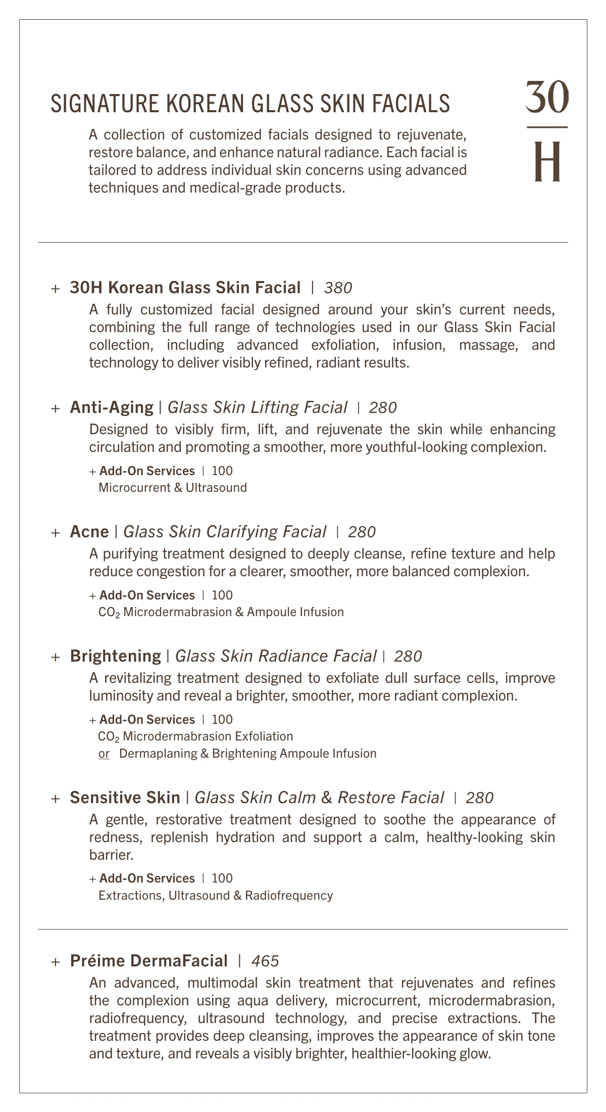
The newsletter and the spa menu follow the same simple rules as the website, so a guest who reads one already knows how to read the others. The September email launched the Korean Glass Skin collection. The spa menu puts the full treatment list and prices into one printed book.
Group treatments, don’t just list them.
A long list is hard to scan. Grouping by collection, like the five Glass Skin facials, helps a reader find their kind of treatment first, then the details.

Spa menu
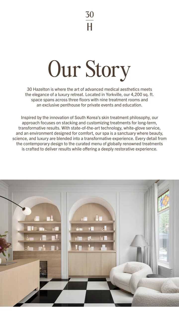
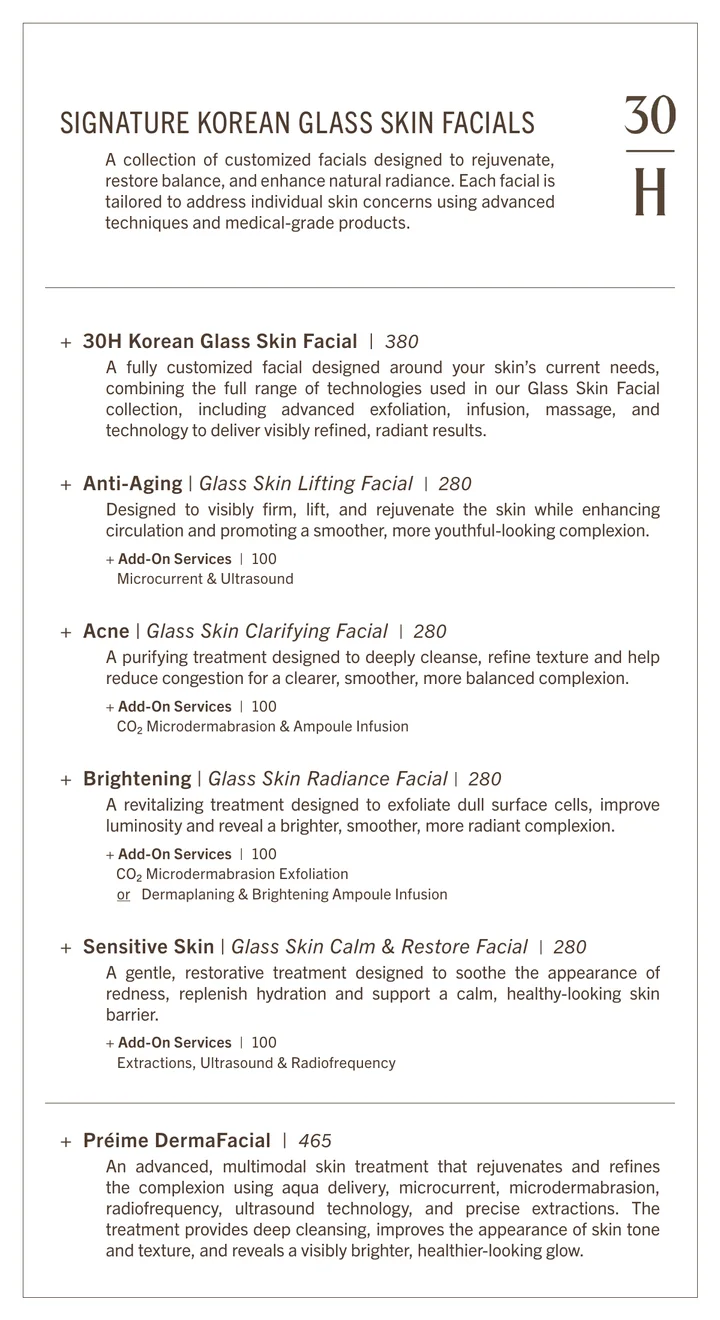
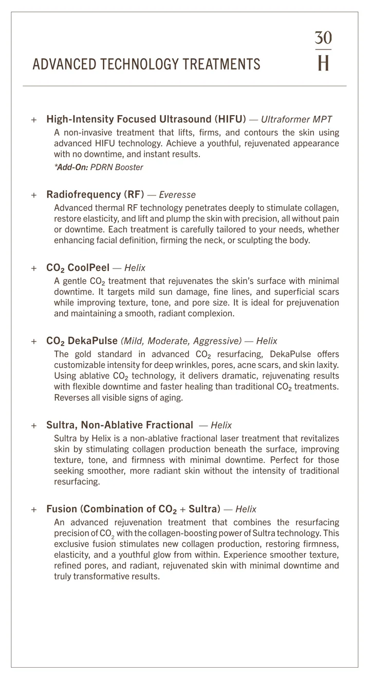
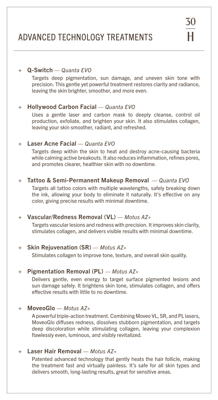
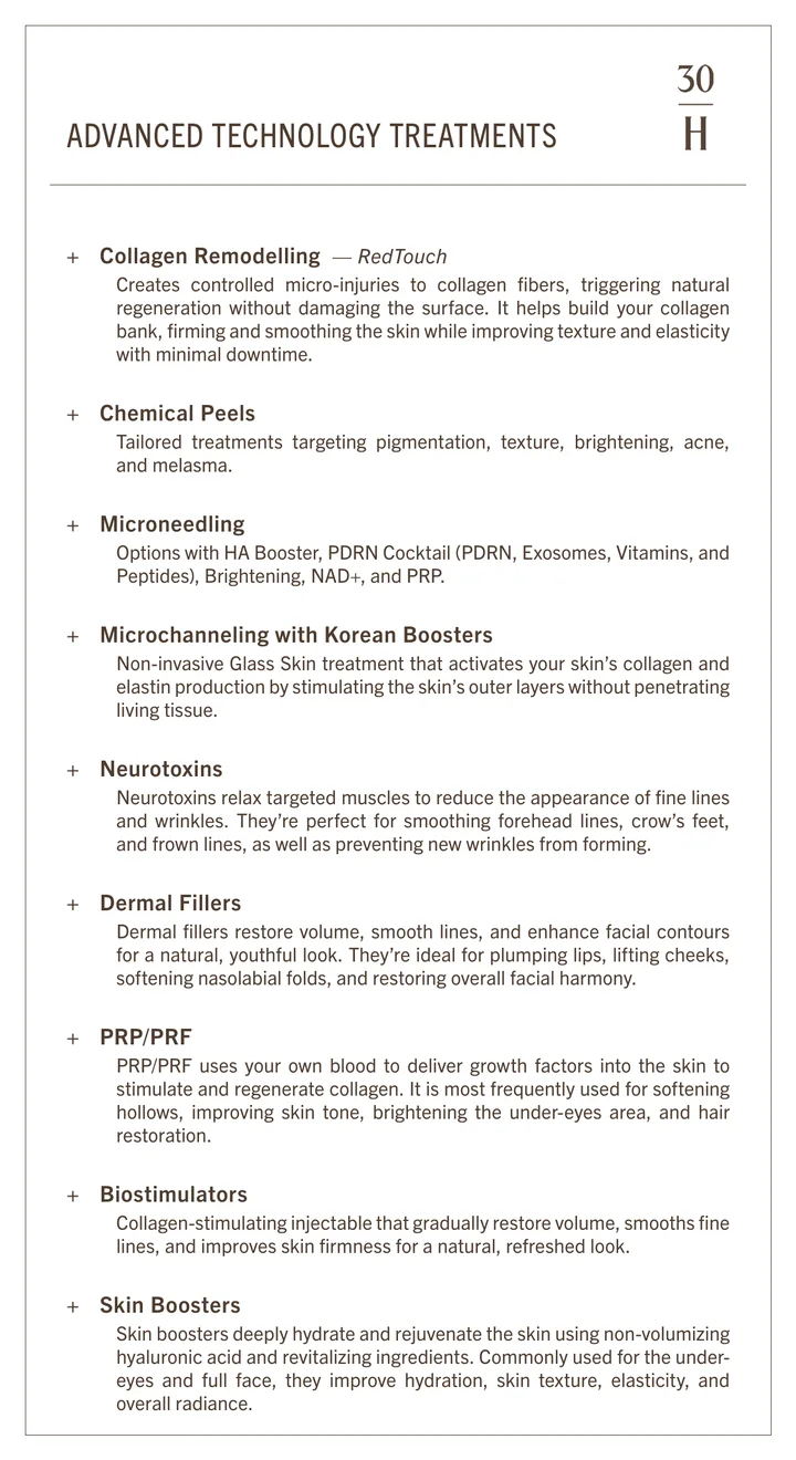
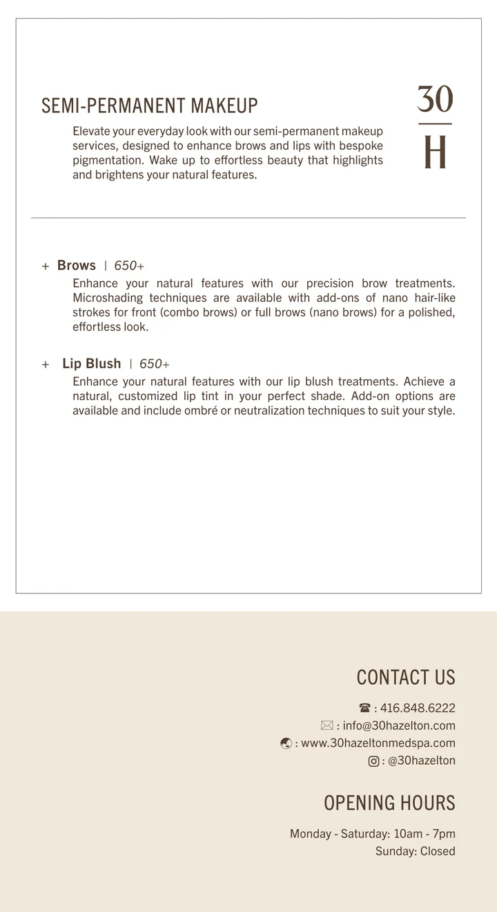
6 × 11 in, 12 pages.
conclusion
I helped 30 Hazelton communicate clearly and consistently.
The goal was simple: when guests plan their next beauty visit, they choose 30 Hazelton. The spa team relied on me to communicate who they are through clear information about their services and a consistent visual identity.
- Make every treatment easy to understand.Each treatment page follows the same structure: what it does, its benefits, how long it takes, who it suits, and how to book. Guests can find the information they need before making a decision.
- Keep playful work true to the brand.Passport to Seoul brought a playful approach while retaining the fonts, colours and spacing that make 30 Hazelton recognisable.
- Build consistency across every touchpoint.The website, packaging, email and passport share a small set of design elements, creating a familiar experience wherever guests encounter the spa.
Together, these choices help guests understand what 30 Hazelton offers and feel more confident choosing it for their next visit.